HOME | DD
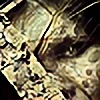
 waugh — short visit

Published: 2005-04-06 17:24:02 +0000 UTC; Views: 6385; Favourites: 188; Downloads: 1932
Redirect to original
Description
thks a lot to roder & daounin.pak pak pak ^^
pak pak pak ^^
pak pak pak ^^
pak pak pak ^^
pak pak pak ^^
.....
pak pak pak ^^
thks a lot for kritiks, have a nice day : )
^^
Related content


Comments: 73


That looks just so cool ")
👍: 0 ⏩: 0


jcrois pas que j'avais vu celle la
elle est superbe
j'aime bien l'ambiance qui s'en dégage, l'explode du vaisseau est super aussi, et le matte est vraiment bien travaillé c'est plein de détails c'est vraiment génial : )
j'adore
")

👍: 0 ⏩: 0


fucking awesome!, masterpiece is to small word for this, i love brushing, colors, terrain everything!
👍: 0 ⏩: 0


Ouwa, ça c'est du bon travail !
Advanced Critique Encouraged : Aucune !
👍: 0 ⏩: 0


👍: 0 ⏩: 0
u works never cease to amaze.
the ships are awesome first off... like how they're out saving the beautiful land below that is just so beautiful and brilliant... almost perfect.
the waterfall is beautiful and like how the city buildings are layed around it.
the planets and nebula are perfect as well as the atmosphere and the stars.... this is fantastic bro.
i guess the top part of ur pieces w/ all the 2D and crazy vector stuff is ur "trademark" but really i'd like it w/out it... almost distracting in the overall piece but hey... i'm not complaining about it

mP
👍: 0 ⏩: 0
u works never cease to amaze.
the ships are awesome first off... like how they're out saving the beautiful land below that is just so beautiful and brilliant... almost perfect.
the waterfall is beautiful and like how the city buildings are layed around it.
the planets and nebula are perfect as well as the atmosphere and the stars.... this is fantastic bro.
i guess the top part of ur pieces w/ all the 2D and crazy vector stuff is ur "trademark" but really i'd like it w/out it... almost distracting in the overall piece but hey... i'm not complaining about it
mP
👍: 0 ⏩: 0


ok a few things to say ^__^ first offf, i love this concept , its a true look at a great piece.
however you are letting your self down mate , alot of people won't notice, but for those few like my self who can , you haven't blended the images right >.< use your masks or soften the edges of each because the picture lines are still there , this wastes it for me, the left side is the worse for it , its easy to fix you could do it in about 2 mins if you wanted.
when its done i will probably fav for i love the concept
*loudon out*
👍: 0 ⏩: 0


Wow it must be the greatest collage i have ever seen, great blending..... I liked specially the nebulae near the moon
👍: 0 ⏩: 0


Please .. Waugh can you make something bad .. just one time for we can say "beuurkkkk ça pue son truc!!!"
Mais non always you do amazing works.. Great man
👍: 0 ⏩: 0


Wow....I don't even know what to say...it's amazing.
👍: 0 ⏩: 0

yep waugh, tu mavai dejka montrer les ebauches de ton travail, et je doit dire ke ton combat de vaisseau et vraiment bien fait, apres ba c toujours réussi au niveau du paysage et pareille pour le ciel et l'espace... continu
👍: 0 ⏩: 0

A little messy done I think, It looks good overall except that u can see the actual edges of the layers up in the top left... would look MUCH better if those werent visible...
👍: 0 ⏩: 0

*dies*
Awsome!!!
Could you make this a print?
👍: 0 ⏩: 0

WOW thats a brilliant image, the colours look very good.
I like the top part of the image the vector kind of look, works very well with the image.
You should make a tutorial how to do that vector part
👍: 0 ⏩: 0
wow excellent job m8!! u always make great big piece's!!
👍: 0 ⏩: 0

whoa the depth of the picture astounds me and makes me feel dizzy....i had to look at the twice to figure out if i was seeing things...heh well
👍: 0 ⏩: 0

v'la les fuuuuuuuuu ......geudin est la section FU ....
je crois qu'ils captent pas le fonfonce style les autres huhuhuhuhu huh huh :!! moi j'approuve a 300% tu c bien !!
nop avec un peu de reculs c vrai que les scapechip sont un tout petit gros a mon gout !! sinon pas de critiks ........................ha si ...........pak pak pak !
P.S: ca aurait pu le faire le bck du header d'un leger bleu (celui du ciel!!)
👍: 0 ⏩: 0


damn the landscape is beautiful! awesome work with the photos

👍: 0 ⏩: 0


Pretty good, exept for the top that just doesn't fit. Smaller planets could use better atmosphere to give a better 3d round effect. Nebula things are very good as well as the spacecrafts.
👍: 0 ⏩: 0

Well that's a funny compositing for sure, but I feel that something is wrong. Maybe it's the darkness of the sky versus the mid-afternoon cloudy-like light that seem to give strange gray colors to the city. Also some cuts don't feel right. I say that because usually your work is absolutely neat, and here I see imperfections.
👍: 0 ⏩: 0


completely awesome, BUT theres a part where the space just cuts off in a line, but dam, thats awesome
👍: 0 ⏩: 0


")

rôôô cte truc de psychopathe
non laisse la vekto du haut  (Wink)")
'tain en bas c vraiment "bizarre", (je dis pas que je n'aime pas hein !! (Smile)")
good job
++
5ive
👍: 0 ⏩: 0

the clouds on top are fucking sweet u dont need the top typo it wud look better without imho
👍: 0 ⏩: 0

awesome incredible sexy space-terra piece
and i love it
👍: 0 ⏩: 0


Holy crap. The space part is one of the best i've ever seen, but the spaceships kinda destroy that
👍: 0 ⏩: 0

awesome stuff man... but the bottom part seems too realistic, so it doesnt really fit with the space part...
anyway pwnage man
👍: 0 ⏩: 0


Awesome stuff.... I really like your surreal, abstract space art style ")
👍: 0 ⏩: 0
| Next =>