HOME | DD
 webbugt — The Creative Center
by-nc-nd
webbugt — The Creative Center
by-nc-nd

Published: 2011-10-17 23:13:31 +0000 UTC; Views: 9613; Favourites: 108; Downloads: 102
Redirect to original
Description
Please vote/comment/favourite, I'd appreciate it")
If you'd really like for this design to get more views, please favourite it, this helps by making it appear higher on the popular lists!
I'll love you for it :*
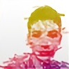
Sketched on paper then done in Flash cs4, pure vector graphics, a few gradients especially on the back portion... Used photoshop only to assemble the final image.
Edit 1 (29.10.): well here's the finished up version, for now. I've added highlights to the tiny objects as well as fixed up some errors that I've noticed
Edit 2 (9.11): WOOOT! Over a hundred faves! The general reactions have been great and I really hope this gets among top50!
 (Smile)")
Edit 3 (11.11.): Well, balls. Only over 200 votes while some have over a thousand
")
I guess I'll be skipping on top50 then, good luck to the winners
I've made a wallpaper from the updated back portion of the design, check it out: [link]
Also check out this awesome design by a friend of mine: [link]
Related content


Comments: 166

Thank you, I appreciate that
Btw. do you mind adding the work to your faves? It'd make my design appear higher on the popular list and now every vote counts
I'd appreciate that even more :3
👍: 0 ⏩: 1

Done! I also submitted it to my group!
👍: 0 ⏩: 1


awesome design! good luck with the contest!
👍: 0 ⏩: 1
thank you,
do you mind favouriting the work so it gets higher on the popular list?
👍: 0 ⏩: 1
ah ofcourse! please check out my designs as well if you dont mind, they arent nearly as good as yours - but was my first attempt at designing anything with a computer program. so would love some feedback
👍: 0 ⏩: 1
thank you very much! And yea, I'll check em out
👍: 0 ⏩: 0

I like your design! XD
I Voted...
Hope you vote for mine designs as well. Thank you.
[link]
[link]
[link]
[link]
[link]
[link]
👍: 0 ⏩: 1
Thanks
Cool designs, I like the first one, but they seem too chaotic in terms of colours and stuff... Too bright
👍: 0 ⏩: 0


What I like about this one is the color and the concept - I am concerned that it is too complex to print on a tee, but it is a very strong idea. Check out my t-shirt design –and vote if you like it - at [link] - thanks!
👍: 0 ⏩: 1
thanks, that's my worry too, but I believe since I don't have any big areas of just 1 colour it should be fine
Yea your design is cool, simple yet carries the message well
Maybe a better idea would be to somehow incorporate the dA logo as a continent in the map (maybe in the Atlantic Ocean)
👍: 0 ⏩: 0

this is probably one of the best ones i have seen
👍: 0 ⏩: 1
Thank you, I appreciate that
👍: 0 ⏩: 0


I've voted for this! btw, it'll be nicer if there's more shading
👍: 0 ⏩: 1
Thanks a lot, I apprechiate it
Heh, I dunno, I never liked to go all out with shading since it tends to look tacky... That's why I've decided to go with lighter shadow colour scheme
👍: 0 ⏩: 1
I see, ah well, different artists have different tastes ")
👍: 0 ⏩: 1
Yea, art has many interpretations
Yea your design is cool but you gotta watch out it's not edge to edge or covering any seams...
👍: 0 ⏩: 1
I hope my design doesn't screw up if it gets printed :\ I was inspired by one of their current T-shirt design that they had with a girl printed to the side as well
👍: 0 ⏩: 1
Dunno, in the guide for the designing (in the template download) it's said that the design shouldn't overlap any seams or be all the way to the edge.
You can solve your problems by simply fading the design those few centimeters before the edge
👍: 0 ⏩: 0

Thanks, but I've decided to go with the original dA colours (the ones used on the site) as the logo so it gives some contrast to teh colorful objects
I tried with the light green they use in the logo but that just looked tacky
👍: 0 ⏩: 0

Looks great! I love vectorized 3D artwork. Good luck!
👍: 0 ⏩: 1

 (Wink)")

like a lot the colours on this one!! if you like, check out mine! [link]
👍: 0 ⏩: 1
Ah thanks, Yea I remember your design, thought I commented on it already
It's pretty awesome
👍: 0 ⏩: 1


Looks like that could be a hit, nice use of simple colors and curves - and still have the logo centered well
👍: 0 ⏩: 1
Thanks a lot
Yea, wanted to complicate things with the curves not the colours
👍: 0 ⏩: 0

Wow, that is very interesting! I would wear it!
👍: 0 ⏩: 1
Thanks a lot! I appreciate that
👍: 0 ⏩: 1

Interesting, but why the image is not centered? Whatever it is, you have my vote!
👍: 0 ⏩: 1
I designed it to feel like it was in motion and growing, if I placed it in the center it would be too stable, too boring... Also, placing it o the side places the dA logo right on the heart
And thanks!
👍: 0 ⏩: 1
| Next =>