HOME | DD
 Wkkid — Poison

Published: 2006-04-30 22:33:32 +0000 UTC; Views: 1156; Favourites: 21; Downloads: 460
Redirect to original
Description
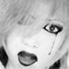
Another lp, simular to the style of my other, this is 100% PS, with NO downloaded brushes just defaults. i like the text, found it kinda funny but w/eenjoy.
Related content


Comments: 25


i love the object in the middle, good focal point.'
not digging the overall sharpness though.
great piece.
👍: 0 ⏩: 0


")
 (Wink)")

 (Smile)")

well since wkkid tricked me before and had me comment on the wrong thing and also add it to favs i might as well do it agian lol but super nice lp wow teach u really outdid urself even for ur own standards lol rape
👍: 0 ⏩: 0

That's pretty cool for nearly defaults. It would be cool if you could make a tutorial on something like that. I'm interested to see how you did that.
👍: 0 ⏩: 1

Ill think about it, and thor ill remove it when i update it.
👍: 0 ⏩: 0

i do like it, but if theres only like 6% c4d... then just get rid of it
👍: 0 ⏩: 0


You need to credit where you got your c4d from.
👍: 0 ⏩: 1
C4d pack?
i carnt remember the person i got it from. like i said there isnt that much in there only like 6% of the peice is c4d.
ill try and find out though.
👍: 0 ⏩: 1
Well, what I would do is 
👍: 0 ⏩: 0


LOL, guess no one eles thinks the text is cool. ill change it later.
👍: 0 ⏩: 0

looks good
bad text
i also dont like that orange blotch (topright)
👍: 0 ⏩: 0
