HOME | DD
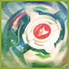
 XxMurderdollxX — Fiery Serpent
by-nc-nd

Published: 2008-09-25 05:26:38 +0000 UTC; Views: 4554; Favourites: 119; Downloads: 0
Redirect to original
Description
Hm... I might just start doing art again...First one in very long time so don't be too harsh on me, but feedback is wanted, specifically opinions on the blue
MD
Related content
Comments: 40

Nice - it flows really well and your colours work great together.
👍: 0 ⏩: 0

"The Artist has requested Critique on this Artwork"
The dragons head feels like it should enjoy the same extra flavor as the rest of his body. By that I mean, the blues and purples elsewhere look great, but I'm thinking some extra dimension or color near the dragons head would create a better balance. Maybe some seafoam green or something to highlight the head, then bubbles of the same color sporadically placed around the figure, I dunno, there's a million possibilities.
The body as of now does not sell itself as more than a flat organic form attached to the head. It seems to carry no weight, part of the visual cue for this perception is the heavy fire shapes overlapping the middle portion. Try to imagine gravity effecting your subject matter!
I am drunk and have to pee. But good job this is cool! Off to pee
👍: 0 ⏩: 0

I like your style. Maybe something to bring it into the background?
👍: 0 ⏩: 0

I like the blue in it, with out it i think it would look almost too harsh. The "cool" colors gives it and overall smoothing appearance, and given the drop-shapes, looks like water too.
Basically, i like the blue. Keep it up!
👍: 0 ⏩: 0

reminds me of Hot wheels toy cars, and I think the peacock feather looking paws are really cute! ;D
👍: 0 ⏩: 0

Eveyerthing looks great, except those blends look very out of place.
👍: 0 ⏩: 0

thanks dude nice to hear
👍: 0 ⏩: 0

heh any idea on what exactly it's missing?
👍: 0 ⏩: 1

I think the blue throws it off. That and I think you put emphasis on the body of the dragon and not the head.
👍: 0 ⏩: 1

I think your whole design would be best fit for etched glass, or stained glass. It looks very colorful and has a good set of complementary colors. The blue works well
👍: 0 ⏩: 1

not sure the blue would work in a stained glass, still that'd be cool to see 
👍: 0 ⏩: 0

This looks great! I love the neat look it has, beautiful choice of colors.
And about what it says in the description, yea you definitively have to keep on doing stuff cause this looks really good for your first work in a long time.
Great job!
👍: 0 ⏩: 0

I was wondering if you would ever come back! Haha.
It looks great.
👍: 0 ⏩: 1

amazing work dude
you should call it Butterfly Serpent
its wings look like butterfly so...
👍: 0 ⏩: 0

awesome comeback bro, welcome to the land of pixels again :]
👍: 0 ⏩: 1

thanks man, felt right to stare at illy and ps for hours again
👍: 0 ⏩: 1

woop woop your back
And it looks like you aint lost anything either!
👍: 0 ⏩: 0

Welcome back bro!
This is some quality vectoring, love the flames and colour scheme.
👍: 0 ⏩: 1

welcome back!
i would suggest some blue at the head of the serpent just like you have it flowing through the rest of the body to even it out. Other than that, the blue is a nice suprise color going and i love how it's setting on that subtle background.
awesome as always
👍: 0 ⏩: 1

hm ill try out some blue on his head, thanks!
👍: 0 ⏩: 1

no prob.
I can use some help on a piece I'm working on too if you're not to busy. -> [link]
I'm coming back from the dead as well..
👍: 0 ⏩: 0


