HOME | DD
 Yacrical — Fiery Knight (3 Years' Improvement)

#digital #digitaldrawing #digitalpainting #fantasy #improvement #medieval #medievalfantasy #improvementmeme
Published: 2018-11-16 12:59:59 +0000 UTC; Views: 4688; Favourites: 304; Downloads: 28
Redirect to original
Description
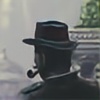
As a celebration for my 100th submission, I redrew my first (not actually first but essentially) proper digital drawing. I polled as to which one of my old drawings should I redo, and Fiery Knight won the plurality. I'm still using the same equipment today as I was in 2016 when I made the original one (Wacom Intuos pro M and Photoshop CC). Both dawings took up roughly a working week to omplete, and I put in similar effort. The difference is I'm far more diligent and have better working ethic and understanding than before. I have made some hefty changes to the overall design and arrangement, which I will explain and justify as well as I can.The biggest one -- his pose. Originally, in 2016, I wanted him to leap towards the viewer ready smack them with his mace. However, I sucked worse than I do nowadays, so I wasn't able to convey that sort of motion that well. This time around I actually thought out his pose and hopefully achieved the feeling better now than I did in 2016.
Secondly: fire and lighting. Despite having named 'Fiery Knight', there wasn't really any fire in the original one. This is mainly due to my inability actually paint convincing fire. Now, however, I wanted to include some intense heat and sparks so as to make the 'Fiery Knight' actually fiery.
Thirdly, the lighting in the original one was quite nonsensical for the most part. Now I put in deliberate effort to have lighting that made actual sense. I settled for three sources of light: The fire, the cavern opening and some unknown point light behind the viewer (you can see the reflection on his helmet and shoulder and elbow pads etc). In the 2016 one, the lights were ambiguous and shone from directions that don't exist. I think I managed to rectify this issue.
I have also made some changes to his appearance and design. I wanted to stay as faithful to the original one as much as could, but obviously I needed to redisgn him. His helmet was quite nice to begin with, so not much was done about that. I got rid of his diaper cape because it was hideous and replaced it with a plateskirt type of solution instead. I chose emboss decorations on his armor to make it fit with his helmet design.
I think this is quite an improvement, at least I am quite happy with it. Hopefully, though, in three years I'll look back to this and think how I could've made it better, because then I know I have improved.
Related content


Comments: 16


I guess i can see that, though it wasn't a conscious decision to make it very souls-y. I do love the dark souls games so there mightve been some unconscious stuff going on : )
👍: 0 ⏩: 0

")
Yeah that's the biggest improvement ")
👍: 0 ⏩: 0


Glad to have inspired you! Keep up the good work
👍: 0 ⏩: 0

I love both of them, Jan's seems more bulky and strong whilst Nov's is wonderfully Dynamic and seems to have so much action in it.
I love them both
 (Smile)")
👍: 0 ⏩: 0

Excellent improvement. Relatively minor touches (e.g. lighting and 'special effects') but they bring a lot to the piece and make it much more exciting and dynamic. Keep up the good work!
👍: 0 ⏩: 0

That's a lot of improvement for only two years! Well done and thank you for sharing
👍: 0 ⏩: 0

DUDE, this is EPIC! And the fire is just beautiful. The balance between what is kept simple and what is detailed is so well mastered in your new one. What brushes did you use for it all?
Here's a picture I did some years ago x,D I was way younger, but I can even remember doing it. It's so funny to look back, and just think about all the stuff you've learned and how much you've grown.
👍: 0 ⏩: 1
Thank you! I'm currently using couple of brushes from this (www.artofserg.com/freebies/ ) pack. I use the watercolour one for the vast majority of everything. It's very versatile.
It's funny looking back to my shitty old works and thinking 'wow I really thought this was incredible when I made it'. I still do think that almost every time I upload and I wonder if in 3 years this Fiery Knight improvement looks just as unrefined and rubbish as the 2016 one looks to me now.
👍: 0 ⏩: 1
Thanks'a bunch
Yeah, I know exactly what you're talking about. But that's what makes it so awesome and exciting - you never stand still, and you constantly press the limits of what you're capable of achieving
👍: 0 ⏩: 0
Thanks! Doesn't matter if it was good. It could still be improved :^)
👍: 0 ⏩: 1