HOME | DD
 ZeroniX-Designs — Dark Fiction layout
by-nc-nd
ZeroniX-Designs — Dark Fiction layout
by-nc-nd

Published: 2007-09-28 10:38:02 +0000 UTC; Views: 8168; Favourites: 30; Downloads: 0
Redirect to original
Description
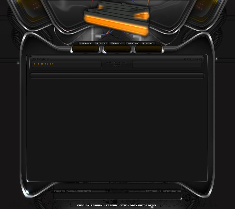
A client asked me to make a small layout, out of the G-Face logo i made month ago.Here is the result and all he requested.
I hope you like this dark layout.
Worktime complete: 3 hours
Worktime Logo: cant remember
")
cya
PS: After all it will be a full flashpage
Related content


Comments: 47

Du lebst auch noch???
Warte immernoch auf dich im: [link]
👍: 0 ⏩: 1

joar, wieder mal ne Runde mit den Painter rumdallern
Hatte ich mich nich mal angemeldet auf PIXEL? glaube ja, hab aber meine Daten nichmehr XD
👍: 0 ⏩: 1
Egal, jetzt biste ja zurück.
Habe alles ein wenig umgebaut und hoffe es gefällt
👍: 0 ⏩: 1
ich checks grade mal
macht nen sauberen Eindruck
 (Smile)")

👍: 0 ⏩: 1


O.o'' I didn't even know there was text till I highlighted it. I think that might be an issue if taken further without any other action.
👍: 0 ⏩: 0


that is really nice, i love the whole concept. great job. 
👍: 0 ⏩: 1
Thanks alot my friend
👍: 0 ⏩: 0

Looks nice, you should make that user box font a bit lighter.
👍: 0 ⏩: 0

Sehr schön, nur würden ein paar mehr Details dem design gut tun ... ;]
👍: 0 ⏩: 0


hey das is ja coool
3std??? krass
haste gut gemacht


👍: 0 ⏩: 1
ach übrigens, ich war der festen überzeugung dich gefeatured zu haben aber hab ich scheinbar doch nicht, jetzt habs ichs eben nachgeholt, passt ja supi zu meinem thema, habs extra zu den favos geklickt damit ichs nicht vergesse, aber nun ja hoffe du verzeihst

👍: 0 ⏩: 1
Mensch i hoffe das ich das PC problem bald erledigt habe.
Bis dahin bestell allen im PS Board die besten Grüße von mir.
Z.Z bin ich bei einem Freund und das nervt auf die dauer (sich immer mit fremden PC´s rumzuschlagen)
👍: 0 ⏩: 1

da sich anscheinend niemand traut ein wenig kritik auszuüben...
Die Buttons - Ich finde die passen garnicht. Die sind eifnach zu glatt ect. einfach kein "tech style"
Das Ding in der Mitte - das ist toll usw. aber du hast da so ein großes ding das dir nichts bringt aufm halben bildschirm... Oo wäre toll wenn es ne "Funktion" erfüllen würde... übergangsanimationen, oder direkt asu den ding buttons... irgendwie so - you know.
Footer - irgendwie leer nä?
Die Seiten - Fette Scanlines ... naja ... naja ... lassen wir die mal durchgehen... wobei so dicke kabel netter wären. so ein fragment kabel.
alles in allem, der Ansatz ist "nett" aber da ist einfach zu wenig nutzfläche und die Buttons passen nicht. sind vor allem zu rund.
und wer meint meine rechtschreibung ... sorry ^^ aber gerade keine lust "gut" zu schreiben.
")
👍: 0 ⏩: 1
Edit: sehe grad das der kunde das so wollte...
machst du keine Kundenberatung?
👍: 0 ⏩: 1
hehehe endlich mal wieder Kritik
Nee, wie gesagt, das war ein Kundenwunsch und ich berate die natürlich auch aber es wurde darauf bestanden, dass es am Ende wirklich SO aussieht wie es jetzt ist.
Das hier ist zwar nur ein Rohling (das komplette behält sich der Besitzer vor) aber wie bereits gesagt, hätte ich einige Sachen dann wohl doch anders gestaltet.
Der braune Verlauf ist ganz schick aber passt (meiner Meinung nach) nicht wirklich zu den Farben des Logos.
Das ist nur 1 Punkt.
Egal, Der Klient ist König
Danke Dir trotzem für Deine immerwährende Kritik
👍: 0 ⏩: 0


logo is way, way too big...
Try looking at some other web design work here on DA and pick out elements you like, then try applying that with your own style.
👍: 0 ⏩: 1
Thank you for the comment dude but THIS is exactly what my customer requested.
My own style is different
👍: 0 ⏩: 0

waaaahhhhhhhhhhhhhhhhhhhhhhhhhhhhhhhhhhh hhhhhh
Sebastian, das ist einfach nur geil!!!!!!!!!!!!!!!!!!!!!!!!!!!!!!!!!!!!!!!!!!!!!!!!!!!!
👍: 0 ⏩: 1
Vielen Dank Cecil
...ne Scherz, vielen Dank Süsse

👍: 0 ⏩: 0

Wasn harter Header! Bissl zu dunkel, aber Ausführung ist erste Sahne, top!
👍: 0 ⏩: 0

Geil! Bisschen zu dunkel wäre es für mich, aber Ausführung ist top!
👍: 0 ⏩: 0

all i'll say is this , the font and the lettering style you've used is very wrong for this style of tech layout mate, it says to me kiddie like bubble writing, yet the layout is dark and tech  (Wink)")
👍: 0 ⏩: 0

Schrift für die Navi dunkler und nicht so eine fette Schrift.
👍: 0 ⏩: 0


Looks great 
")
👍: 0 ⏩: 0


der header teil ist total geil bloß die navi ist echt nich die beste
insgesamt ganz gut gelungen ^^
👍: 0 ⏩: 0

Well i think the Navigation is WAY to big ")
👍: 0 ⏩: 0

looks cool
but i think.. some parts are 2 dark ^^..
Great job
👍: 0 ⏩: 2
Yeah, i know what you mean but the client is a bit gothic and thats what he requested
👍: 0 ⏩: 1
heh.. but the name is PERFECT ^^
👍: 0 ⏩: 0