HOME | DD
 zilla774 — For Her Light

Published: 2009-04-03 16:07:02 +0000 UTC; Views: 6793; Favourites: 126; Downloads: 98
Redirect to original
Description
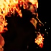
I've been a fan of ~NikxStock for a while now, but haven't had the time or inspiration to do anything. Until now...This was a fairly quick 2hr paint across two lunchtimes. Just some custom brushes and my Wacom tablet.
I was going for a bookcover-esque painted feel. I really like the immediacy of work like this, feel and technique over realism works for me at the moment. I've not got the time to devote to hours and hours of painting, much though I miss it, due to spending long hours at work (ie, making dA the sexy place it is) so I'm trying to just practice where I can.
Also, changing my palette from Red is a really nice thing. Not just for me, but also for my watchers I'm sure.
 (Smile)")
Stock reference: [link]

z.
Related content


Comments: 22

Overall

Vision
Originality
Technique
Impact
This is a great painting. I can tell that you must also have some skills with a real paintbrush as well as a tablet.
There is very little to complain about from a technical standpoint. The only thing I would mention is that something is slightly off with how her neck meets the jawline on the left (her right) side. That makes it look more like she has a big head instead of looking like she is jutting her chin forward. That is just a nitpick though, especially given the time you spent on it the anatomy is very good.
I have to admit that I am not a big fan of the background. I feel like if you are going to have something as odd as tentacles in the background, you should go over the top and put some time into making them crazy. I also don't get why her hair morphs into the background. From a color standpoint the hair is a focus of the painting (and I feel like it is the coolest part of the reference photo). I would love to see it rendered with as much loving detail as the rest of the figure.
Keep up the good work!
👍: 0 ⏩: 0

Overall
Vision
Originality
Technique

I'm so glad to see you using some different colours, and a different style too! It really feels like you've experimented and enjoyed this piece, and it's pleasing to see that. e.deviantart.com/emoticons/a/a… " width="15" height="15" alt="

First things first, the hair was the first thing that struck me. I love the bright copper tones and I think you've effectively captured that 'novel' cover, as you've used broad strokes as opposed to deep detail. I would perhaps, on the left of her hair, like to see a little more red, as it seems to fade a little bit into the background.
The second thing I love is the background. It compliments the hair brilliantly, as it has all those green tones, and it gives quite a surreal overall atmosphere. Her pose also makes me wonder whether her arms haven't been trapped by the octopus. e.deviantart.com/emoticons/g/g… " width="17" height="15" alt="

I like her eyes too, they're deep and inviting and draw me into the piece, although I wonder the effect that would have been created if they were the blue you tend to associate with redheads.
A touch more toning in her black top would have been nice, as her right breast seems to lie very flat in comparison to the left.
Overall, I think this is a very effective piece in terms of being a 'novel' cover. It's got that abstract, surreal feel which intrigues you and makes you want to open up and read inside. e.deviantart.com/emoticons/g/g… " width="17" height="15" alt="
👍: 0 ⏩: 4

Wow we have an extra dimension on DA!
👍: 0 ⏩: 0

Critique opens up a whole new part of DA!
👍: 0 ⏩: 0

I like this system. Still figuring out the folds, but very cool. By the way, I would like to agree. The color palatte is fantastic.
👍: 0 ⏩: 1
And :hgifhive:
👍: 0 ⏩: 1
")

new critique system is amazing
👍: 0 ⏩: 1

Great brushing altogether on this one, love the feel, and flow of it all. The colours are perfect, and the tentacles really give it that extra oomph!!
👍: 0 ⏩: 0


Delicious! I absolutely love this style in digital art. The thick brush strokes have always fascinated me...they look so good! I'm really liking the tentacles in the background as well..really nice touch. :}
👍: 0 ⏩: 0

i love how her eyes are so prominent! a cool background with the tentacles and a great pose for the girl as well. very nice with the way different parts of the hair look different colours
👍: 0 ⏩: 0

Just a fantastic painting!
The slightly forward leaning pose, the asymmetry of the dress, the expression, the coloring, just all go together beautifully.
👍: 0 ⏩: 1
I also want to complement the model for coming up with the great initial pose.
👍: 0 ⏩: 0

This is perfect...love the exact shade of the green of her eyes. I wouldn't change a thing.
Well done.
👍: 0 ⏩: 0

It's the composition and graphic arrangement that lend that book-cover flair you're aiming for. Wonderful choices in your palette, naturally the turquoise and bright orange are an immediate hit. The pink though, in her bra strap, is what really sets this off. Draws the eye line back to her eyes and lips. And the lose structure definitely work for this, breathes a sense of life rather than an "unfinished" quality. All in all, awesome job
👍: 0 ⏩: 0
I knew I recognised the stock image from somewhere; Fi's 'Say Something' - love how differently you two have used the same piece.
👍: 0 ⏩: 0