HOME | DD
 znodden — red

Published: 2009-03-10 16:30:34 +0000 UTC; Views: 681; Favourites: 17; Downloads: 60
Redirect to original
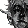
Description
my first oil painting, done in school. (Smile)")
Related content


Comments: 11

Beautiful.
I'm envious, I dont remember my first oil painting turning out anything like this
I really like the depth and layers of color that you can see hidden behind everything. One of the things that I love about oil paintings is actually SEEING the brushstrokes. You get that with other paints to a certain degree but none of them quite have that same flow.
Personally, I like the empty headspace. It gives the impression that he's in some large dark limbo. Adding a little more space to the bottom might be good. But in the end it's what you think looks best for the piece. Everyone will have different feelings about what makes a good composition.
So great work, it's very interesting and very well done.
Keep it up
")
👍: 0 ⏩: 1

Haha, well, in fact this is probably my second painting. I made one when I was about 11 years old too, with Donald Duck in it ")
Yeah, I like that too, adds some nice textures or something!
Well, that was kind of what I wanted it to look like
Thank you!
👍: 0 ⏩: 1

oil paints were always fun.
And because advanced critiques were asked for, critiques I can give!
I actually don't see too much you could fix with this, as I think it's pretty awesome already.
The other thing would be the composition feels a little off-balanced. I would either add more space to the bottom or cut from the top, although I think this isn't possible due to the fact that this is on a canvas. You could theoretically crop it in photoshop, but then you'd lose all that nice red splatter up top. ):
Anyway, hope that helps a little. This turned out pretty friggin' sweet.
👍: 0 ⏩: 1
They sure are!
Hmm, yeah, that would maybe look nice! I'll see if I can add something like that without messing up the picture tomorrow
Could I maybe fix that by adding something on the top? Dunno what though D:
Thanks a lot!
👍: 0 ⏩: 1
Yeah, maybe. Or maybe if you had something at the top leading down to the bottom, so it feels more comfortable having the viewer's eyes tread down there? Not sure. Maybe red stuff leading down?
👍: 0 ⏩: 1
Hmm.. Yeah, that would maybe work. Like some kind of frame or something? I'll see if I can come up with a look for that
👍: 0 ⏩: 1
Something like that.
I've tried to hit ctrl-z so many times before. ):
👍: 0 ⏩: 1
Haha, yeah, I wouldn't dare messing around with that on the canvas. Hope I can borrow a tablet at school xD
Augh, me too DD:
👍: 0 ⏩: 0

XD wow this is great! Especially for your first oil painting! Beautiful!
👍: 0 ⏩: 1
Thank you! It was really fun to paint, I should do this more often XD
👍: 0 ⏩: 0