HOME | DD
 1NNU3NDO — Kanji

Published: 2008-02-26 21:31:25 +0000 UTC; Views: 9598; Favourites: 177; Downloads: 363
Redirect to original
Description
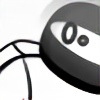
Shirt designs for a clothing brand. They commissioned/challenged me to base the designs on the Japanese Kanji signs mixing it with my own, took a free interpretation to the 4 signs chosen.The idea was to mix traditional Japanese culture with western elements (yes, one of them looks like the 300 masks. They were inspired by Noh masks themselves apparently).
The themes are Way of the Samurai, Legend, Perfect and Victory
[link]
[link]
[link]
[link]
[link]
[link]
Related content


Comments: 45


Not a fan of the gradient on the Bushido image, but otherwise the collection is bold, very striking and iconic.
The guns are brilliant, that would be my face. Especially like how the white smoke eats up part of the neckline of the teeshirt. Good stuff!
👍: 0 ⏩: 1

Thanks man  (Smile)")
👍: 0 ⏩: 1
Sweet. Are you planning on printing this proper? Gold inks are pricey... Metallic inks in general are over the top from what I heard, though I havent had much most exposure to the print industry.
👍: 0 ⏩: 0

I make a little feature for this deviation in my journal. Take care!!!

👍: 0 ⏩: 0


yeah man, should be. I gotta ask them where and ill let you know
👍: 0 ⏩: 1

thanks alot man i want like 3 of them so badly
👍: 0 ⏩: 0


loving the first and third. The shading scheme on the first one is just totally ace. I love the smoke on the third one, so crisp and yet not at the same time.
👍: 0 ⏩: 0

")

love the middle two especially, very cool work chop mate.
👍: 0 ⏩: 0


Hey one of them looks like it's from 300.
Kidding  (Wink)")
Awesome job, very stylistic and crisp.
👍: 0 ⏩: 1
Hahah, sometimes it just happens. Thanks for the comment man, I really dig your art! Gonna watch you and go over your gallery more in detail later
👍: 0 ⏩: 0

I really dig the first two. I would rock them in a New York minute.
k
👍: 0 ⏩: 0

Shouri en Kanzen vindt ik echt geweldig, absoluut shirts die ik zou halen, als ze te koop gezet worden, geef even een seintje?
👍: 0 ⏩: 1
Is goed, zal ze binnenkort eens vragen hoe het gaat. Merk wordt namelijk nieuw op gezet. En bedankt
👍: 0 ⏩: 0

LOVE LOVE LOVE LOVE! especially the last two!
=]
👍: 0 ⏩: 0


i dont like the smoke only because i know how simple it is to do. to the rest of the world itll look fine tho XD.
awesome work and i love that second one
👍: 0 ⏩: 2
Yeah I know. Designers sometimes think too much. It's probably my favorite
👍: 0 ⏩: 0
easy? lets see you come up with that without copying his...if you've ever used vectors you'll know that that isnt simple.
👍: 0 ⏩: 1
relax man i'm not discrediting his skill.
i was just pointing out how whenever i see that filter it somehow makes the piece seem less remarkable, which is weird because it still looks great
the effect actually is pretty simple to do, but a lot of art is how/where you use the simple things... and it works here
👍: 0 ⏩: 0


")

wow cool!... be cool if some of them were interactiveish... in the way like the bushidu one instead of the swords across front... do them across back like full length shoulder to bottom like where they could be worn kind of thing... if you even get what im on about..
")
👍: 0 ⏩: 1
I do, but I went for a japanese skull & bones with a Noh mask and samurai swords
👍: 0 ⏩: 0
The two to the right are really awesome!
I love the style, keep it up mate
👍: 0 ⏩: 0

Absolutely great, colors, shapes and mixes, probably the one least stunning is "Bushidu", may be the gradient, i don't know doesn't seems as good as the otherones.
👍: 0 ⏩: 1
I put in the gradient to illustrate the gold print. Didn't spend a lot of time on making it look like perfect gold. Thanks very much!
👍: 0 ⏩: 0

man i love the shouri, option two great work done here...

👍: 0 ⏩: 0

I'd actually buy and wear the first two easily, especially the legend.
I gotta tell you man, that I don't really like the smoke on the 3rd one, cuz it obviously was done with the help of illustrators distort/swirl tools, riiight?
cmon dude, you could do much better by hand!
my apologies if it actually IS done by hand, tho but otherwise yea

👍: 0 ⏩: 0


Thanks
👍: 0 ⏩: 0