HOME | DD
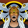
 39rin — Miku

#colorful #digitalart #digitalpainting #mangaanime #vocaloid #hatsune_miku #hatsunemikuvocaloid #vocaloidfanart
Published: 2019-02-24 16:18:43 +0000 UTC; Views: 532; Favourites: 119; Downloads: 0
Redirect to original
Description
This is not my usual art style, but it was fun experimenting xDRelated content


Comments: 29

Hello again (lmao, I remember your Rin and Len along the seashore art), I'm here for #projectcomment
Love this colorful and sketchy (lines) style! I love how there is so much color everywhere, especially how you semi-blended them together in the hair <3 The expression is simply beautiful as well. I like how you drew the skin as well, super soft (in contrast to the hard lines). The translucent hair is also a quite interesting variation compared to the original teal. Overall, nice job with this piece!
Some things that I believe you can improve on:
- shading. The drawing is full of color, which is great! However, it would add more depth if you use shadows. For instance, the pigtail holders should give some hardish (some soft blend) shadows on the pigtails. There should be some shadows right under the hair on top of the face. Some hard shadows right under the neck ribbon would be nice as well.
- bubbles. I mean no offense, but I thought that the grey shading made the bubbles look like rocks. Same goes for the shape of them – they should be smooth and flowing. I see that the current lineart for the rocks is kind of sketchy (lines), which is fine. But give some curvature to it, give it some smooth curves so that it looks round like bubbles. Additionally, change the grey shading to blue, if anything – it would give the viewers a bigger understanding that Miku is underwater.
- other thoughts – Miku's pigtail holders should be semi-floating above the hair. The one on her left pigtail (our right) isn't really around all the way? Kind of confused. Some gentle, light blue highlights on her skin and the paper would accentuate the underwater-ish theme.
This piece is pretty well done, but I hope that my tips are sort of helpful
👍: 0 ⏩: 1

Hii! I remember you to haha. Thank you so much for your comment!
I tried something else with this, so it's great to receive some feedback on what looks good and what needs some improvement.
Thank you for telling me how I can add more depth to the shadows...what you say is true and looking at this again now, I can see that the shading needs a bit more refining and depth.
I know that the bubbles don't really look like bubbles...I managed to draw bubbles against a darker background before, but this technique wouldn't work against the light background T.T It would've been wiser to choose a more blueish background...Or changing the grey shading and outlines to blue. That's a really nice idea (I didn't even think about it then, but I think this can really work). Thank you! <3
I agree that her pigtail holder looks a bit weird oops And adding some light blue highlights seem like a great idea!
Thank you so much for your comment! I really appreciate it <3
👍: 0 ⏩: 1

The colors are beautiful and stunning. Feels a it like an opal. It's a small detail, but I especially love the bubbled shading on the hand and how you let it extend beyond the outline. Creates a sort of glowing effect that I really dig.
👍: 0 ⏩: 1
Thank you <33 I really appreciate you noticed this small detail <3
👍: 0 ⏩: 0

Ding ding! ProjectComment here!
First of all, great drawing! But since i'll be a critic here, i'll have to be as rude as possible so that you can do better next time, sorry!
The shading is pretty good but you could use some more shadows! It would give much more depth to the drawing and step it up a good amount  (Wink)")
She also look like she's underwater? Then maybe you should have given a slight blue hue to the drawing and blur the whole image a taddle bit
Now for the perspective/lineart/proportions! Not much to say here, except that her neck looks a bit long and her face a bit too square... The hand is alright but maybe the little finger is a bit too long? Not trying to be mean, but your other drawings are much more polished and in-depth... But you're right, experimenting new styles is a great way to find new drawing techniques so don't worry about it
")
")
👍: 0 ⏩: 1
Ding Ding! Thank you for your comment and sorry I'm replying this late ;-;
Thank you for your feedback and the disclaimer, but don't worry, you're not mean at all!
Thank you for telling me how I improve the rendering style...I tried working with colors rather than shadows, so I can see that it looks a bit messy...I will try using warm and light colours for lighter areas and cooler and darker colors for shading, maybe this will add a bit more structure and depth xD (I'm just curious, but since I really enjoyed this type of colouring, how would you make the shading good? If you have any ideas or experiences please share them with me <3)
Adding a blue background and making the whole picture appear underwater by adding some blue tint and blur is a good idea. I'll take note of it for my next underwater piece! ^^
Anatomy and proportions can always be improved, so thank you for telling me what exactly I can do better in my next pieces!
Once again, thanks! I really appreciate your feedback!
👍: 0 ⏩: 0

I like this thing. I can see the emotions i her eyes, and it makes me think that the bubbles are symbolic of some kind of sadness. Well done.
Just one thing...
...who's Miku?
👍: 0 ⏩: 1
you're right xD
And Miku is the character in this illustration (her full name is Hatsune Miku ^^)
👍: 0 ⏩: 1
Yeah. I got that.
But who is she? Is she a real person? Is she fictional?
👍: 0 ⏩: 1
ahh, sorry ;-;
she is not a real person, but a software by crypton future media. Hatsune Miku is a voicebank for the vocal synthesizer software VOCALOID and you can create singing vocals with her. Therefore many people think of her as a virtual idol and she even gives concerts ^^
There are many Miku songs in Japanese, Chinese and English language and some of them are even featured in rhythm games like Project DIVA ^^
(just to clarify: this is fan art of her, but I changed her design a bit. Normally she looks like this:
)
👍: 0 ⏩: 1
AH. I understand.
Wait a minute. Now that I think about it, I've heard a miku cover of that new song "Over Quartzer."
Does she have any songs in english? Or just in languages originating from Kanji?
👍: 0 ⏩: 1
Nice! I haven't heard that song you mentioned, but I'll check it out ^^
And yes she does have some songs in english  (Smile)")
👍: 0 ⏩: 0
Ok, before I tell you what you can work on, I just wanna give a thumbs up for trying a different style. It's very hard to come out of your comfort zone and I really like what you did here. One thing that I would do is move those bubble.... thingies, away from her mouth. They kinda feel like they are in the way. But if you are trying to make it look like she's underwater, I would suggest making the bubbles smaller and have them moving vertical instead of horizontal.
👍: 0 ⏩: 1
Hello! Thank you for your comment!
Trying a different style was really fun! It's a bit challenging, but all in all moving out of one's comfort zone is nice every once in a while xD
Thank you for telling me how I can improve this. I wanted some of the bubbles to come out of her mouth but I can see how they are a bit in the way...Making them smaller and more organised seems a good idea too.
👍: 0 ⏩: 0
Hi, there! I'm here from ProjectComment !
First of all, incredible job on the hair! The different colours look stunning! And adding all the colours to the edges of the papers and to the bubbles brings the piece together even more! Her eyes are very striking, and you did an amazing job with the bubble shapes. I like the bubbles in the background, too. The white highlights around the edges of the ribbon make it look so much better - great idea! Edge lighting always helps with clothing. The lines you used to shade the side of her neck and her hand are an interesting choice - it fits with the style of the hair. I like that you didn't just keep all the line art around her face and hands black - adding some colour to it really helps the effect of her being underwater, where things would be a little bit blurred. I think you used some sort of ink brush instead of a crisp pen for the lineart - good choice.
Speaking of lines and lineart, you have some aqua strands coming out from her bangs - they look great! Underwater, there'd be a lot of those, so I'd recommend adding a few more such strands, especially from the ponytails. Also, I think you have some thick black lines for the hair outlines towards the back (the black lines are behind the base of ponytails) - perhaps it'd help to have those be a lighter colour, as well.
There are just a few other suggestions I can think of. One would be to perhaps have a very very light coloured background (maybe a greyish blue?) so that it's easier to tell the papers from the background. Another is that I'm not sure the bubbles in the bottom left corner would be visible if they're behind the papers. If you take a look at this reference , you can see that her hand should probably be a bit larger. Also, a black/dark outline for the bubbles does make them look a but more solid than a bubble. This reference shows you that bubbles typically have lighter outlines - another reason why a pale background would help, so that you could make a white outline for the bubbles. Also, if she's underwater, the ribbon at the back of her neck won't be symmetrical. You did a great job making the hair flow in the water - the same rules apply to the ribbon, too! Also, I'm not quite sure what the V-shaped things around her hair are? If they're ribbons, they certainly won't have that V shape underwater.
Overall, amazing job! I admire that you took such a creative risk like adding all those colours to the hair, and making the bubbles and everything. Just a couple details here and there that could be improved. I look forward to seeing your art in the future ❤
👍: 0 ⏩: 1
Hello! Thank you so much for your comment! I appreciate it <3
I'm glad you like it! I wasn't sure if all the colours fit, so I was hesitant about posting this, but I'm glad to hear that the colours work ^^ It was really fun adding all these colors and I really want to do artworks like this more often~
I imagined this character to be underwater, so adding in a few more strands, especially from the ponytails as you said, would probably make this look more believable. I mainly focused on the area around the face and the eyes, so I probably forgot to color the black outlines of the ponytails oops xD
I really like the idea of adding a light coloured background btw, I think a grey blue might look great and the piece wouldn't feel so empty then. As you said it also would help to separate the paper from the background and help the bubbles stand out (I looked at the reference image you linked and usually bubbles have this glow around them, that works best with a darker background)
Anatomy and proportions is something I'm still learning, so thank you for pointing out where I can improve <3
And thank you so much for pointing out that the ribbon around her neck and in her hair would move in the water as well...I forgot that not only hair was affected by the physics of water xD
Once again thank you so much for your feedback and sorry for replying this late
👍: 0 ⏩: 1
Haha, no worries! I'm glad I could be of help! ❤
👍: 0 ⏩: 0

You're welcome! I used to be a fan of Vocaloid, but then, It seemed to have been overplayed! XD
👍: 0 ⏩: 0

SHE'S SO PRETTY <33 ! The rainbow colors are an awesome effect ;v;. They make her eyes glow like she's staring down at you <3.
I can't wait to see more Vocaloid art ;w;!
👍: 0 ⏩: 1