HOME | DD

AcjBizar — MK:DA Ermac

Published: 2004-04-11 03:13:52 +0000 UTC; Views: 3284; Favourites: 29; Downloads: 139
Redirect to original
Description 
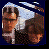
A fan art piece in the style of the concept art that was released prior to the launch of Mortal Kombat: Deadly Alliance by the design/development team.
Drawn with a narrow tip (callographic) pen and drawing ink, and added the black with brushes and Indian ink.
Touched up in PhotoShop.
Related content
Comments: 23

naked-snakes-box [2015-02-17 18:35:59 +0000 UTC]

I love its great to see fan art of ermac

👍: 0 ⏩: 0

ECTO87 [2012-03-09 03:01:03 +0000 UTC]

me loves it.

👍: 0 ⏩: 0

Deadpool-08th [2011-05-08 20:47:45 +0000 UTC]

now this is good

👍: 0 ⏩: 0

gardiken2 [2009-06-09 04:41:47 +0000 UTC]

the hands make it look like havik.
still good though.

👍: 0 ⏩: 0

You-Know-This-Bitch [2006-12-13 11:57:36 +0000 UTC]

That's freakishly awesome!

👍: 0 ⏩: 0

cthullhu [2006-10-19 08:33:56 +0000 UTC]

nice! , a fan of Burn Hogarth i see....

👍: 0 ⏩: 0

Japoshi [2004-04-12 23:21:34 +0000 UTC]

Oo~! You know, I've never played Deadly Alliance. But after seening this piece, it really makes me want to. Top notch~!

👍: 0 ⏩: 1

AcjBizar In reply to Japoshi [2004-04-13 04:40:11 +0000 UTC]

Don't bother. Heh.

Oh, and this particular character isn't in it anyway. He will be in the next installment: Deception.

👍: 0 ⏩: 1

Japoshi In reply to AcjBizar [2004-04-13 18:13:08 +0000 UTC]

I shouldn't I bother? Is the game no good?

👍: 0 ⏩: 0

project9928 [2004-04-11 15:26:50 +0000 UTC]

has a very good effect (the paint and the ink) and the colour is nice with the dark greens, makes it look scary

👍: 0 ⏩: 1

AcjBizar In reply to project9928 [2004-04-12 02:11:10 +0000 UTC]

Thanks.

👍: 0 ⏩: 1

project9928 In reply to AcjBizar [2004-04-12 07:33:42 +0000 UTC]

your welcome

👍: 0 ⏩: 0

Cham000 [2004-04-11 07:08:51 +0000 UTC]

Nice ACJ

👍: 0 ⏩: 1

AcjBizar In reply to Cham000 [2004-04-12 02:09:45 +0000 UTC]

Thanks.

👍: 0 ⏩: 0

SpikeDSL [2004-04-11 05:02:58 +0000 UTC]

im loving these i have to say thats another +fav

👍: 0 ⏩: 1

AcjBizar In reply to SpikeDSL [2004-04-11 05:35:13 +0000 UTC]

Thank you.

👍: 0 ⏩: 0

Murdoink [2004-04-11 03:22:54 +0000 UTC]

Yeah, I love this one.

👍: 0 ⏩: 1

AcjBizar In reply to Murdoink [2004-04-11 03:24:44 +0000 UTC]

:dances:

👍: 0 ⏩: 1

AcjBizar In reply to AcjBizar [2004-04-11 03:25:27 +0000 UTC]

Eek!

👍: 0 ⏩: 0

relsh [2004-04-11 03:17:23 +0000 UTC]

VERY nice.....love the texture of the ink, and the expressivenrss of the pose.

i know it's for mortal kombat....but the image would be MUCH better without the text and MK logo.

👍: 0 ⏩: 1

AcjBizar In reply to relsh [2004-04-11 03:22:38 +0000 UTC]

VERY nice.....love the texture of the ink, and the expressivenrss of the pose.

Thanks. I'm a big fan of what ink and paint can turn out like when digitized, personally. I'm currently working on a piece where the textures of the ink and paper play a much more prominent role.

i know it's for mortal kombat....but the image would be MUCH better without the text and MK logo.

I see what you mean, and I have to agree. The thing is: I wanted to depicture what I figured the conceptual art might have looked like if they were to decide to put Ermac in the game. I used the exact same logo, type face (which is a horrid choise) and positioning of elements as the original art works.

Thanks for the feedback, I appreciate it!

👍: 0 ⏩: 0

JoeFrench [2004-04-11 03:14:54 +0000 UTC]

That.

Kicks.

Ass.

+50 points.

👍: 0 ⏩: 1

AcjBizar In reply to JoeFrench [2004-04-11 03:16:22 +0000 UTC]

Haha. Thanks!

👍: 0 ⏩: 0