HOME | DD
 aip — Renasci

Published: 2006-01-16 13:59:02 +0000 UTC; Views: 574; Favourites: 7; Downloads: 39
Redirect to original
Description
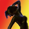
To be born againthe light of life...
trapped in a shell...
renascent...
Latin, re-: "again" + nasci: "to be born."
Source
Cheers B .
Related content
Comments: 32

Still not sick of it.
Still my phone background.
Has stood the test of time with me.
Want to say good work once again, and so, when can I get one?
Cheerio
👍: 0 ⏩: 0

So. How big will my print of this be?
And how come I'm not getting sick of it? (Not that that has happened with any of your other photogaphs, but this one still blows me away all the times I see it.... It has the same effect on me as schism... in a visual sense... that makes no sense... you know what I mean)
👍: 0 ⏩: 1

Hey,
Im currently researching pricing and stuff like that, so i can get back to you once I have... like, a chart to show you, or something, haha, i dunno.
I can do 8X10, or 10X12 (inches), above and beyond I spose. then matted, framed, the whole hog!
Thanks for your interest too!
👍: 0 ⏩: 1

how about as a birthday present?
Haha, you know I kid.
The bigger the better!
👍: 0 ⏩: 0

Hello fellow adelaide deviant!
Great pic! the glass patterns here are great, so is the models pose. Gives an awesome feeling of someone nearly inviting us into their private life. Love the drama. I cant seem to get my head around the discription, i think i prefered the image before it when it had that sence of mystery. Otherwise... huge high fives for style!
👍: 0 ⏩: 1

Hello!
Thanks for the comments. I see your point though, and im glad you brought it up. I guess I wanted to tell a story with my photo, but neglected the fact that people 'out there' can have their own interpretations... and i've enjoyed hearing them too! So thanks for your input!
👍: 0 ⏩: 1

I agree, often i do the same thing too, infact... a little too often. And thanks for coming to my page and having a look around too, always cool!
👍: 0 ⏩: 1

no probs, glad i could return the favour
👍: 0 ⏩: 0

I can't get sick of this. I always come back to it!
I have written a full analytical essay of this piece of course, but it won't fit in this posting space.
I'm just waiting for you to sell me a print of it! Either that or burn it to my retinas!
Hope you can capture more inspiring images like this one in the future.
👍: 0 ⏩: 1

sell a print? haha.. i wouldnt know what to charge
thanks for the compliments.
👍: 0 ⏩: 0

This is fantastic. Great to suggest only the nudity as then we are forced to look at the female figure and not just the "nakedness" of the piece.
A good thought provocing piece.
👍: 0 ⏩: 1

thank you for ur advice on lighting,
i thought id stop by and look and im glad i did!
u photography is amazing!
i hope to be as good as u one day!
nice work.
ill be coming back!
xx
👍: 0 ⏩: 1

Thankyou very much for the visit, and your kind words, which I found very encouraging, and also the 
I dont think I deserve that much praise though, but its very nice to hear
Thankou very much!
👍: 0 ⏩: 1

Nice one.
Renasci, however, it's more like I was born again 
I'm Portuguese
👍: 0 ⏩: 1

Thanks... and thanks!!
Is Latin similar to portugese? (please excuse my ignorance).
Thats handy to know, I sourced that from dictionary.com. I actually dont mind either meaning I guess
👍: 0 ⏩: 1

portuguese is a latin-based language
👍: 0 ⏩: 0

i really love this photo... yes the bar is frustrating, but because the attention of the model is concentrated to their hands (which is the focused part of the photo) you can look past it. Really nicely composed shot and great capture of the lighting behind the head
👍: 0 ⏩: 1

Thanks. Yeah, I want to reshoot I think without the 'bar'. (by the way, its all focused evenly, what do you mean by 'focused part'?)
👍: 0 ⏩: 1

sorries didnt know how to explain it in photo-speak... but the arms/hands are outlined quite clearly in the silloutette... but the rest of the body has slightly blurred lines.
👍: 0 ⏩: 0

As the others have said before me ... the textured glass adds greath depth, as too the DOF on your models silloutte, really conveys your prose nicely.... the only thing that erks me is that damn line accross the middle of the picture ( window frame im guessing? ) .... somethings just can't be helped
👍: 0 ⏩: 1

Thanks Marcia!
The line in the middle is part of the door that I shot through. Idealy I would have prefered that it wasnt there, and I took a range of shots to see how to use it instead of it just being 'there'. In the end I was happy to leave it, to maybe try and break the picture apart, light and dark, maintain the door idea.. I think it made my work different from any other. I see your point, and felt the same way, I guess it can be what sets the likers from the haters
👍: 0 ⏩: 1

lol does that make me a hater 
either way u've worked within your constraints... and in a sense used that to your advantage...
for eg: the DOF changing from sharp to shallow as it flows down the image and crosses over "the line" ... i guess the symbology's certainly there if you look for it ,
I think too many people on DA fail to really LOOK...
👍: 0 ⏩: 1

...Yep, i've said that all along, most people just dont go into depth unless they're told to, which I try to restain from doing. But I attribute that to the sheer size of DA and that its rare that a single piece of work will get the time of day... but thats my drive... not just to take a photo, but to tell a story, and make people think harder. Its a dead end, but it makes me feel good trying.
Cheers for your support nevertheless!
👍: 0 ⏩: 1

Keep it up ... I know SOME people that use DA as a canvas DO give a shit .... It really erks me the ones who use it for a "happy snap" photo album!
have u heard from CCP about our course yet ?
👍: 0 ⏩: 1


CCP: nopes, might ring soon if I dont get anything.
👍: 0 ⏩: 0

Wow. Your black and whites are great, I love the texture and line, and everything about this! Its very sensual without being too overbearing
👍: 0 ⏩: 1


I thought about putting it in the artistic nude, but I figured the emphasis is on the meaning, and not the nudity (which is barely visible).
Thankyou so much for your comments.
👍: 0 ⏩: 0

This picture is really different i like the way that you have used the patterns on the glass to add effect to the picture. It is a very effective use of light and shadow. It gives the feeling of being trapped. Also the way that certain parts of the outline of the figure are in perfect focus and other parts arent really gives it some depth.
👍: 0 ⏩: 1

Thanks for your comments and analysis, I appreciate your opinion and the time you granted my work, Thanks
👍: 0 ⏩: 0


