HOME | DD
 ARoulette — Pink and Green Cloth

Published: 2005-03-13 04:32:14 +0000 UTC; Views: 3046; Favourites: 74; Downloads: 677
Redirect to original
Description
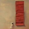
This was probably the most minimal piece I did for this series. I really wanted to see how far I could push simplicity and still make it work. This piece was also hard to get a good reproduction of I hope it looks ok. Oil on panel 22"x29".Related content
Comments: 23

this is beautiful in a way i can't really put my finger on. it's my favourite of your series, simply because the composition seems to be the best. i love awkward position of the subject and the cable running along the ground.
really good work!
👍: 0 ⏩: 0

I love the warm chromatic gray of the wall, It reminds me of whistler. very beautiful
👍: 0 ⏩: 0

it works. oh boy, it DEFFINITELY works.
not only does the distortion of the body leave you wondering for a while to figure out what it is, it also works so well with making the whole painting and the massive emptiness in the painting balance and just...work! and i love the tones and colours that you have in all your paintings
the only thing that's bugging me a little bit is how to intepret the painting. i think i have an idea, but the title and your comment really still leaves me wondering what you were thinking when you did this...
👍: 0 ⏩: 0

It's always amazing to find people using some of the same imagery as yourself and realizing how many different ways the same image can be interpreted and translated...
👍: 0 ⏩: 0

i have a thing for pictures with lots of... is it negative space? or is that something else? anyways, you get what i mean
this is really great, the composition is great, and i think it seems quite emotional. i couldn't describe how though, anyways. i love it.
👍: 0 ⏩: 0

I like the way the colors balance out. I also dig your brush strokes.
👍: 0 ⏩: 0

I am a bit of a fan of negative space and this definitely wins my vote. The use of colour done very well and composition and positioning of the man's body is excellent. It is all rather wonderful, not forgetting your brilliant use of brushstrokes and lighting, which all together bring out the emotion in the piece. This is without doubt my favourite peice in your gallery. Lush stuff, keep it up!
👍: 0 ⏩: 0

I think this one works really well. the sense of emptiness is really amazing, and the contorcioned body creates great tension between it and the surrounding space
👍: 0 ⏩: 0

I think that this is my favourite in your gallery. The process you did to make it the simpliest gave amazing effect. But only objections i have is that the pieces of cloth are a bit too blury. But anyways the pose of person in georgous.
👍: 0 ⏩: 0

i think that this is the best one because of all simplicity and some nonsense
nice work
👍: 0 ⏩: 0

When I first saw this in the smaller size I actually thoguht the body was a hastily packed suitcase, which would give this a comepletly differnent meaning (although that would be cool too). The curled body is a much more intresting subject though, much more emotion. I like the simplictity and the little details like the power cord, it's cool how you chose to make it go straight through the body... there's a powerful meaning in that that I can't really find the right words for.
And of course this is done with an amazing skill in realism. Really, really amazing.
👍: 0 ⏩: 0

il ike the positions u chose for em...very original et pretty pleasant style 
👍: 0 ⏩: 0

This very nice

👍: 0 ⏩: 1

It didn't take me that long, I worked on it for 3 maybe 4 days. I don't remember how many hours though. I'm glad you like it.
👍: 0 ⏩: 0

It's great! A bit more empty, with less emotional impact but, as you've said, it's suppose to be minimal (which it is, of course). Anyway, it's amazing and I can't wait to see more of your work.
👍: 0 ⏩: 0

i like the contortion of the body. I don't think this one works quite as well as the others, but I like it nonetheless. I think it would be much better in real life, as this picture is a little blurry. I am a fan and not a fan of the open space at the top. Sometimes it seems to empty, sometimes it seems just right.
mel.
👍: 0 ⏩: 1

Thank you for the honest critique. I can see what you mean. The picture is a bit blurry a few of my pieces I had to try to photograph due to difficulty scanning it. If I can get a better quality image I’ll defiantly replace it. Thanks for commenting.
👍: 0 ⏩: 0


