HOME | DD
 AshleighPopplewell — Courting the Raven

Published: 2007-08-21 21:26:14 +0000 UTC; Views: 2820; Favourites: 30; Downloads: 111
Redirect to original
Description
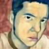
Newest painting for the series I'm working onAcrylic on canvas - 3' x 4'
I used the following stock for reference:
[link] by *TrapDoor-Stock
Raven image from Google Images
I can't find the stock photo of the girl that I used, so please if you have seen it before or
 ed it, let me know so I can give the stock-artist the proper credit.
Related content


Comments: 137

Oh wow
I absolutely love that.
You have a stunning gallery & ur dangerous at trivia

👍: 0 ⏩: 1


👍: 0 ⏩: 0


The colour of the clothing works great, it blends in, yet it still contrasts *nods*
👍: 0 ⏩: 1

i really like the color you use, and how nicely they all blend together. Really nice work! The raven has a really realistic feel to it
👍: 0 ⏩: 1


I like the theme of keys that you seem to have in your work. This picture reminds me of House of Flying Daggers for some reason.
👍: 0 ⏩: 1
lol. Now that you mention it, it kind of reminds me of it too.
👍: 0 ⏩: 0
Your use of color is well balanced not to mention your detail and technical skills are quite exquisite as well.
👍: 0 ⏩: 1
wow thanks so much
👍: 0 ⏩: 1
LOL, some how I posted the same message twice which is made funnier that you replied to both.
👍: 0 ⏩: 1
Your use of color is well balanced not to mention your detail and technical skills are quite exquisite as well.
👍: 0 ⏩: 1

I love the composition and colors of this. My only "crituque is the raven needs to be more perched on her arm and the claws more attached like it's griping her arm. But I love the texture of the backgroung and you did an excelent job making her skin smooth and even.
👍: 0 ⏩: 1
You're very welcome.
👍: 0 ⏩: 0

This is really gorgeous - the contrasting colours have great effect, and the facial expression and pose of the girl work really well together in providing a challenging yet enigmatic look. To me, though, there does seem to be a bit of negative space on the far left of the picture, which detracts the eye slightly from the overall image. However, it still looks incredibly striking.
👍: 0 ⏩: 1

I like the contrast of the green against red
And the background has a realy nice weathered look to it
But I'm a little confused...is there a purpose to the key, or was it just for fun?
")
👍: 0 ⏩: 1
The key is a symbol I use a lot  (Smile)")
 (Wink)")
👍: 0 ⏩: 0

this looks really nice, especially her facial expression, but I would say (if you don't mind) that her right hand (the one on the left when you're looking at it) seems to be so blocky and unnatural. Maybe more curves to the fingers, and perhaps even make it a little smaller? IDK, just a suggestion!
👍: 0 ⏩: 1
I admit the pose is quite strange, but that's how they looked in the photo. 

👍: 0 ⏩: 0

I love the trickling background with the green and grey. The ominous key in the background kind of frightens me, but other than, I like this piece. Although I question the motives of the woman. XD
👍: 0 ⏩: 1

The stomack looks not really as it would be one, first i mean it would be a big belt. I don#t know exactly why, but i would suggest to play there a bit with the shadodow, or search a similar stock picture on that you can see that (when you can't find that one)
Oh and i would make some folds under the crow feeds
And now to the face, nice face

👍: 0 ⏩: 1
thanks for your comments
👍: 0 ⏩: 0

Her expression and the background texture work great, I especially like the streaky darker lines and how they fade to solid at the bottom.
Some bits could use a little work though... the staff-thing she's got her hand on could really use some definition so it doesn't blend right into the dark streaks, and the patch of fabric between her left arm and body isn't reading very well. Did you have a model or some reference for this?
👍: 0 ⏩: 1
I had a stock photo, but I lost it halfway through the painting. I'll definitely go back and rework the robe, since many have suggested it
👍: 0 ⏩: 1
Always glad to help
Might work just to grab a bedsheet and a friend and make your own reference, too
👍: 0 ⏩: 1


This particular style isn’t for me, but I can see at least that you have gotten a handle on it.
It might be worth your time to listen to those above who requested a bit more detail on the robe. Certainly, more details make more of an impression.
Watch out for symmetrical disparities visible on the key.
Looking good.
L. Spiro
👍: 0 ⏩: 1

I like the texture in the background- however, you've made a halo around your two main subjects that looks very out of place. The complimenting colors are nice, but there isn't a lot of balance. I'd try to somehow repeat the key shape somewhere in/on the woman.
👍: 0 ⏩: 1
thanks for the compliment. I don't mind the halo so much, since the entire series is about random objects and their symbolism. I agree about the color, and might glaze over the robe with that green in some places.
👍: 0 ⏩: 1
I don't see what the halo has to do with the meaning of anything, but I'll take your word for it.
An idea for the robe- give it an embroidered pattern or symbol, perhaps?
👍: 0 ⏩: 1
I suppose that might work...maybe a key type of embroidery
👍: 0 ⏩: 0

wow i love acrylics <3 I don't think i've ever used acrylics on canvas though
my favorite part here is the crow, and her face. the bird looks shiny and real. The key too, if that has any meaning. traditional art is funnnnn
👍: 0 ⏩: 1
It most certainly is
👍: 0 ⏩: 0

Lovely piece, its a great piece of art. however, id like to poitna few things. Her right arm's clothing looks asi if it spawns from the middle of her chest. maybe adding some shading would work nivcely there. her hand on her hip doesnt have the feeling of weight over it, it looks as if it isn't toucheg her hip. other than that, the picture's fantastic!
👍: 0 ⏩: 1
Thanks for your in-depth comment
👍: 0 ⏩: 1
| Next =>