HOME | DD
 AssasinMonkey — Mane Event

Published: 2013-12-22 01:23:30 +0000 UTC; Views: 12452; Favourites: 585; Downloads: 481
Redirect to original
Description
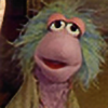
Guess I had this one coming hehe, new Villain? Time for another Villain piece then.Gotta say, this was quite a hairy situation for the Power Ponies to be in. But thanks to Spike they could comb out of this. You'd almost be abraid he'd mess it up again.
I'll end it there... had so many puns in the chat while making this, I didn't realise how long of a tail those puns had.
Such a dark piece and those colours (doesn't help that DA makes the image darker...). Not exactly colours I work with a lot. Still, being able to go crazy or insane with the face was worth it haha.
I should make the Power Ponies next, but that would be quite a bigger project to take on. That's why I did this first, I could actually finish this today hehe.
Anyhow, hope y'all enjoyed another episode of MLP, I know I did. Great take on all the references and such to the comic worlds out there.
Approx time: 4 hours
WIP:
Related content


Comments: 48

Overall
Vision
Originality
Technique
Impact
As a portrait of MLP:FIM villain Mane-iac the image's ORIGINALITY relies on its VISION , IMPACT and TECHNIQUE alone to be distinct.
The vision is well executed but doesn't take risk to do something innovative or meaningful in the work to otherwise make it stand out or make it appealing to others outside of the MLP FIM bias. (But as a work of MLP fan-art it grasps my ultimately biased favor.)
The impact is relatively weak however the usage of contrast between the main image objects and the darker background allude to a great distance between the two areas and that creates a since of a scale difference, taking that into consideration the villain's hair appears to be absolutely monstrous. That being said there is something to be taken from the work as a whole as it seemingly attempts to define the character portrayed.
Technique is solid from the foundations to the coloring, it makes great use of colors and contrast to create a focal but doesn't make effective use of highlights to support the light source in all layers of the work.
The blur does emphasize motion but doesn’t seem to be there for any purpose other than to emphasize the focal. I'd consider this poor use as the blur alludes to motion when combined with the green motion lines but in the work is only used to farther emphasize the already functioning focal by effectively removing the rest of the canvas from the attention of the viewer rather than actually directing attention. However the point of focus is simultaneously enforced and preserved by the blur, directing your attention towards the face by the contrast between the two areas creating an effective focal in the intense expression. Also yes the direction she is looking is affecting the attention of the viewer as well however there is nothing there to be seen or focus on causing attention to travel into otherwise negative space. (And I am using "negative" loosely to emphasize a lack of substance)
(Since the idea that this image lacks substance is in itself biased since as we can all see the image remains pretty consistent I will omit that from my objective argument but I'll leave it in the passage because I want to touch on it again later on.)
The blur makes it impossible to tell there even are details in the hair and they would otherwise go undiscovered without the WIP images to show they do exist. Negative space is useless unless it emphasizes or contrasts and already existing asset, In this case the negative space is a compliment to the hair but doesn’t have a strong affect because of the object(s) between them. (note real negative space is consider anything canvas colored or)
My onions, yes opinions are like onions, not for everypony, layered and usually unsavory!
In my opinion using that orb from the episode as a secondary focal and the hair as motion lines towards it from her face could make a light source, point of focus for the character and help balance the image but that would change what the image is attempting to define and practically alter every aspect of it. I’d simply say the focal asset in the image is not presented strongly enough to have a high impact. Maybe making the eye stare at the viewer and having all lines move towards the focal would enhance it.
Overall I do like the image and the artist is obviously great at what they do but its strongest asset is its foundation and detail, I’d have to say the potential was locked away in frame 6 of the WIP. Perhaps the vision and the technique came to a fork. I enjoyed looking at this picture for over 2 hours as I analyzed it and think that it’s a good piece of work, I encourage the artist to continue making pictures like it and I hope he takes from his own work as much as everypony else does! Thankyou, N3-P
Disagree with something? Feel free to add your critique to the work!
👍: 0 ⏩: 1

Thank you for the in depth analysis and view on this and your time taken. I feel I'll have to try and match that up with a proper reply.
When it came to the episode, I had 2 choices of art I wanted to make, 6 power ponies and Spike her Mane-iac. You indeed caught that this is the one with less risk. (which kinda shows in that the other piece I sadly see being cancelled or due for a complete remake in the future)
Pushing it a bit towards having something finished during my Saturday Livestream like I did with the previous episodes, inspired by the ones I made for Celestia, Nightmare Moon, Discord and Ahuizotl, putting a single big character in the spotlight.
Here I did push certain things a bit further and perhaps a bit far. Specifically the blur. While I did it for the motion and danger I wanted to invoke, implying there's something to put all this insanity against. In hindsight I slightly overdid it, a bit too strong in certain areas at least. Part of it might be that in this piece I didn't do a lot of effects flying around in the post-processing, which I did in the others. That could've created a more spread out sharpness over the blurriness. Although still the blur adjusted (especially the hairs around her face)
Other than blur, there's the highlights, though I'm doing that deliberately, refraining from using too many highlights or any at all at surfaces which are not reflective. But to think of it, on the hooves I did add a slight one, which would be suited (ba-dum-tsh) for a stronger sharper highlight considering I imagine her suit being shiny like some superheroes/villians are in comic books. For fur coats I try to refrain from it, bringing a softer more "realistic" touch to it.
Eyes could also be done a bit more shiny or rather reflecting the shadows from around her than being quite bright.
For the scene, I went for 2 "motions" the focus on her face, but also trying to imply there's something else out of view where it's directed at. Like the power ponies, referencing more to the episode, rather than having her stare at the viewer. I did try to compensate slightly by making sure the expression was still strong enough to radiate to the viewer as well.
A view direction can be a strong tool, though I don't always deem it necessary to use. Sometimes the viewer suits the spectator position better than the being the focus and a view directing towards the edge can be compensated or less "powerful" by using other means. Trying to create some curves to bend the view back in (though perhaps a few strands here and there might be pointing in the wrong direction for that)
It would still be interesting and equally working to have her look in the camera, which then probably depends on what's wanted.
To finish this text off, I really appreciate the words written and it's always great to see another perspective, especially in such depth. The time taken is already an honor.
👍: 0 ⏩: 1
Dear AssasinMonkey,
Thank you for the reply, It's was pretty interesting to write the review because my initial impression was far off from what it became afterwards. I looked at the picture like I would something I drew trying to find areas where I could improve and that made me sit staring at if for a while; it brought back a lot of memories and I even pulled out my brother's old portfolio later on to look at some of the art he made. It was a pleasure in the end to write that review.
If it weren't for that message inviting a critique I wouldn't have even bothered to take a second look at the picture; looking at it led me to have greater aspirations for my knowledge of art techniques and history. Having that kind of knowledge is useful to draw upon when looking at ones own art and I think I't will help me to better understand the works I find.
Once again I want to thank you for your reply and the extra effort you put into it to. I'd do sincerely like your artwork and continue to encourage you to continue as you have been. I'm glad I decided to check my deviant art messages today as I was able to catch your message relatively early to reply.
On a concluding note I just want to add that I recognize that when a person makes a work they take a lot of time to consider the gestalt and the little details that help bring life to the image and as a work of a human that includes lots of personal touches and experience. The little things make artwork more interesting for those of us still learning our techniques and mastering the fundamentals, the basis for all any any work hand draw or otherwise.
Sincerely,
Halcyon Starlight.
👍: 0 ⏩: 0


This piece screams with energy, something you would expect from a crazy-pony like the Mane-iac. Her mane really does have the affect of motion with the gnarled brush strokes. The tendrils look ready to spring from the page. Above all you accomplish this all with a relatively simple colour-palette. The "wildness" composition is accentuated by the relatively short range of focus and motion lines which take our eyes directly to her face. Once again, you've established a convincing moment of motion by reserving the highest levels of details for her face. This piece is absolutely crazy, and a great one at that! e.deviantart.net/emoticons/b/b… " width="15" height="15" alt="
")
👍: 0 ⏩: 0

Woah!!! This looks pretty cool!!! Love her face, too!!! 
👍: 0 ⏩: 0

Ladies and Gentlemen! Get ready for the main event! I promise, It'll be a killer!
👍: 0 ⏩: 0

This is actually making me a bit motion sick.
Also, I KNEW DA MADE IMAGES DARKER! I'll need to figure out a way to work around that.
👍: 0 ⏩: 0


The Mane-iac is represented definitely like a villain.
👍: 0 ⏩: 0

AAAAAAAAAAAAAAAAAAAAAAAAAAAH!!! ITS THE MANIAC!!! hahaha
👍: 0 ⏩: 0

That motion blur makes the focus of the piece very clear.
Good job, you keep churning out these really nice pieces after each episode
 (Smile)")
👍: 0 ⏩: 0
I would like to site my lack of using terminology like subject and media.
👍: 0 ⏩: 0
Wow that really good, great even. You are a real professional.
👍: 0 ⏩: 0


I felt my flight mechanism going off when I saw this picture! Love the sense of danger and the expression!
👍: 0 ⏩: 1
D'aw I was totally imagining a Fluttershy reaction.
Though maybe I'd do the same hehe.
👍: 0 ⏩: 0

The chat was just full of puns...it was pretty great.
👍: 0 ⏩: 1
Whenever we thought it ended it kept splitting up
👍: 0 ⏩: 0

So epic, love the colouring!
I really liked that episode, so awesome!
👍: 0 ⏩: 0

Oh man. She looks quite crazy, mad with power even? Anyway, I can't really remember if I asked you about doing my cybernetically rebuilt character in your style of digital, but I'm gonna ask anyway. Would you do it? I'll go check my messages to find out and I'll check back.
👍: 0 ⏩: 1
I am open for commission, so if you'd be prepared for that I could definitely make something for you
👍: 0 ⏩: 1
Okay, now, I am not exactly sure what a commission is. Though I am going to guess, here it is: I actually have to pay you in order for you to paint it. I may be wrong, but it's just a guess. Talk to you in a bit
👍: 0 ⏩: 0

.....that pun it hurts XD
very nicely done AM, i like the perspective very much :3
it makes me feel very good deep inside
👍: 0 ⏩: 1
The puns quite Cut right? Makes you want to Curl up in the corner.
")
👍: 0 ⏩: 0

I just love how you captured the expression of madness and evil *_*
👍: 0 ⏩: 1
I could say I went a little mad and evil myself when I made this haha!
👍: 0 ⏩: 0

Amazing piece! You´ve made a comical villain actually look intimidating
👍: 0 ⏩: 1
The extremes can be used quite nicely for that yea
👍: 0 ⏩: 0


Yeah, that was a wonderful episode. And a very..... what?!? Already a fanclub on DA about Mane-iac? That was fast. I know there are already Tumblr blog about her. That same happened with Chrysalis anyway. I expect pieces with those two. *cough* Like I was saying, it was a very awaited episode since the animatic gone out.
I like that you gave her this dark piece, reminding that she is a villain. A crazy, mane-iacal laughing mare. But we love our villain in MLP. I like the expression you gave her.
Awesome piece
👍: 0 ⏩: 1
The fandom really loves its new villains! Indeed can't wait for new villain collection pieces to pop up, or combinations, always fun to see what happens.
It was already lots of fun to go with this new insane personality, pushing the expression even further than what would make sense for the other villains
👍: 0 ⏩: 1
It seems that they liked your drawing enough to put it on the header for their Follow-up of the episode: www.equestriadaily.com/2013/12…
Yeah, the fandom love its villains... but I let you guess what kind of art they create from a villain with tentaculish controlling hairs...
I'm pretty sure you expected that yourself, anyway.
👍: 0 ⏩: 0
Those colours yea haha. It was great to see all the little things from existing villains they took, like Dr. Oc's walking and such.
👍: 0 ⏩: 1

Joker's origin story, Doc Ock's leg walking, Poison Ivy's color scheme
👍: 0 ⏩: 0

I saw the epsiode today already love her. Nice work too
👍: 0 ⏩: 0
The absolute insanity on her face makes this really stand out.
I like
👍: 0 ⏩: 1
So much fun making that insanity, never had such a good reason to go full into it hehe
👍: 0 ⏩: 0


You know, I personally do not like the character. But it is in your picture, I gave him preference (Wink)")
Sorry for bad English, Google translator
👍: 0 ⏩: 0

I guess I made the right call when I made a separate Maneiac folder way back before I even knew her name.
This character is getting tons of art.
👍: 0 ⏩: 1
There's indeed so much. I guess it's nice to have a brand new villain to work with and in an awesome way of delivery while they were at it!
Just had to go with the flow with this hehe, so much fun.
👍: 0 ⏩: 0
