HOME | DD

beo-wulf — audio tech_e.3

Published: 2004-01-26 18:00:30 +0000 UTC; Views: 4229; Favourites: 25; Downloads: 991
Redirect to original
Description 
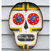
This piece has taken me a better part of a 3 day weekend. I could probably realease a brush pack now because I have like 40 custom brushes. I think it's one of the best I have done. Hope you guys like it.

Photoshop, Comments,Dw, and +fav appreciated.

Oh yes. This is HEAVILY inspired by Silvatrez, En Code deviation. He is my favorite artist, so i try to be like him , lame yes.
Related content
Comments: 42

econolyne [2004-07-23 05:29:05 +0000 UTC]

cool.

👍: 0 ⏩: 0

iamtsu [2004-06-28 02:15:30 +0000 UTC]

thats tite..I like that style..

👍: 0 ⏩: 0

nazuro [2004-04-23 19:17:58 +0000 UTC]

wow awesome dude

👍: 0 ⏩: 0

mcmidgetman [2004-04-09 13:33:04 +0000 UTC]

it fuckin identical to silvatrezs lol just flipped around and a bit darker

👍: 0 ⏩: 1

beo-wulf In reply to mcmidgetman [2004-04-09 16:32:12 +0000 UTC]

haha ok stud, his is like 100x better than mine. And his actually look like good speakers.

👍: 0 ⏩: 1

mcmidgetman In reply to beo-wulf [2004-04-09 16:33:06 +0000 UTC]

ye ye just sayin

👍: 0 ⏩: 0

khrass [2004-03-28 22:40:21 +0000 UTC]

Excellent work.

👍: 0 ⏩: 0

send [2004-03-25 15:00:12 +0000 UTC]

I love the 2d effects and the perspective of the piece but I really dislike the (apparent) lack of Antialias on the text... the tech-effects are a bit jaggy and so is the text, that is my only critique. Because the rest of the piece is just amazing. Keep it up!

👍: 0 ⏩: 0

replenish [2004-03-16 12:06:32 +0000 UTC]

looks great! good job here...

👍: 0 ⏩: 0

replenish [2004-03-16 12:05:29 +0000 UTC]

looks great! good job here...

👍: 0 ⏩: 0

jigit [2004-03-01 04:25:05 +0000 UTC]

cool composition

👍: 0 ⏩: 0

redcarbon [2004-02-29 15:52:43 +0000 UTC]

awesome
yeah
its reminds me of silvatrez

why not do a series of different speakers?

👍: 0 ⏩: 1

beo-wulf In reply to redcarbon [2004-02-29 16:09:48 +0000 UTC]

thanks
ill think about it, i have some other ideas right now

👍: 0 ⏩: 1

redcarbon In reply to beo-wulf [2004-02-29 16:16:50 +0000 UTC]

np.
have fun you

👍: 0 ⏩: 0

acey [2004-02-22 17:52:06 +0000 UTC]

looks very cool to me, futuristic look. nice job!

👍: 0 ⏩: 0

lilholyterror [2004-02-22 05:32:42 +0000 UTC]

HOLY CRAP RYAN thats brilliant. i love it. +fave.

👍: 0 ⏩: 0

r1-mel [2004-02-18 08:49:28 +0000 UTC]

kewl! Awesome!!!

👍: 0 ⏩: 0

KylieKeene [2004-02-17 04:25:30 +0000 UTC]

very nice work, altho I don't like the font used for the text down the bottom makes it look a bit cheap. but the rest of the image is great!

👍: 0 ⏩: 0

escapepodone [2004-02-14 06:54:48 +0000 UTC]

holy geez this is great work... very similar to the silvatrez dev, yeah, but you certainly have made your own interpretation of what he brought to the table. very fine work bud. im quite impressed. lovely colorwork as well... or rather, the lacktherof the color work- only place where i see room for improvement if your typography.

👍: 0 ⏩: 0

arawn [2004-02-07 18:55:09 +0000 UTC]

very nice uve come along way with ur 2d styling and knowdlge

👍: 0 ⏩: 0

calufa2 [2004-02-03 04:30:06 +0000 UTC]

very nice!!!!

👍: 0 ⏩: 0

prototypical [2004-02-03 03:46:54 +0000 UTC]

I really like this, very techo looking. A brush pack would be a great idea Checking out your gallery too!

👍: 0 ⏩: 0

xx1cexx [2004-02-01 00:08:11 +0000 UTC]

cool work

👍: 0 ⏩: 0

salsus [2004-01-30 06:25:54 +0000 UTC]

very nice. rock on!

👍: 0 ⏩: 0

khim3ra [2004-01-28 17:34:41 +0000 UTC]

awesome work! lovin it

👍: 0 ⏩: 0

aeox [2004-01-28 12:33:32 +0000 UTC]

Good job on that one keep improving want to see more works from you

👍: 0 ⏩: 0

Jenga- [2004-01-27 16:45:41 +0000 UTC]

Amazing job, this is really cool!

👍: 0 ⏩: 0

passenger-nq [2004-01-27 12:43:23 +0000 UTC]

looks good, i love the tech style

👍: 0 ⏩: 0

ser [2004-01-27 08:47:23 +0000 UTC]

nice piece - my only real complaint is that maybe it would look better if the text were smoothed down instead of pixelly.

👍: 0 ⏩: 0

silvatrez [2004-01-27 03:35:03 +0000 UTC]

kewl looking compo here duckie......love the flow of designs & the colour schemes.....
keep em coming.....& u gotta know that u're gettin better & better.......

👍: 0 ⏩: 0

seenew [2004-01-27 03:11:17 +0000 UTC]

Nice.

👍: 0 ⏩: 0

mattpurcell [2004-01-27 03:10:55 +0000 UTC]

Looks very cool. Good job

👍: 0 ⏩: 0

bauf [2004-01-27 02:07:56 +0000 UTC]

ptetty sic dude

👍: 0 ⏩: 0

evisceratedlemming [2004-01-27 01:57:49 +0000 UTC]

oo nice
i like how the foreground and background kinda connect

👍: 0 ⏩: 0

dulux [2004-01-26 18:31:15 +0000 UTC]

Man that is nice, taking ages to download though. "d is soo cool and choice of colours is really stylish.

Good work my friend.

👍: 0 ⏩: 0

beo-wulf [2004-01-26 18:28:31 +0000 UTC]

Thanks for you comments, i suggest you guys look at silvatrezs gallary, its amazing [link] .

👍: 0 ⏩: 0

snakeart [2004-01-26 18:22:09 +0000 UTC]

well aint that bad i would say ... there are some sharp parts though and that really sux in these sort of images... those need to be clean and smooth... anyway i would suggest you to change the fonts to more smoother ones and to lower the opacity a bit more on the 2d... that should help i think... a part from these things you did very well i must say... keep it up

👍: 0 ⏩: 0

Punq [2004-01-26 18:18:33 +0000 UTC]

Damn bro good job, I can tell already your getting alot better with photoshop.

👍: 0 ⏩: 0

Castigator [2004-01-26 18:14:48 +0000 UTC]

woah tis cool!

👍: 0 ⏩: 0

sain-one [2004-01-26 18:13:22 +0000 UTC]

Looking good. Very nice composition and details.

👍: 0 ⏩: 0

nefariax [2004-01-26 18:13:22 +0000 UTC]

aah! nice!

👍: 0 ⏩: 0

Octa [2004-01-26 18:05:27 +0000 UTC]

looking good

👍: 0 ⏩: 0