HOME | DD

BuckNut — Desolation

Published: 2006-02-15 03:06:47 +0000 UTC; Views: 1661; Favourites: 68; Downloads: 139
Redirect to original
Description 
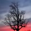
des-o-la-tion n. ~ A wasteland; the condition of being ruined or deserted; loneliness.


See also Lost
Related content
Comments: 47

In-the-picture [2007-02-05 08:02:24 +0000 UTC]

Great adds to my

👍: 0 ⏩: 0

corbepippo [2007-01-24 10:24:41 +0000 UTC]

amazing picture!!!
The light looks perfekt and the shadows and the pose are great!!!

👍: 0 ⏩: 1

BuckNut In reply to corbepippo [2007-01-27 00:45:30 +0000 UTC]

Thank You

👍: 0 ⏩: 0

AmberSunset [2006-11-03 19:18:47 +0000 UTC]

Beautiful and melancholic...

👍: 0 ⏩: 0

StudioMaya [2006-10-03 12:03:38 +0000 UTC]

Beautiful, calm and great captured!

👍: 0 ⏩: 1

BuckNut In reply to StudioMaya [2006-10-04 15:13:56 +0000 UTC]

Thanks

👍: 0 ⏩: 1

StudioMaya In reply to BuckNut [2006-10-04 21:35:05 +0000 UTC]

You're welcome

👍: 0 ⏩: 0

xMEGALOPOLISx [2006-09-22 13:04:34 +0000 UTC]

👍: 0 ⏩: 1

BuckNut In reply to xMEGALOPOLISx [2006-09-23 05:46:19 +0000 UTC]

Thank You. I'm honored .

👍: 0 ⏩: 0

brutinni [2006-08-18 14:11:53 +0000 UTC]

lonliness... solitude... this is an awesome capture.

👍: 0 ⏩: 1

BuckNut In reply to brutinni [2006-08-28 23:49:05 +0000 UTC]

Thank You

👍: 0 ⏩: 1

brutinni In reply to BuckNut [2006-08-30 13:25:58 +0000 UTC]

you're welcome!

👍: 0 ⏩: 0

AlexJHH [2006-08-11 11:41:55 +0000 UTC]

Definitely prefer this one - the tones are far more condusive to the atmosphere. Great shot.

👍: 0 ⏩: 1

BuckNut In reply to AlexJHH [2006-08-12 13:42:23 +0000 UTC]

This one's my fave of the two also. Thanks for taking the time to look .

👍: 0 ⏩: 1

AlexJHH In reply to BuckNut [2006-08-12 17:46:22 +0000 UTC]

👍: 0 ⏩: 0

Bagby [2006-07-16 00:15:00 +0000 UTC]

wow. I bet this was beautiful to see in person.

👍: 0 ⏩: 1

BuckNut In reply to Bagby [2006-07-16 20:31:53 +0000 UTC]

It's quite a sight
Thanks for the comment

👍: 0 ⏩: 0

EmotiVista [2006-03-04 20:42:50 +0000 UTC]

Excellent photograph! The composition, the contrast... beautifully done! ~Deb

👍: 0 ⏩: 1

BuckNut In reply to EmotiVista [2006-03-04 21:19:59 +0000 UTC]

Thank You very much and thanks for the on it . Glad you like it .

👍: 0 ⏩: 0

BandGeek9723 [2006-02-26 15:07:19 +0000 UTC]

I like the lighting in this photo better than the last one. It just seems like its older. I can't really describe it.

👍: 0 ⏩: 1

BuckNut In reply to BandGeek9723 [2006-02-27 05:22:06 +0000 UTC]

Thank you

👍: 0 ⏩: 0

pitchblacknight [2006-02-20 15:50:26 +0000 UTC]

Really a great motiv! Very well done...

👍: 0 ⏩: 1

BuckNut In reply to pitchblacknight [2006-02-21 03:50:07 +0000 UTC]

Thank you, for the comment and the

👍: 0 ⏩: 0

Mashuto [2006-02-19 01:00:32 +0000 UTC]

Another great shot! I think i like the mood of this shot better than the last one... however, I think I like the composition better on the other. Keep up the great work!

👍: 0 ⏩: 1

BuckNut In reply to Mashuto [2006-02-19 01:04:47 +0000 UTC]

Thanks

👍: 0 ⏩: 0

cheekylittlemonkey [2006-02-16 22:26:36 +0000 UTC]

like the darkness, the grain and the sepia hue. A human element, such as something, an object, a piece of clothing, left on what remains of the pier would be quite thought provoking although appreciate that this might not have been possible for you to do. I like the crop to, nice and balanced. Great pic.

👍: 0 ⏩: 1

BuckNut In reply to cheekylittlemonkey [2006-02-16 22:37:04 +0000 UTC]

Thank you for the detailed critique . It would have been quite impossible unless I just happened to have a boat with me . I agree though, it would add a whole new element to the shot. Thanks again .

👍: 0 ⏩: 0

AreteEirene [2006-02-15 22:09:23 +0000 UTC]

Very nice. I like it a bit better with the sepia.

👍: 0 ⏩: 1

BuckNut In reply to AreteEirene [2006-02-16 07:09:55 +0000 UTC]

I do too, thanks

👍: 0 ⏩: 1

AreteEirene In reply to BuckNut [2006-02-16 12:37:51 +0000 UTC]

You're welcome

👍: 0 ⏩: 0

Nadia1956 [2006-02-15 18:34:32 +0000 UTC]

It looks good in sepia too. Did you try another angle too, with the subject off-centered? << I'm almost sure this phrase is not 100% correct, please ignore the mistakes.

👍: 0 ⏩: 1

BuckNut In reply to Nadia1956 [2006-02-15 19:05:11 +0000 UTC]

Unfortunately this is the only angle I got of this, but *MariusStormcrow has a different shot with the pier off-center in his gallery, here ~ [link] . You should check his out too . Thanks for the comment

👍: 0 ⏩: 1

Nadia1956 In reply to BuckNut [2006-02-16 16:48:51 +0000 UTC]

Don't worry, I'm watching both your brothers too

👍: 0 ⏩: 0

RobHM [2006-02-15 18:16:40 +0000 UTC]

very good! the subject is excellent; and the composition aswell as the sepia scale makes it even more so the well crafted mood in this is memorizing, great work!

👍: 0 ⏩: 1

BuckNut In reply to RobHM [2006-02-15 18:24:44 +0000 UTC]

Thank you very much. I'm glad to hear your opinion on this shot.

👍: 0 ⏩: 1

RobHM In reply to BuckNut [2006-02-15 18:48:40 +0000 UTC]

I'm glad to give it

Part of my comment didn't show so I have to write this down
The fact that bridges leading out to to water is somewhat of a subgenre in dA (the beggining, the end concept) makes this even more rewarding.
In this almost methaforic way that there is no real end and beginning (seeing as it don't lead out from shore to the water, it is without it's purpose) isn't just surreal but also brilliant - a well crafted twist to the mentioned genre.

👍: 0 ⏩: 0

MichaelLaird [2006-02-15 14:32:08 +0000 UTC]

Very cool subject! The lighting on the water around the sunken pier is pretty cool. I think this probably would have looked better with a tighter composition, there's too much space around the pier. (IMHO )

👍: 0 ⏩: 2

BuckNut In reply to MichaelLaird [2006-02-15 17:59:10 +0000 UTC]

Did you see the other shot of this in my gallery? It's got much less water in it. Just wondering, since you commented on the space around the pier .

👍: 0 ⏩: 1

MichaelLaird In reply to BuckNut [2006-02-15 22:22:35 +0000 UTC]

Yeah, I actually did, but commented on this one because it's the better of the two. The other shot, "Lost" (I think that's what your talking about ), is too light, and the sky is far too blotchy, especially in the center where it's just a flat 'white'. This shot has much more depth and a darker tone to it. I guess the type of composition I was thinking of would be one that just focuses on the pier and water (no horizon or sky). But don't mind me... I'm probably just in a 'mood' today

👍: 0 ⏩: 1

BuckNut In reply to MichaelLaird [2006-02-16 07:11:09 +0000 UTC]

I go through moods as well, I know what you mean. Thanks for the critique .

👍: 0 ⏩: 0

BuckNut In reply to MichaelLaird [2006-02-15 14:54:08 +0000 UTC]

Thanks for the comment .

👍: 0 ⏩: 0

nidrig [2006-02-15 07:03:00 +0000 UTC]

Nice choice of colors, it fits the mood perfectly!

👍: 0 ⏩: 1

BuckNut In reply to nidrig [2006-02-15 14:54:18 +0000 UTC]

Thanks

👍: 0 ⏩: 0

MariusStormcrow [2006-02-15 04:53:41 +0000 UTC]

Whoa! That's just all kinds of cool!! I'm glad you decided to submit this one! Not sure about all that educational stuff though.

👍: 0 ⏩: 1

BuckNut In reply to MariusStormcrow [2006-02-15 14:56:55 +0000 UTC]

Ah, that educational stuff is good for you once in a while . Thanks for the on this

👍: 0 ⏩: 0

TRBPhotographyLLC [2006-02-15 03:09:47 +0000 UTC]

A very fitting title!! Super job on this work!!

👍: 0 ⏩: 1

BuckNut In reply to TRBPhotographyLLC [2006-02-15 03:30:17 +0000 UTC]

Thank you very much .

👍: 0 ⏩: 0