HOME | DD
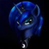 C-Cain — Despair

Published: 2012-04-23 17:59:51 +0000 UTC; Views: 3301; Favourites: 153; Downloads: 187
Redirect to original
Description
I was asked to draw a cover for 's fanfic.As you may see it's going to be cheery and upbeat. Check it out.
Drawn by mouse, as always.
Related content


Comments: 98

")

I'm glad you like it.
And I guess I'm just kind of fond of drawing sad expressions. ^_^
👍: 0 ⏩: 0

I know it's based off another fic, but when I first saw this, I first thought of Saved by the Pony in My Pocket or something like that. Am I the only one to have made that connection?
👍: 0 ⏩: 1
Yes, so far you're the only one.
Which makes you unique. Yay! ^_^
👍: 0 ⏩: 1
Don't suppose you know about it too? I could link you to the particular scene in that fic if you are wondering.
👍: 0 ⏩: 1
Nope, I don't. And I don't think that would be necessary - I'm not a fanfic person. But thanks for the offer. ^_^
👍: 0 ⏩: 0

Don't get me wrong, it looks really great! In fact, you conveyed the emotion you were attempting to (I think) really well
 (Smile)")
👍: 0 ⏩: 1
")
What? This pic is supposed to be sad?! And here I was gonna go read that fanfic for it's happy feelings ")
👍: 0 ⏩: 1
Maybe you could get some kind of sick and twisted kick out of it.
And thank you.

👍: 0 ⏩: 1
What?! OH, lol! I was kinda surprised to see someone apparently insulting my character with impunity. Until I read what I had type, after which time it made perfect sense XD But yeah, looks amazing and sad, so there's no need to thank me
👍: 0 ⏩: 0

Ow0 Amazing job. That shadow is multiple levels of awesome.
👍: 0 ⏩: 1

Neat shadow effect. If only it was aligned with the light source. O_o
👍: 0 ⏩: 1
It's meant to be symbolic. T_T
Oh never mind...
👍: 0 ⏩: 0
I haven't read it myself, but I hope you have fun regardless. ^_^
👍: 0 ⏩: 1

I've read about 4 fics already. Silent Ponyville 1 & 2, My Little Dashie, and Cupcakes. I'm expecting something the color of red in the story
👍: 0 ⏩: 1
O-kay. I can see you're fond of these grimdark stories.
👍: 0 ⏩: 1
Yea, but they can mess me up...after Cupcakes, I reqally didn't look at pinkie pie soo good after that. Then, after Silent Ponyville, I felt pretty bad for her
👍: 0 ⏩: 1
Don't let fanfics colour your opinion on canon characters. ^_^
👍: 0 ⏩: 1
Yea. I really don't have ANY problem with Pinkie Pie, it's just the fanfic threw me off
👍: 0 ⏩: 0
Thank you. I'm glad you like it.
It's probably the best thing I've ever drawn (from a purely technical perspective).
👍: 0 ⏩: 1
Eh. The community's response to it has been rather underwhelming. I expected it to do better. But oh well.
👍: 0 ⏩: 1

That's good. I value your opinion. ^_^
👍: 0 ⏩: 1


Kudos on the buildings and the work on the char.
👍: 0 ⏩: 1
I'm especially fond of the buildings.
👍: 0 ⏩: 1
You should be, its good stuff.
Most of the MLP stuff I see here and other places, folks do not put a lot of work into the background.
Then again, I do a lot of landscape stuff so I already have that down somewhat.
Reminds me a bit of this guy's work.
[link]
[link]
You might want to check out some of Edward Hopper's work, you can get some great ideas and make 1st class MLP themed stuff. Heck, you can go beyond MLP and kick butt. A MLP/Edward Hopper mix would be cool. Thats where I want to go but I have a long way to go. Step 1, I have to change my viewpoint to closer/intimate view.
Did a great job on the lighting too.
Feels like there is some perspective here too.
I plan to study this picture a lot.
👍: 0 ⏩: 1
Heh. I'm guilty of that too. I usually do the background last. So there's ending fatigue and working with a mouse doesn't make it any easier.
Thank you for mentioning Hopper. I took a look at his work. But I'm afraid I'm not skilled enough to do anything like him.
And thanks again. Perhaps I should continue to draw the background first.

👍: 0 ⏩: 1
Yeah, work with the background first and work forward, depending on the scene.
Am working on a scene in a peep show and I did the scene first and the ponies last.
Did the booth and the viewing area first and then put the ponies on top.
If you have layers you could work on anything you want when you want to and just put the layers together.
Wish artrage had a better vertical flip, they just have a stupid rotate.
Need to be able to flip vertically so stuff is not lopsided.
There is this other artist who paints like Hopper forgot his name, if you get a copy of American Art Collector, you might see his stuff. That is a great magazine for eye candy.
ImagineFX is good too but its kinda expensive since it comes from England but its worth every shilling, um penny. A bunch of folks that give tutorials in the magazine have accounts here on DA.
Now we are not skilled enough to do work like Edward Hopper but if we keep at it we can be HEROES!
Well maybe? If we keep at it we can get close. Even if we do not get there, our techniques will improve anyway.
👍: 0 ⏩: 1
Artrage? Never heard of that. I'm using GIMP.
I don't think they sell American Art Collector in my area... I might be able to find a copy of ImageFX, though.
Yes, you're right. That's one of the reasons I even started this whole art thing a couple of months ago. To improve. ^_^
👍: 0 ⏩: 1
They don't sell American Art Collector(AAC) in my area either, I have to go to a Barnes & Noble if I want one or go into Manehattan. Borders used to sell AAC too.
There are plenty of stores there but big magazine stores are your best bet.
If you are into doing traditional art, American Artist and The Artist's Magazine have great tutorials and eye candy.
One of those magazines has a special issue on drawing. ImagineFX can be found in large magazine stores too.
Artrage is like painter's cheaper cousin, you use it if you want to work with natural media or at least stuff that acts like natural media. You still need something like photoshop though for special effects like putting text on a picture.
Artrage has a free version and a pay version($30ish), the pay version has layers and some other goodies. Each of the media types acts/feels different. Since I use the background to erase with, layers are not that useful for me and I use the palette knife a lot. I just use the brush, palette knife and now the pencil, the pencil is great for really fine details.
I was introduced to Artrage by someone's post on DA.
👍: 0 ⏩: 1
Well, I'm not living in the US of A. So I don't have access to B&N, either
Ah, I see. I may check Artrage out. I kind of fancy the 'looks like natural media' look. Thanks for sharing.
👍: 0 ⏩: 1
| Next =>