HOME | DD
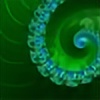
 ChaosFissure — Frozen Heart

#apophysis #chaotica #digitalart #fractal
Published: 2016-08-17 17:07:10 +0000 UTC; Views: 4244; Favourites: 437; Downloads: 0
Redirect to original
Description
His heart remains frozen in an impenetrable shadow of legacy and prestige. When will the ice melt, and the frozen heart begin beating and seeing the warmth of the world?Trying some variations I don't use a lot, like hyperbolic! If you've any suggestions of variations to try out, please let me know because I'm challenging myself to work with new things!
Apo + Chaotica
____________________________________
This image, or modifications of this image, is not to be used, reuploaded, or redistributed in any form without my prior, written permission. © ChaosFissure 2016
Related content


Comments: 29
I can describe my interpretation of your art this way:
A lot of people like Jackson Pollock. I, however, hate Jackson Pollock. I think he is, in a word, talentless.
You, my good sir/madam, are not talentless. Your art is eye candy. This is probably how other people feel looking at Pollock.
TL;DR : I like it a lot, despite it not being my usual style.
👍: 0 ⏩: 1

I do appreciate the compliment  (Smile)")
I'll admit that I'm not a huge fan of Jackson Pollock because my mind cannot parse and explore what he does very easily. In what I create, I have the benefit of knowing how my emotions are channeled, which makes it easier for me to extract a scene or object to take away from what I'm looking at, which allows me to refine what I've worked on into a more solidified idea. Some of my favorite pieces (Observer , Jealousy , Awakened , Death and the Angel , and many of the phoenix' I work with) have been refined and revised numerous times to try to be as representative (and "magical") as possible, since that's the type of world my mind thrives within. I get inspiration from epic digital paintings and spacescapes, and try to recreate some of that in a more abstract way as a scene, event, or object represented in an abstract way.
👍: 0 ⏩: 2

👍: 0 ⏩: 0
Absolutely! Your cognitive awareness of your subconscious interpretation is evidently doing wonders for your artistic identity. You aren't the only one to benefit either! We're all enjoying the show! You're doing great work here, dude.
Follow-up question: apparently the programs used are Chaotica and APO. I've done the research on Chaotica, but what exactly is APO?
👍: 0 ⏩: 1
Apo is an abbreviation for "Apophysis." More information about it can be found either on my profile or in this guide - Starting Out: Learning Apophysis . There's download links and a bunch more information there if you're interested, and I'd be happy to provide any opinions I might have if you're wanting those too.
👍: 0 ⏩: 1
Thank you kindly sir! I intend to review your gallery in its entirety to help me better understand these organic, nebulous forms. I am more of a painterly, concept art type of aesthetic, so I'm looking to turn over a few stones and learn a bit!
👍: 0 ⏩: 1
If you have any questions, don't hesitate to ask. Honestly, I find that fractals can be used to express motion and energy very well, so perhaps it would be able to complement what you work with now by providing ideas from the shapes and motion!
👍: 0 ⏩: 0

What the.....why.....You...amazingness....talent beyond talent....*internally crying*
I hope you enjoyed my technical criticism
👍: 0 ⏩: 0


The heart ice can melt. But who
Dare seriously to touch the cold?
Cold prevails in the soul of ice,
Not just to break through it.
This layer blocks the light lives,
And the more I want to melt,
The stronger holding of the winter shackles.
Compress heart, trying to suffocate
Those flashes of bursting into the open.
And only losing, will make it light
Flushing of fire, snow, flood of tears.
But soon the wind died down, it really is not!
And heart burn, fall of coals.
👍: 0 ⏩: 0

Dramatic, like polished metal but with natural ocean waves being evaporated around it. I'd say this is only the beginning, there's too much potential to leave alone here!
👍: 0 ⏩: 1
I'm still exploring the shapes this has and seeing what different color schemes can do. I need to get UF again so I can start making more gradients XD
👍: 0 ⏩: 0

Awesome composition , i like every fractal creation you done , why? because it's unique and original . Keep it up

👍: 0 ⏩: 0


WOAH! At first you would think the sky is bleeding, but when you look at it from another angle, it's a whole different thing!
👍: 0 ⏩: 1
Thus is the joy of abstract artwork, there's many ways things can be interpreted ")
👍: 0 ⏩: 1
LE GASP! SENPAI NOTICED ME!
👍: 0 ⏩: 1


This is astonishing, Chaos! The colors and the structure of the piece work brilliantly together; the shadowed reds are sheltered in the brightness of the pale blues, creating amazing contrast. Great job!
👍: 0 ⏩: 1
What surprised me the most with this is how the reds were so emotive without the strength of the fiery oranges and whites that I usually see with this gradient. :3
👍: 0 ⏩: 0

**mesmerized**
The mixture of the harsh 'textures' and the smooth metallic ones really blends well here to make one heck of a harmonious masterpiece~
👍: 0 ⏩: 1
The texture-work did turn out surprisingly well
👍: 0 ⏩: 1
It's funny how often clashing things together turns out to be pretty cool in art~
Always keep your wardrobe colors straight though xD
👍: 0 ⏩: 0

Incredible composition, and the colors in the centre are just fantastic. I love the flow
👍: 0 ⏩: 1
Cheers ^^ I keep thinking that I use this gradient too much. It lends itself to have fire mixed with ice, but the dull reds really set apart the color scheme in this variant. I can't say that I'm super thrilled by the hyperbolic variation, but it can do some interesting things when pushed appropriately, even if it's still a pain to work with XD
👍: 0 ⏩: 0


 (Wink)")