HOME | DD
 CloneByDesign — Black Plauge Tag
by-nc-nd
CloneByDesign — Black Plauge Tag
by-nc-nd

Published: 2011-02-24 01:15:54 +0000 UTC; Views: 1071; Favourites: 23; Downloads: 16
Redirect to original
Description
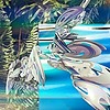
Revisiting the classic style I've always been so good at. However I've added in recent things I've learned to enhance it. Constructive criticism preferred.02/09/11: Removed border and sharpened face and effects by the head.
Related content


Comments: 34


 (Wink)")
My only citicism of this is that the light/contrast could be a little stronger. I really love the angular flow and I'm not normally put off by monochrome color schemes...I think people bitch too much about mono schemes but they're just a viable, imo, than any multi-chromo schemes. Those effects are really nice and I may try to emulate that although my style is usually a lot more chaotic and I slam on the filter effects usually and kind of wing it. This seems a lot more precise than what I'm accustomed to.
One more thing, there are some lines that aren't really helping anything in the BG area that I think should be blurred out or erased from the effect layer - they're kind of sharp and break up the clean flow of the right side (only a little). Watch out for those when you apply your filter effects.
I know I implied in my first paragraph that I had only one criticism of this, but I feel I should keep adding to my thoughts as I see things while writing this - after all, you wanted constructive crit. The last thing I was thinking is that I'd like to see the focal positioned more "strategically" - it's a little high (the face, which seems to be what should be the focal) - it's also a little too centered for my taste.
I want to really get the point across here that I like the effects overall, especially on the right side of the focal. Hope I didn't rant too much. Btw, one last note, there's nothing wrong with borders and there's nothing wrong with not having borders - there are situations where they work well and some where they don't but I find that usually a border cleans up an entire image, especially with sigs. Thanks for all your comments.
👍: 0 ⏩: 1

Whoa dude... your crit is so pro D:
Awesome!
👍: 0 ⏩: 0
Congratulations from Signature Lab on winning 3rd place with this sig.
Here is your award:
[link]
👍: 0 ⏩: 0

Looks awesome. My only complaint is that it's a tad bit too empty on the left side. Other than that, pure win
👍: 0 ⏩: 1


I love work. Great job, keep it up mate.
-------------------------------------------------- ----------------------------
Visit my deviantART, I know I have not too many jobs and I'm not very expert. But with his comments, encouragement and advice I can improve for the next work and my satisfaction would learn from someone like you. Thanks for your attention and time. I hope to see your comment on my deviantart page and work.
If you wish to donate to my DeviantART account do, I appreciate it.
👍: 0 ⏩: 1
")

By a long shot, the Deadspace one. This one seems empty to me. - 3D
👍: 0 ⏩: 1
Meh, it's all matter of opinion XD
👍: 0 ⏩: 0

Epic tag. Love the effect, you pulled it off very nicely.
👍: 0 ⏩: 1
Hey thanks man, I'm really liking it too.
👍: 0 ⏩: 0

Loving the effects on the right side. They are pwnage!
For me, the left side could probably use just a bit more to enhance your overall atmosphere.
Either way, pwnage tag m8!!
👍: 0 ⏩: 1

Very nice signature, and fits the doctor. Love the doctor, by far my favorite character to play as XD
I love that sideways line effect there.
👍: 0 ⏩: 1
Thanks. I applied the image on to a new layer, then went to filter>brush strokes> Angled Stroke (or something) then played with the settings a bit and clicked ok. I then set the layer to lighten and played with the opacity and moved it around and erased parts that weren't needed.
👍: 0 ⏩: 0
Congratulations, your sig has been nominated and entered in Daily Signature Competition #56 with
[link]
👍: 0 ⏩: 1
lol you can totally do that
")
👍: 0 ⏩: 1
Yeah I'm in charge of the sig contests :3
👍: 0 ⏩: 0
Awesome job. Maybe add a bit more of the glowy lighting with that Linear Dodge thing you do, as the shoulder effects are looking sorta dull.
👍: 0 ⏩: 1
Ok I'll test it out later, thanks for the input.
👍: 0 ⏩: 0

Thank you very much, glad you like it
👍: 0 ⏩: 0

Pretty hot. Ditch borders though. They kill stuff.
Maybe sharpen it. The shoulder effects looks great but a little weird at the bottom. Nice work.
👍: 0 ⏩: 2
Ok there, removed border, sharpened, however I couldn't fix the effects at the bottom without making them worse. I may have an idea on how to fix it but I have to try it later.
👍: 0 ⏩: 1
lol
That large blob on his right side.
👍: 0 ⏩: 1
It also looks a little lq on the left with the trace lines.
👍: 0 ⏩: 0
Weird at the bottom, eh? How so? I'd like to fix it up
(This actually reminds me, remember back when we got into that argument and you said I never listened to C&C? Yeah well I'm glad that happened because I'm making my art better by listening)
👍: 0 ⏩: 0
