HOME | DD
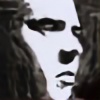
 CrimesAgainstArt — Countenance1

Published: 2004-10-27 05:52:22 +0000 UTC; Views: 1304; Favourites: 27; Downloads: 73
Redirect to original
Description
Illustrator and PhotoshopRelated content
Comments: 10

this is so cool.. some refreshing vector art for once!
👍: 0 ⏩: 0

This reminds me of Converge's album cover for Jane Doe.
👍: 0 ⏩: 0

this one is pretty good, i love how it fades into the back especially through the eyes and i love the whole shadowy seeping effect
👍: 0 ⏩: 0

Ah you make me have to choose once again. I think that overall this one is my favorite of the two. It has a nice strong composition and compared to the green version I think this one has some subtle things to it that are really nice. I would have to say though I like the fact that on the green one there isn't so much going on in the render of the face and I would like to have maybe seen that carry over.
👍: 0 ⏩: 0

yea i like the look. the nostrels really stand out 
👍: 0 ⏩: 0

Looks very good. I like the concept. Something seems odd about the face when seen close up though. Mainly just the left side. I think if you went from the last strand of hair and angled the face in more there it would look more natural.
👍: 0 ⏩: 1


