HOME | DD
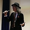
 CrystalEnceladus — Lee 'n' Three-Fists of 1970's

#arts #coloured #doctor #lee #man #martial #men #pencil #portrait
Published: 2011-06-14 02:15:50 +0000 UTC; Views: 2211; Favourites: 94; Downloads: 0
Redirect to original
Description
Imagine if Bruce Lee had travelled with the Third Doctor... Can you imagine their philosophical discussions, when they're not kicking ass?
Multiple refs used: The Green Hornet promo pic for Lee, Jet Li for Three, photos of Antonio Gaudi's stuff I'd taken in Barcelona to help with the background. I might do a pic of Jet Li another time.
The original has more green in it. Had to use Gimp to highlight Three's jacket; the tones in his hair also disappeared in the upload. Bruce's skin went all yellow. Yikes!
It being the 70's, the clothes are nice and garish.
It needs to be sharper and smoother, but this is where my skill is at for the moment. It was fun though. Did most of it to the 'War of the Worlds' soundtrack.
Related content


Comments: 143

👍: 0 ⏩: 0
👍: 0 ⏩: 1
👍: 0 ⏩: 1
👍: 0 ⏩: 0

👍: 0 ⏩: 1
👍: 0 ⏩: 0
👍: 0 ⏩: 1
👍: 0 ⏩: 1
👍: 0 ⏩: 0

👍: 0 ⏩: 1
👍: 0 ⏩: 1
👍: 0 ⏩: 1
👍: 0 ⏩: 1
👍: 0 ⏩: 0

Bruce Lee and the 3rd Doctor team up? This looks freaking amazing 😍
👍: 0 ⏩: 1
Haha, thank you!
👍: 0 ⏩: 0


What a great art work for a very neat idea ... i would listen to thier discussions even if there never would be action stuff XD
👍: 0 ⏩: 1
Haha, yeah!
Doctor: 'Violence is not the answer!"
Bruce: 'What was that again?'
Doctor: 'Necessary.'
Bruce: "Like water?'
Doctor: 'Oh, do be quiet. I'm trying to think here.'
Bruce: 'Like water.'
Doctor: -
👍: 1 ⏩: 1
XD i yes, something like that
👍: 0 ⏩: 0

So this is one of those pictures that feels like it has all the right elements to look amazing; and it truly does, everything that's needed is here to make this a fun and deeply inspired piece, yet it's held back by a few compositional problems. And these actually have nothing to do with your drawing style or choice of medium. With more time, you'll eventually find ways to smooth out your line and color work.
First I'll list everything that I like and that I feel works. #1. Putting these two together. I feel like the Doctor would get a schooling from Lee quite a bit on the philosophical ideas, where as Lee would get a crash-course in science and phenomena. Definitely a fun script could come out of the pairing. #2. Placing the two characters in similar poses introduces a chemistry between the two, a comradery that shows they have a bond. #3. The dark 70s atmosphere of these big swirling clouds with planetary spheres hanging in the distance. It feels like something out of Flash Gordon 1980. #4. The wavy floor pattern. It adds further dynamism to the piece, and adds even greater potential energy to our heroes, showing that they're about to leap into action.
So everything about this piece is fun and visually exciting. But, I think there are a few areas where the composition of these elements don't line up the best, which causes the piece to fall short of that awe-inspiring mark.
Now granted, I could be way off the mark myself, as this also looks like it may intentionally be designed to appear like a diorama, or an early Renaissance painting, where 3-dimentional characters move in front of a flattened backdrop. I can't say for sure. But I'll assume those were not the intention for the sake of offering advice you might consider for the future.
In terms of the background, I think the sky and the planets look great. From the top down to about the middle, nothing is conceptually awkward. But then you have this slab of pink and gray wavy lines that juts out from right to left, and only has one visible corner. Why not have the slab show off both back corners? Or why not make the slab stretch on into infinity? It could also be a floating disk, or a series of concentric rings. It could even have been a floating staircase that trailed down from the sky to where they're now standing. Basically what I'm getting at is that the slab might look better if it was symmetrical, or continued into the background in some manner, rather than starting right up front.
Something about the camera angle looks a bit odd too. In order to show more of the background I can see why you picked this slightly high angle, but it clashes with their forward stance. If the background were angled a bit more flat, then I think Lee and Pertwee would pop forward from the picture more. I guess I'm conflicted on this aspect, though.
I also feel like the plant or sea-life shapes that dot the ground could be a little clearer in shape. It looks like you designed them right on the paper itself, rather than sketch out a few possible designs, and then draw in the ones you liked most. I think if the plant-like shapes had clearer forms rather than just spikes and swirls, they might make a greater connection with the eye.
Lastly, I can sort of see where you tried to draw shadows for both of them, but they get lost in the pink and gray swirls. I wouldn't make them much darker, but slightly darker would help plant them to the ground better. I even feel like the slab they're standing on would be cooler if it were glass-like, and actually reflected their bodies a little. Something to think about.
I feel like I should ask people who submit to my thread to turn on Critiques, cause sometimes my comments basically are full critiques. lol. Anyways, the more I look at this piece, the more I love it. Thanks so much for sharing it.
👍: 0 ⏩: 1
Wow, that's awesome feedback!
Yeah, I never do sketches before drawing on stuff. If something catches my eye (Gaudi's stuff for example), I just draw it however.
Funny you should mention the slab, but I was conflicted about that when drawing it. Glass, eh? Must learn reflections.
👍: 0 ⏩: 0


The sky has like a little fantastic feel to it. Reminds me when I used to draw a planet (usually with rings) on the sky. It gave something kinda dreamy.
I really like the mix of the colors as well! There is a sort of... movement I guess.

👍: 0 ⏩: 1
Thanks, that was what I was going for.
👍: 0 ⏩: 0


This would of made an interesting crossover. Great work on this
👍: 0 ⏩: 1
Thanks, it would have been a fun one!
👍: 0 ⏩: 1

Nice! I love how many references you used to get such a well rounded result!
👍: 0 ⏩: 1
Yup, this one was fun. I usually do that with all my stuff, even portraits.
👍: 0 ⏩: 0

The third doctor's pose looks fluid. The colour of his coat also seems real, with the way the dark shades clash with the red, like some sort of royal apparel.
👍: 0 ⏩: 1
Haha, thank you. That coat gave me trouble. It's supposed to be velvet, since Three just loved velvet.
👍: 0 ⏩: 1

Awesome! 

👍: 0 ⏩: 1
Thanks. I like doing hands for some reason.
👍: 0 ⏩: 1
You have masterd them my friend! 
👍: 0 ⏩: 0

this is really amazing, the background here is really, really cool, and the poses are great too, even with refs poses are still hard to do, so really well done on them, i also really love the coloring here, the shading and lights are just perfect, great job!
👍: 0 ⏩: 1
Thank you, yeah it was hard, since Jet Li is so short, and Three so tall. ")
👍: 0 ⏩: 1
you're quite welcome!
👍: 0 ⏩: 0

Good job capturing the look and feel of the 70s. This could make a poster if it was a photographer or otherwise done digitally.
 (Smile)")
👍: 0 ⏩: 1
Thanks, I wanted a yearbook kinda look.
👍: 0 ⏩: 0

Thanks for the fave!
👍: 0 ⏩: 1

| Next =>