HOME | DD
 crystalpurity — Lament in the Sunset

Published: 2011-12-30 02:35:21 +0000 UTC; Views: 1420; Favourites: 22; Downloads: 20
Redirect to original
Description
Boo.I'm still not happy with how it looks, but there's not much more I can do with the time I have left XD
Note to self: Next time, don't leave the background until the end. Doing the extra highlights was such a pain DX
This is my entry for 's December Coloring Contest.
Lineart:
by
Program: Adobe Photoshop CS4
Time: Roughly 20 hours (I stopped counting after 18 XD) spread out over a period of two weeks.
The background is literally 14 layers of gradients, brushes, and a few painted clouds

I'll upload a walkthrough of sorts later (I need to do something with the screenshots I took every two or so hours XD)
Related content


Comments: 4

I don't have a paid account, so just pretend I'm using the critique feature, haha.
You've got a well defined color scheme--red and green. Thanks to Christmas, this can often be hard to pull off without conjuring up some kind of holiday sensation, but I think you did a good job of avoiding that feeling here. You've incorporated some hints of yellows and blues here and there to balance things out. The background is quite dynamic, using a visible bright area in the corner and shadows in the opposite edges. I like that you left the outlines green rather than black. Keeping the lineart black would have reduced a lot of the depth I think.
You've done some work to add light and shadowed areas to the dragon. The details, like the feathers and scales, have volume, but the dragon as a whole is rather flat. Scales and feathers that are father away from the light source will be overall darker (and likely less saturated, although there are exceptions) than the scales/feathers in direct light.
Going back to the blues/yellows you had added in--I think you could have made them stronger. Maybe incorporate yellow tones into your highlights and blues into your shadows.
I'm getting a little nitpicky here, but the claws on the dragon's hind legs are brighter than the surrounding body parts. In this, case, the claws should be more or less the same tone as the skin. Or, if you wanted to make the claws glowing (which would be rather nifty), you could increase the brightness, but you'd have to add a bit of light on the surrounding feet and scales.
Well that's all I got. It's been a long day for me, so hopefully this is all coherent, haha
 (Smile)")
👍: 0 ⏩: 1

(I thought anyone could leave a critique, even if they weren't paid users :/ )
Thanks for the advice! ^^ I would've probably done some of the things you suggested if I had more time and hadn't gotten so frustrated with making the highlights match the background
And don't worry, that was very coherent
")
👍: 0 ⏩: 0
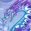
That is a very unusual approach to this dragon's colors! It makes me think of nearly translucent, carved jade. I've seen some pieces in the art museum that have a similar quality of color and luster. Very nifty that you've captured it in *pixels*!
👍: 0 ⏩: 1
Thanks, that was actually what I was going for ^.^
👍: 0 ⏩: 0