HOME | DD
 DarkSyren — . Untitled .
by-nc-nd
DarkSyren — . Untitled .
by-nc-nd

Published: 2006-07-15 04:33:00 +0000 UTC; Views: 1149; Favourites: 30; Downloads: 77
Redirect to original
Description
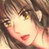
. Freedom or confinement?. Fight or Flight?
. As this is still a work in progress and I'm setting to 'advanced critique'. Any well thought critique I will keep in mind as I try to finish this one. Comments such as "That's cool" are still welcome...since I've learned not to fight it. ^_^;
Media: watercolour
Time Spent: 10 so far i think...
Related content


Comments: 34

Oh, i thought this was a finished piece. it looks great!
👍: 0 ⏩: 0

wow, reminds me of the last time I took shroom'z. I saw alot of stuff that this pic reminds me of.
Believe me when I say that is a total complament.
👍: 0 ⏩: 0

this is coming out really sweet! Nice job! I wasnt so crazy about the black wings on the center, its a little disctracting, but the overall composition is very good and the narrative is amazing =]
I really enjoyed the blood and stripes, and the texture at the lower right corner.
You could fill in the blank area with some nice light colors, keeping the same detail level and creativity (like maybe something that reminds of time, afterall, freedom is having time in yout hands)..just some thoughs...im sure you´re gonna finish it beautifully, however u do it.
👍: 0 ⏩: 0

technicly (^^") the drawing is awsome, very interesting as usual...
then as far as the drawing is really concerned (wa vocabulary) it is very original and unique of course lot of imagination but...arhem... I think she's on wood and I think those which seem to be kind of branches are too much, to my mind they don't really respect the harmony of the perspective...
moreover I don't like such a red (in the left bottom) with blue and pink (i mean violet which is a derivation of pink)... maybe you should take the "maroon"(?) (>the dark red)
but anyway it is very good and would never do better, escpecially if I would use watercolor !
but don't forget it's just my advice ! to make you improving ! evenif im just a stupid girl aged 15.
(very dificult to talk about art in english !)
👍: 0 ⏩: 1

thank you, thank you! I hadn't even thought of that. (the colors) I'll see if I can make change that before I post the final version of this painting. Thanks alot for your advice. It makes me happy that you care enough to think that I can get better! ^__^

👍: 0 ⏩: 0

Advance critique? Hmm... I don't know what to say! XD I'm not so skilled at water color...X( I don't use them...yet...
^^ This does however inspire me to do something in watercolor....o.O
^^ I have been wanting to use them for a while now...Anyways! Awsome piece. X3 the colors are sooo pretty!!!!
👍: 0 ⏩: 1
Thank you so much. ^_^ all your comments are really encouraging. i'm glad you like this. you should -definately- try out watercolours. aaah. soooo much fun. :3 I just have to warn you not to get discouraged when you first start out...because even great artists call it the most difficult medium to control. They say you can't mess up. But honestly...I do all the time. I just cover it up. XD It's a much more forgiving medium once you get to know it.
👍: 0 ⏩: 0

Wow I seem to like every bit of this... *goes off to see the rest of your gallery*
Very unique.
👍: 0 ⏩: 1
Thank you! ^_^ It's taking a long time to finish. T_T I think i'm stuck. argh.
Ah well. I've done two new paintings in the meantime. ")
👍: 0 ⏩: 0

Wow, I hadn't seen it, it's a very strong painting, truely amazing, original, and rich. Beyond the fact that the esthetic is very beautiful (especially your colours: so deep) it's a very interesting painting: no ground, no sky, just a kind of fall or elevation (but I think this is fall), the only real light which come from the window which should be open on the 'real' world, but you realized that there's just ocean under the storm. Also the blood which seems taking away from her veines, and she, eyes blind, like in some dreams/nightmares when you know you're dreaming, everything's gonna stop yet you can't open your eyes.
I really like it! Lot of contrasts, very powerful...
👍: 0 ⏩: 0

wow ")
very unique. i like
 (Smile)")
👍: 0 ⏩: 0


wow. ther eis quite ALOT of stuff in here. ncie trees..sad day that they are murderous...or did they set the captive free?this is extremely surrealistic..ooo, artsy word! heh. ym mind wants something to focus on in this though...it's not too BUSY, but there is SO MUCH to look at and wonder about. try 'flipping' the scan, and turning it upside down you may see somehting needs fixin'...(i wish i could do that on my screen) i like how the scarf becomes like a river....what are the black things beside her, they look like hairs. my only critique would be to DEFINE something...so many objects in thei picture, i feel like it needs a focus point. does that make sense? i may come back to this when i am feeling more eloquent^.^
👍: 0 ⏩: 0

She wants to go, but cant, she's tied there to that confined post, so much space around her that she wants to explore... if she doesnt leave she's going to commit suicide, and she knows how to do it properly too...
👍: 0 ⏩: 1
Wow. Yes, you hit the nail right on the head. I've had much of this feeling lately...and hadn't even thought of this picture that way.
This is why it's good to hear other people's views on my artwork. I have a clouded view of it...an objective perspective is nice.
👍: 0 ⏩: 1
Well, I just looked "dark" and that's what I saw... It's a great pic, but I didnt want to say just that.. I get this one person commenting on my work and most of the time she is so predictable, its a one word comment "Neato" and it drives me nuts!
👍: 0 ⏩: 0
Wings, wings are beautiful! And colors too.
At first I didn't realized that we looked on her from abowe. Because of the window, I think. ^^ But still, your work is great! Its'so... light? I can't find a words. ^^
👍: 0 ⏩: 1
Thank you! Yes, the fact that we're looking down seems to throw alot of people off. heh. It's a different perspective though, that I wanted to try.
Thank you for the comments! ^_^
👍: 0 ⏩: 0


I didn't realise we were looking at her from above at first... wow. That parchment looks particularly awesome... though all of those tan/brown shades are the same colour... The moon looks fine, but I think the top of that tree (the flat part) and the parchment paper would be a little more yellow, and you might want to neutralise the colour of the bark a little more, since it's kind of bright looking... Otherwise, it's absolutely awesome.
👍: 0 ⏩: 1
Much of it is rather unrefined looking. I'm a little embarressed to show it in this stage because all the details are not pulled together yet. But I promise, by the time it is done...they will! uhm. yeah. the browns. I was thinking that too...but whenever I try a different colour I don't like them. I don't like browns with too much yellow or too much red. but the sphere thing...(moon, i guess) does need to be at least a different shade. As you might be able to tell already I'm doing one side darker. Getting a good gradient from light to dark is hard. *sigh*
👍: 0 ⏩: 1
well... hmm. I have that problem with browns a lot, which is why I stick to greyish ones and reddish ones... you could even go bluish I bet. With guoache (sp?), whenever I add a colour, like red, I'll add a tiny bit of it's complement just so it's more grey.
Sorry I sort of assumed that was the moon... it looked moony. I like all the different colours and shades... I like the grey especially, I don't know why... I have a thing for grey o.0.
👍: 0 ⏩: 0

amazing, where do you get your ideas from? everything is tied in so well, the one thing you are missing are the infamous curly cues of every great artwork. all your paintings are a great depiction of a force pulling downward as if falling to the deep abyss. everything flows at an unsurpassed level really. everything in the picture is incarcerated yet shirking away. well thought out. don't have any ideas on how to help you, your art skills are well planned compared to mine...if you have ideas for me let me know. it would be great help.
👍: 0 ⏩: 1
curly cues? XD yeah...I don't think I'll be having any of those in this picture...unless I suddenly have the urge to do some Mucha art at the last minute. It makes me happy to hear that there is depth...that you feel some sort of gravity. Because...much of my art is inspired by that feeling. the weight of emotions that pull downward...and hope of flight. This picture was inspired by...well, I was in a really bad mood. I was in a complete rage so I drew out everything that made me angry. By the time I finished the pencil sketch and started painting...I wasn't mad anymore. I'm at my best when I feel something strongly...but that can't always be the case. Sometimes my artwork is inspired by looking at other artists and trying to learn how they do things. But, most often, my dreams (nightmares...actually) inspire me. Sorry if that's not much help.
If you have any other questions...always feel free to ask. I'll do my best to give a helpful answer. ^_^
And thank you so much for the wonderful comment!
👍: 0 ⏩: 0

Okay, advanced critique, so I won't probably be sending too many flowers. So far, I like everything inside the window, and the apocalyptic blue decor upper right corner. Though this part lacks a bit finishing, in my opinion. After all this is WIP. Great work on the blood spills among the...tree branches? That's what it looks like at first glance. The colors around the top area seem fine and to fit well, though the green...plant? things appear to me as an eyesore in the composition. The color spits off...it might've had to be much less saturated. (You asked for critique, I'm giving it to you ^__^) Otherwise, at a glance, the pose of the character in the center area is a bit confusing, and she doesn't stand out enough with the big round cheese behind her, being too much in the same tones. That part is very confusing. Other than that, the tree poles pulling out from the clouds beneath are...okay. Again...the blue (sky?) in the lower part...a little too saturated, a little too vivid, something darker might've been better. This remains my opinion, by all means. Overall the general composition flows well, maybe except for that candle...It bothers me a lot.
Well there you have it

👍: 0 ⏩: 0


Wow.... O_O those are some watercolors! That can be a difficult medium to pull off well and this is just beautiful. The only thing I think you could add would be some detail over in the white area. The white sucks the attention away from the cool window and all those black strings (?) you've so carefully crafted.
👍: 0 ⏩: 1
Thank you! Yesss. That is the area that I'm stuck on. I'm not even sure what to put there. (suggestions? haha) eh... I'll think of something.
Thank you so much for the wonderful comment! ^_^
👍: 0 ⏩: 1
Er... birds or bird silhouettes? Feathers perhaps? These occure to me because bondage seems to be a theme and feathers and birds tend to remind people of freedom and I'm all for contrast. But if you don't want conflicting themes, you could do ravens. OR if you hate birds and feathers and such, a narrow twisted door/gate with climbing vines might work. Or... I might just be rambling. XD
👍: 0 ⏩: 1
O.O no no! these are all good ideas! wow. If I ever get stuck on a painting I should just come to you!
I love contrast. I feel sometimes I overdo it..with all my pictures of angels and demons. Dark and Light. Etc. But I love it so much and it has so much to do with me. Life's struggle and...oh Wow. I just got an inspiration for another painting...hold on...I had to write that down. haha. Thank yooou!
Rambling is always welcome on my page. XD It might lead to new ideas. ^_~
👍: 0 ⏩: 0

oo love this, its really original and unique. awesome.
👍: 0 ⏩: 1
Thank you! Glad you think so. ^^
👍: 0 ⏩: 1