HOME | DD
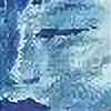
 DisneyFan-01 — Her Eyes

Published: 2008-11-12 21:32:53 +0000 UTC; Views: 16168; Favourites: 177; Downloads: 81
Redirect to original
Description
Finished it.I changed Silver's hand position a little since the title is "Wanting to see her Eyes" So I could have both her eyes open.
I made the shading a little simple but wanted a different color for the background since I never did a purple sky before.
John Silver (c) Disney
Marina Seadrift (c) DisneyFan-01
Related content


Comments: 43


Wait, why was this submitted as a Disney cross over? It doesn't count.
👍: 0 ⏩: 1


I like the sky alot ^^
However, I think you made the top part of Marina's lips too dark and too much of a purple shade, and the gap between her nose and mouth too small. Also, shouldn't part of her hair be lying flat? (unless there is a slight breeze)
Nevertheless, you did a good job
 (Smile)")
👍: 0 ⏩: 1

Yes. There is a breeze. That's why he's stroking her hair like so to see her eyes.
👍: 0 ⏩: 1


I saw old your old drawings and when I see this I see how you improve
and you will improve mor than we imagine
only drawing can learn how drawing, miss
and you handle the digital color such a nice way
👍: 0 ⏩: 0
lovely image
so romantic and not quite tipical couple
love it, congratulations from an art student
:LOVE:
👍: 0 ⏩: 0

Hmmm... Since I'm not sure where I should put my general opinion on your gallery, I think I'll simply put it here.
First thing: I'm aware that you have suffered from many attacks - most of them childish and reckless - on you and your art and I don't approve them. However, I think that you might rebuff most of those attacks if you improved your art. And there's quite a bit of improvement waiting on that field...
Generally, you are getting better and better in what you draw - by that I mean closing in one style, which is mostly a compilation of borrowed styles. A compilation, not a synthesis.
Your character Marina differs stylistically from Disney-borrowed chracters. She's quite anime-ish - the face in particular - and little is done to either assimilate her style to the one from Treasure Planet/Kingdom Hearts/else - or the other way around.
The only thing that keeps them together is shading and that's not consequent either. Sometimes it's cel-shading, sometimes it's just a simple soft brush slapped on the picture without much thought.
If you'd like to mimick an effective way of shading that Disney's using in animation I suggest the most minimal approach possible. There's very little of shade on characters and animated objects - it's the work of elaborate backgrounds (and perspective) to make an illusion of dimension.
The characters and animated objects should stay as plain and crisp as possible (even 3D-generated objects don't have much of a shade on them). Disney artists are using shading mostly in presence of strong lighting or emotions backing the scene. And even then they are mostly slapping a simple gradient.
Also - the color key for TP is brown - shades and gradients used in it are generally in warm brown-ish color, not gray.
Gray is not the best color for shades, especially if used alone. As long as it isn't within the mood of a picture, too much gray can make the drawing look quite unfriendly or unattractive.
And when it comes to improving a complexity of shadows in still pictures... If you are adamant on using simple multiplied gray/darkened shade of color used on object, I'd suggest taking an interest in the afterglow effect. Usually lightning conditions of the environment make objects project a certain amount of their color on neighboring objects. That means that if a character e.g. has red trousers and blue coat, depending on lighting some redness of the trousers would be reflecting on the coat pants and vice versa. Also lightning sources can have different colors - a light from the fire does have a different light than light from the sun. Taking that to consideration will definitely enrich a painting, but it also means that lightning has to be carefully studied.
For the lighting to be placed properly, there also has to be a study of perspective and three-dimensionality.
As much as cartoony or unrealistic world you might draw, studying real world is always a massive help.
I think you've heard enough about the need of studying anatomy, so I don't need to put my three cents to it. And I won't perorate on backgrounds either, since I have to work on them too XD;;;
My biggest concern is that you prefer to stick to what you know instead of breaking the ground. Perhaps you should try drawing your Marina in different styles - more or less realistic, or borrowing different styles than 'disneyana' or anime. Simply for practice's purpose. It won't do the damage to the things you've already done - on the contrary: it will help you in search for the style of your own and remove the label or either 'tracer' or 'copier', no matter how unfair it is.
👍: 0 ⏩: 1
I only take critiques that are helpful and not the ones that just say I'm talentless. That doesn't help at all.
I guess the main reason why Marina looks a little anime-ish is because she started out anime when I first created her about 10 years ago. I guess the style just stayed in a little even after I moved on to a more Disney look for her.
I didn't use grey on this pic at all for shades. It was a dark indigo-ish color multiplied on another layer.
Shading is one thing I'm getting use to, but it's lighting I've been trying to get right and need to practice more on.
👍: 0 ⏩: 1
If I didn't believe in a certain talent sitting in you I wouldn't say anything.
But... if your style hasn't changed much after ten years period... then I don't think you'd ever consider my comment as helpful. It's an attitude thing, not lack talent. Marina still looks 'off' if put in a Disney world.
And I'm talking about general use of grey in pictures, not that one in particular. And lighting and shadows correlate with each other on such close level, that it's important to study them both at the same time.
👍: 0 ⏩: 0

Omgosh I love how it turned out!! >w<
Great job, as usual. ^^
👍: 0 ⏩: 0

This is lovely. It's awesome to be able to go back and see how much you've improved.
👍: 0 ⏩: 0

Looks awesome all coloured and shaded. As a few others have mentioned maybe you could add a bit more detail to the ship. It just looks really flat other than that good work and I love the sky.
👍: 0 ⏩: 0
Absolutely LOVE the skyline on this. It's gorgeous.
It's amazing how you make a touch from a robotic hand look tender. I love it.
👍: 0 ⏩: 0

I love the way you have the eyes noticed you set the scene and get it done.
👍: 0 ⏩: 0

i like the perspective/angle you chose for this.
👍: 0 ⏩: 0
hi Kem06 hope you're doing well....tech. the corners of the mouth are suppose to end mid eye and looking at this they appear to do just that...or did you mean the lips seem to full?
👍: 0 ⏩: 1

Too full in my opinion XD They just seem like they pucker out too much, unless she's making a pucker-y face. And yeah, I'm doing okay, just VERY low on iron apparently. Gotta take pills for it now ><
👍: 0 ⏩: 1
aaahhh i gotcha...I'm sorry to hear that I hope you feel better soon
👍: 0 ⏩: 1
Meh, I've dealt with worse XD I certainly will try to keep it from getting me down.
👍: 0 ⏩: 0


Wow! You've really improved, and this pic certainly shows that. I agree with Alexiel-VIII about the ship needing a bit more detail. I don't think the difference in styles between the forground and background is so much a problem, though, since that's often the case with animation. The only other critique I have is about the color of the lineart. Some of the lines contrast a lot with the object they're outlining, like Silver's hat, but some seem to have very little contrast, like his face and bandana. You might try experimenting with that. It's a problem I struggle with sometimes too.
👍: 0 ⏩: 0

YES! that's better! No poking her eye now Silver.. *shakes finger* lol
👍: 0 ⏩: 0

Awww pretty!! Great background, love the clouds nice touch
 (Wink)")
👍: 0 ⏩: 0


")

Amazing! Yet again, it's so beautiful. Your line quality is improving so much! I keep thinking that they're going to start moving. -blink-
👍: 0 ⏩: 0


Oh wow, this is beautiful! I LOVE the sky, especially the stars and how you coloured it. You did a really excellent job on her hair and eyes.
👍: 0 ⏩: 0


Not bad. The cell shading and the background look a bit mismatched, but that's alright. The ship parts could use some more detail. They sort of take away from how nice the picture is.
Pretty decent work on the characters, anyway.
👍: 0 ⏩: 0

I love it!!The cyborg hand, Marina's face... This pic rocks!!
👍: 0 ⏩: 0

makes me think of "beauty and the beast." but the purple sky is a swee touch
👍: 0 ⏩: 0


