HOME | DD
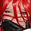
 Drakenborg — Mystique
[NSFW]
Drakenborg — Mystique
[NSFW]

Published: 2005-03-17 23:21:35 +0000 UTC; Views: 4413; Favourites: 68; Downloads: 935
Redirect to original
Description
I was planning on doing a similar piece as my recent mermaid pic, with the hair and all but sitting up looking over the sea... I did the background and all, and started on her and everything, but then... I got stuck, I got no where... Now if this is because I had an artisitc blackout or if it is because I am trying to stop smoking I dont know...Or maybe it happend because my mind wanted to create this piece that came out of it all?!....
Photoshop CS
Graphics tablet
(lens flare)
X-amount of hours
Related content


Comments: 39


beautifully displayed feminine form! it reminds me of a body that would belong to a goddess

👍: 0 ⏩: 0

Thats so amazing. The colors are so pretty.

👍: 0 ⏩: 0


Very lovely. I think you still got the Mermaid Effect. That is what I saw even before reading your description. Another beautiful piece.
👍: 0 ⏩: 0

Great title, great background... the blue shades are perfect. Honestly, I've tried to articulate this idealization for a month. Thanks for sharing.
👍: 0 ⏩: 0

wow. I thought it was a photo manip. Very detailed! I love it!
👍: 0 ⏩: 0


This made me think of an old fresco. Lovely pastel colors, and your usual excellent photorealistic figure. Wonderful!!--AG
👍: 0 ⏩: 0

Wow, Gorgeous, well done, great job on ethe anatomy also the colors look great! a
👍: 0 ⏩: 0

beautiful! Excellent colors and great technique. I thought it was a photo at first! Keep it up!
👍: 0 ⏩: 0


wow..looks like a photo....a perfume advertisement almost...gorgeus ")
👍: 0 ⏩: 0


whatever the reason for creating this pic is, it comes out very pretty. the colors are really smooth, like the contrasts very much  (Smile)")
👍: 0 ⏩: 0


amazing..the anatomy is wonderful
👍: 0 ⏩: 0


I can't really say anything negative about this piece - I erally love it the colors, the feeling of motion, everything. Great work
👍: 0 ⏩: 0

This looks like a photo.....If it isn't, what reference did you use, I wonder? It looks nice though.
👍: 0 ⏩: 1

I usually use a reference but this in perticular I didnt. But then again after 4 years of painting bodies almost every day it should give me some skill.
thanks for the comment!
👍: 0 ⏩: 1
Wow, that's really good ^^
👍: 0 ⏩: 0


so beauitful and magical....just takes my breath away

👍: 0 ⏩: 0

Breathtaking!!!
Great job on the colors and the lens.
👍: 0 ⏩: 0

time for an honest comment which is going to be longer than one sentence...
colors: colors are quite nice and really suit the mood of the artwork
quality: resolution is ok, howerver the image is not really sharp. the artwork itselft is of course nicely done, no doubt about that.
style+atmosphere+concept: well, I'll have to be critical. at least in my opinion you have better artworks, for example [link] Somehow this one leaves less impact... of course when I look at other artworks you made, I can easily see that this one belongs to the same author. you have a distinctive style and that is good.
conclusion: if i was to give a grade from 1 to 10 i would give 7. it is a nice artwork anyway. hope to see more soon
👍: 0 ⏩: 1
ok thanks
👍: 0 ⏩: 0


You're picture is very pretty. It reminds me of seeing a mermaid in space

👍: 0 ⏩: 0