HOME | DD
 duhcoolies — Resort Sri Lanka - Concept

Published: 2007-11-21 15:56:49 +0000 UTC; Views: 3188; Favourites: 23; Downloads: 0
Redirect to original
Description
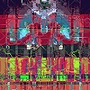
The Sri Lankan Tourist Board (SLTB) has started a tender for the next cycle of their advertising budget. So all the ad agencies are preparing for a pitch to see who would win the tender. Hopefully, my agency will win the pitch
The top banner will be a flash based image slideshow showing different places in Sri Lanka. This is just a concept am working on for the Sri Lankan Tourist Board official tourism site [link] Am not too happy with it, still working on it
")
©2007 Daran K.
EDIT
Changed the layout... am more happy with this one than the last... though the only thing is there aren't bright colours 'coz it's part of the creative brief am supposed to stick to

Related content


Comments: 48


")


Not liking the font in the navigation but I like its use in the content area.
Unless that header is going to be a nice flash banner showcasing different aspects of Sri Lanka, it's too big and will take up much screen space which I think is unnecessary.
Overall, everything else is fine. Nice design and I hope you win.
👍: 0 ⏩: 1

The header is a flash banner and it will be showcasing different pictures around the country.
How have u been, man? long time out of touch. dC is kinda dead, eh? need to recruite some admins
")
👍: 0 ⏩: 0

Fantastic design..Really nice picture usage as well..Brilliant job..Cheers
👍: 0 ⏩: 1
Hmm, don't know. There is something wrong.
I shouldn't repeat that pattern also behind the text.
The rest is just fine, I know it will get nice.
👍: 0 ⏩: 1
Yeah, I didnt either. I have changed the layout since
👍: 0 ⏩: 1
Edit is already way better.
But where is the contrast m8? =O
Btw, thank god you did that old script away.
👍: 0 ⏩: 1
there isnt supposed to be any contrast... 'coz that's part of the creative brief sadly :[
👍: 0 ⏩: 0
Looks great, perfect for it's purpose
The main content, to my eyes, looks a bit odd without some sort of background on top of the main green tile. Not sure what the solution is, but it's the only fault I have with it


👍: 0 ⏩: 1
lol, the background part was the one that was bugging me as well 
thnx, man
👍: 0 ⏩: 0

have changed the layout, bro. Check and give me feedback
👍: 0 ⏩: 0

I like the design! Very nice and elegant. I loooove the font you used; what is it called?
👍: 0 ⏩: 1
CluKennedySH was the font used. But I have changed the layout now from the previous look
👍: 0 ⏩: 0

Whaaa that header is so cool, do you have that kind of place there??
I liked the icons, the lil swirls, 
Nice work, Daran!
👍: 0 ⏩: 1
That is actually a malidivian beach
👍: 0 ⏩: 1
Ha!
Btw, was going to suggest to make the header kinda changing the images, the flash slideshow, but saw that you already did! Out of the current 5, i liked the bg of 1st & last not so much of the rest 3!!
👍: 0 ⏩: 1
each important page will depict different colours according it's topic... that's why they are different to the first and last. I wanted to make them more contrast-y but unfortunately that clashes with the creative brief I was given
👍: 0 ⏩: 0

Hmm..Looking pure awesome man..Congratulation..Cheers
👍: 0 ⏩: 0

typical DARAN is back woth a classy thing
i love the top icons
i think i dont like the background colour
good luck man

👍: 0 ⏩: 1
i guess its a flash thing i mean the image area
👍: 0 ⏩: 0

I don't know about you, but that text makes it look awful cheezy
👍: 0 ⏩: 1
For the buttons that is, the other text is fine looking
")
👍: 0 ⏩: 1
LOL I thought no one would notice 
👍: 0 ⏩: 0

interesting choice for the headlines, cool typo. and I like the icons at the top part!
👍: 0 ⏩: 1

Exactly.. it gives out a warm soothing feel. Very effective use of warm shades
👍: 0 ⏩: 1


Very nice! Soothing, calm and I think it would portray Sri Lanka as a resort very well!  (Smile)")

👍: 0 ⏩: 1

