HOME | DD
 faore — Hobo Patrol

Published: 2010-11-10 03:32:00 +0000 UTC; Views: 1288; Favourites: 38; Downloads: 7
Redirect to original
Description
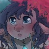
I wanted to see how it would turn out if I did some lineless coloring. Of course, I sketched it first and decided to upload both versions together. What do you guys think? Lines, no lines?This is my new character, Toby. He's a hobo. And also a werewolf. And totally paranoid. Enjoy him. Do it. You enjoy that.
Related content
Comments: 85

I think the lineless one turned out really well. I personally like dark lines better, as in my own work. I think you should try more lineless stuff, it looks really good. His hair looks amazing
👍: 0 ⏩: 1

I will definitely try it out more! Thanks. (:
👍: 0 ⏩: 1

I like the lines :3
oh and I think I might have a spare room in my house that Toby can come and live in :3
👍: 0 ⏩: 1

HA HA. He would probably appreciate that. But he would also probably decline because he turns into an uncontrollable BEAST every full moon.
👍: 0 ⏩: 1

I CAN DEAL WITH IT ;A;
👍: 0 ⏩: 0

I am a sucker for lines. Have you tried colored lines?
👍: 0 ⏩: 1

I've dabbles with colored lines before in the past. Perhaps it's time to try my hand at them again? : D
👍: 0 ⏩: 0

i love Toby 8D Hobo werewolves are soooooo awesome.... i want to hug him
👍: 0 ⏩: 1

Thanks so much! He's pretty huggable, I think. XD
👍: 0 ⏩: 1

dammit. make him real and send him to my house
👍: 0 ⏩: 1

yes! Score! *epic fist pump of epicness*
👍: 0 ⏩: 0

I like them both.................BUT if I had to choose..........I...........think.........I would go for the line version.
Corinne below me has said it best!
MAGIC!
👍: 0 ⏩: 1

Personally, I like the lined style because it seems to stand out more, but there isn't really anything wrong with the lineless style(except maybe that the hair looks a little washed out). A good compromise would be to make lines that are a darker version of the color of the thing you're outlining.
👍: 0 ⏩: 1

Thanks so much for the input! (: I really appreciate it!
👍: 0 ⏩: 1

Very Nice! Personally I like the lineless style a lot for you, it meshes well. Love your style and work so far, by the way
👍: 0 ⏩: 1

Aw, thanks so much! That really means a lot to me! I'm glad you like it. ♥
👍: 0 ⏩: 0

I think the no lines makes it a bit more realistic but with the lines its more DRAMATIC.
👍: 0 ⏩: 1

What about the Tics? You a fan of that??
👍: 0 ⏩: 1

I think it's pretty sexy, personally.
👍: 0 ⏩: 1

Congratulations! Your entry has been level up to amazing gallery at keep up the good work!
👍: 0 ⏩: 1

I prefer the one with lines, I have a better idea about the textures and his expression
(Hope you understand what I want to say, my english is not perfect yet 
👍: 0 ⏩: 1

I totally understand! I appreciate the input! (:
👍: 0 ⏩: 0

I gotta say, I love both soooo much, it was really hard to choose. But I gotta say I like the unlined better, just because it looks more finished and more like a complete, professional piece. However, I still really like the sketch and feel like you should keep that in certain pictures to give it a different feel than... as polished up as the unlined one.
^dunno if any of that made sense, I'm dead tired, sorry xD orz
👍: 0 ⏩: 1

It made perfect sense! I really appreciate the input. I will definitely be experimenting with line-less coloring more. ♥
👍: 0 ⏩: 0

Personally, I prefer the lineless version. But I think that if you are going to do more lineless work, you need to add more contrast. It seems like it's dark where he is, so the shadows should be a lot more stark and dramatic. It stands out especially on the scarf, which looks brighter than the rest of the image.
He's cute! I love his freckles. ♥
👍: 0 ⏩: 1

Thanks so much for the input, baby! I really appreciate it. (: I will definitely work on that.
👍: 0 ⏩: 0

i like it with lines 
👍: 0 ⏩: 1

Thanks so much! I may draw more of him soon. (:
👍: 0 ⏩: 1

Lines look much better in my opinion.
Without lines, he looks pretty anemic XD
But he's so adorbs! I love him!
👍: 0 ⏩: 1

LOL. He COULD be anemic. You never know! Being a hobo makes you all kinds of sickly.
Thanks, love! XD
👍: 0 ⏩: 0

Very well drawn, I admire the structure plus the figure itself. Amazing touches to it along with such creativity. This is true art here, and I admire it highly!! 10/10 of course!!
👍: 0 ⏩: 1

Aw, thanks so much! That really, really means a lot to me! I am flattered to receive such a nice comment. ♥
👍: 0 ⏩: 1

No Problem, it seriously was worth going over your art!! I really admire it and hope you continue to make submissions because yours is worth seeing ^_^
👍: 0 ⏩: 1

Once again, thank you so much! I am really glad you enjoy my work. (:
👍: 0 ⏩: 0

I like it better with the lines. It adds more depth to the whole 'hobo' aspect.
👍: 0 ⏩: 1

Haha, thanks! I guess it makes him look more gritty, which definitely works!
👍: 0 ⏩: 0

If you're going for a more comic style, stick with using black lines. But in general I actually disagree with everyone and like the line-free version better. It looks very soft and natural.
👍: 0 ⏩: 1

Thanks so much, dear! I like both for different reasons. I definitely like the lines for the comic book look. And definitely like the line-less version for the soft look. (:
👍: 0 ⏩: 0

i personally think that the version with lines looks much better
👍: 0 ⏩: 1
| Next =>


