HOME | DD
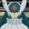
 Gequibren — DnD (Neverwinter) - Moon Elf Ranger (OC)

#colorpencil #dungeonsanddragons #eagle #graphite #moonelf #neverwinter #panther #ranger #traditional
Published: 2018-03-18 19:14:35 +0000 UTC; Views: 1003; Favourites: 20; Downloads: 0
Redirect to original
Description
An original character when I played Neverwinter Nights 1 years ago. He had a wolf as an animal companion, but since I had already drawn wolves recently, I preferred to choose the panther and the eagle (this only appears in the manuals, not in the video game).
Character sheet:
Name: Sirildur
Race: Moon Elf
Class: Ranger
Sex: Male
Age: 34 years (in human age)
Weight: 80 Kg.
Height: 170 cm
Alignment: True neutral
Personality: Abstracted, pensive, taciturn, lonely, independent and distrustful. It usually roams the woods and is close to the animals, but tries to avoid people. He wears simple clothes and is armed with a handmade and rudimentary bow.
-------------------------------------------------
Paper: A4 (210 x 297 mm) (8,25" x 11,69")
Graphite pencils: 6H, 3H (Faber Castell) ---- HB, 2B, 6B (Staedtler)
Colored pencils: Faber Castell, Alpino, Carioca, Seagull, Chung Hwa
Contrast and brightness edited with GIMP.
Un personaje original con el que jugaba hace años cuando le dedicaba tiempo al Neverwinter Nights 1. Tenía un lobo como compañero animal, pero como ya había dibujado unos lobos recientemente, prefería elegir a la pantera y al águila (esta solo aparece en los manuales, no en el videojuego).
Ficha del personaje:
Nombre: Sirildur
Raza: Elfo lunar
Clase: Explorador
Sexo: Masculino
Edad: 34 años (en edad humana)
Peso: 80 Kg.
Altura: 170 cm.
Alineamiento: Neutral auténtico.
Personalidad: Abstraido, pensativo, taciturno, solitario, independiente y desconfiado. Suele rondar por los bosques y está cerca de los animales, pero trata de evitar a las personas. Viste ropas simples y está armado con un arco artesanal y rudimentario.
-------------------------------------------------
Papel: A4 (210 x 297 mm) (8,25" x 11,69")
Lápices de grafito: 6H, 3H (Faber Castell) ---- HB, 2B, 6B (Staedtler)
Lápices de colores: Faber Castell, Alpino, Carioca, Seagull, Chung Hwa
Contraste y brillo editado con GIMP.
Social networks / Redes sociales
Related content


Comments: 4
I agree with the previous commenter about colour: everything looks rather desaturated and flat. I don't know if it's intentional, your pencils are hard or lacking in pigment, or something else? Contrast is good - it makes your drawings pop. Right now, it feels like the characters are each drawn from separate references without much of your drawing setting's light and shadows being taken into account. Saturate your colours more (especially on what you want a viewer to focus on - the characters) and be brave with highlights and shadows. I see you've already made the background less detailed and less saturated than the foreground. Good job on that.
Another thing I want to point out is how a lot of your colouring direction is pretty much at random. Don't do this. Never contradict the form/shape! This ruins the illusion of things appearing 3D. It's not as important as in hatching, but do keep this in mind. I also see you varied your line weights. To make outlines more solid, you can ink it.
This is a nitpick, but feathers (especially flight feathers) are supposed to have smooth edges, or at least not as ragged as that.
Overall, nice work.
👍: 0 ⏩: 1

Thanks for the long comment
 (Smile)")
I realized about the same problems some time ago, but I wanted confirmation from other people ^^
👍: 0 ⏩: 0
Okay its really pretty! But a few tips: try to work more with light and shadows: so try to create more contrast. That will make it way more realistic.
Also about the grass. Instead of making a lot of individual plants it can work to make all of it green and make it realistic with the contrast and just point out a few sprits. I should also spend more attention to make the shapes realistic so the tribe of a tree is simplefied a cylinder. There a lot of webpages which can learn you to make it more realistic: for example this one:
www.youtube.com/watch?v=hSAf6T…
You can also work with distance. So make all the things on the front really bright and make things more behind darker/less atractive. So it will be more obvious that the threes in de distance are actually in the distance. You have already done, but make it more extreme.
So my overall tip: make colour differance more extreme: don't be afraid to work with black an white!
Howevery the forms and composition are really really pretty, my complimants!
👍: 0 ⏩: 1
Thanks for the long comment
I take note of everything and I'll try to improve ^o^
👍: 0 ⏩: 0