HOME | DD
 Golden-Ares — Poison Ivy

#comic #dc #fanart #flower #green #ivy #plants #readhead #goldenares #poisonivy #villain
Published: 2017-04-22 18:17:20 +0000 UTC; Views: 994; Favourites: 55; Downloads: 0
Redirect to original
Description
Something I've drawn a few weeks ago. I'm not perfectly happy with her anatomy, I think her neck is to long and thick if I look at her arms but I failed to fix it so yeah....not quite happy but I will post it anyway since it's poison ivy and I LOVE her.Fan Art: Poison Ivy from DC
You asked me to show you the finished drawing so here you go jes--chan thanks for your interest
Related content


Comments: 30

My fave! Poison Ivy is my all-time favorite villian
👍: 0 ⏩: 1


She reminds me of gamora from guardians of the galaxy
👍: 0 ⏩: 1

Now that you say it
👍: 0 ⏩: 1

Love the way you design hair! Looks so smooth and natural!
👍: 0 ⏩: 1

oh my- what detail! i love how neat your lineart is ♥ you have such a pretty style~
👍: 0 ⏩: 1
Beautiful drawing .I like how you draw hair and the flowers .
👍: 0 ⏩: 1

I love the hair here and the colors look great, I really like the shading when it´s this neat and contrasting
👍: 0 ⏩: 1
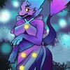
Beautiful colors, I would think the stroke on the flower should of been reduce so it wouldn't drag much attention from Ivy, I also believe a the blue is a bit tense next to Ivy's hair, I think a purple or more red would of been better. I believe Your well done Ivy should be center of attention, not the flowers XD. Well done though. And I love the glow on the insect
👍: 0 ⏩: 1
you're absolutely right!
I'm glad you like the drawing - Thank you for your feedback and have a nice day!
👍: 0 ⏩: 1

Hey. I know it’s a stylistic choice but I feel like there needs to a variation between cel shading and actual blending. As of now it looks too flat. But that’s just a suggestion. To point of some blaring mistakes, the characters head is in a 3/4th perspective but the torso is facing the viewer, which creates a weird, distorted look. The shoulders are too low on the head giving off an illusion of her neck being way too long. And the lack of details on her face makes her look rather bland rather than seductive or promiscuous or whatever poison ivy’s character is like. I feel like you can do away with the over exaggerated-ly gaunt face/high cheek bones and add in the nose bridge and whatever else was suggested above. I do like the directional force within the composition with the vines below and it makes me question the choice of adding in the pink flower. I feel like it would be more interesting to have a singular color pop – the hair, rather than having blue, white, and pink, trying to balance to drawing. Maybe you could use different variations of green for shading and background. Which, I have to say is lacking as well. The background seems to just be slapped on. It’s boring. Next time I’d suggest either doing away with all the clutter or spending more time with it because at the moment it only distracts the viewer away from the subject. And not in a good way.
👍: 0 ⏩: 1
Hey Idleye
The shading...yeah I'm working with flat colors very often but I will try to come out of my comfort zone and try a drawing with both cell shading and blending and see how it will look  (Smile)")
I already mentioned in my description that I'm unhappy with her anatomy.
I'm surprised that you think that she looks bald I think that she has quite the dreamy look on her face.
The cheekbones are something I really like to draw and for the moment I like them the way they are maybe to a later point I will outgrow it...dunno. I'm experimenting with other noses but drawing the nose brige is something I personally consider in most drawings as kind ugly.
I'm sorry but I don't quite get what you refer to when you say "whatever else was suggested above"
You're right about the flower, I wanted to add something in the right coner but I should have used a darker color. Thanks for pointing that out
This was probably the firt time I tried to create a back ground. I usually just put a simple color in the background but I want to improve on the background since I feel kinda limited by the fact that I've never tried to draw a background and now lacking the skills to do it...
I've seen in your gallery that you have a lot of simple color background too but may you still have an advice for me?
Thanks for you comment and have a nice day!
")
👍: 0 ⏩: 1
You should practice life/gesture drawing. Look it up on youtube and practice off life and internet. It’ll help out a whole lot. I guess to each their own on the face. But to me, poison ivy should be an attractive character, an attraction that really can’t be captured with a simple outline and color. It’s really 2 dimensional, flat – imo. I also think it’d be interesting and may improve your work greatly if you were to consider a light source, especially when using gradients – or are my eyes playing tricks on me?
I’ve started digital art doing simple colors, but at the time I found it unnecessary because none of my pieces were telling a story and or whatever. But idk, I feel like every piece should be more ambitious than whatever you’ve created before. It’s always a challenge that I’m willing to face and as long as the end result is good, I’m down to spend the amount of time to learn those certain techniques or practice those certain skills. Now as a person with a background in fine arts, I suppose it’s easier to say but it’s really all just about experimenting, getting out of your comfort zone. Experiment with whatever tools that you have available to you, brushes, filters, lassos, wands, etc. And it’s also very important to expose yourself to other people’s art.
I’m glad that you were able to take my crit. If you ever need help on anything, hmu.
👍: 0 ⏩: 1
Sure I will!
The light sourced where the glowing dragonflies...but I didn't really highlight though...
I'm always experimenting some stuff just turns out better than other
I should probably say that I've drawn with my mouse until now so I felt always kinda restricted. I got my drawing tablet last week and finished my first drawing with it. I think pen pressure made a lot of things way easier especially using the airbrush tool for shading and highlighting....I also felt more comfortable with the piece in general and I'm quite happy with the outcome. I personally think that it turned out way better than this one and it would be great to hear your opinion about it if you have some spare time
👍: 0 ⏩: 0


This is beautiful!!! I like the dreamy feel with all the elements you put. Thank you for showing me!!! If i could favorite it more than once, i would ^_______^
👍: 0 ⏩: 1
Aww you're too kind. I'm so glad you like it and also thanks for watching me - your support means a lot
👍: 0 ⏩: 0