HOME | DD
 HarLequin-X — 'As Above so Below'

Published: 2006-10-12 00:04:49 +0000 UTC; Views: 728; Favourites: 16; Downloads: 5
Redirect to original
Description
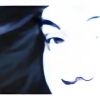
Spoken as as the Great Masters with there pointing Hand Symbol in most of there Paintings..IE: "Last Supper"and many others...
this is a Plaster Cast of my hand which was Photographed then Inverted and added Space stuff..im keen to do alot more with Space in the future...
but i liked how this Hand turned out.
please Crit ..even if you know how to do good spacescapes all crits welcomed and Encouraged..cheers
Dutch....
Related content


Comments: 18

I love the idea of this, and it looks really nice too.
 (Smile)")
👍: 0 ⏩: 0

yeah agree on the effects.. would look more wicked on a plain white background would bring that blue out
nice to see you being multi media like
👍: 0 ⏩: 0

Cool.
Interesting effects at it.
Try another draws at hand.
👍: 0 ⏩: 0

very spiffy it looks very cool with the space stuff and the gold!!! great pic!!!!

👍: 0 ⏩: 0

wow thanx for the comments..i think more than ive ever got...yeah the flames do look dry..that cause its real paint inverted...i might try touching it up in PS later..ty thou
👍: 0 ⏩: 0


very nifty ... i like the contrast in textures between the spacey stuff and the firey stuff.
The orange tones look like clay ... very cool.
👍: 0 ⏩: 0

this is awesome..
The space stuff is a nice touch
👍: 0 ⏩: 0

")

Absolutely fantastic. I can't find anything to crit on.
👍: 0 ⏩: 0

Nice one. However, the fire looks simply too dry and 2D when compared to the stars.
👍: 0 ⏩: 0


