HOME | DD
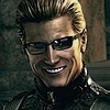 Hax-Dev — Crusader Gavin

#oc #practice #painttoolsai
Published: 2019-04-22 03:30:57 +0000 UTC; Views: 796; Favourites: 77; Downloads: 4
Redirect to original
Description
Recently something was bothering me about my art, and I realized that it was that the lines and colors didn't work together. The lines usually overpowered the drawing, so it was kinda chaotic looking. I wondered, "how can I fix this?" Then I happened to come across some videos on youtube about "How to improve your painting in 10 minutes" and another really awesome one on digital rendering. Needless to say, they made me attempt this. This was definitely one of my more experimental drawings... no lineart, no stabilizer, brushes I never used before, just using colors I thought would be kinda cool. And, well. I kinda like how it came out. But by all means, tell me where I can get better. I'm no painting expert after all.Until today I was really afraid of working on a painting like this, but then I realized, I'm already doing something similar in my life drawing class (drawing with just value.) So I became determined to do something with a similar vein digitally. I almost quit halfway through this drawing because it wasn't doing so well, but I decided to finish it. Glad I did. This didn't take me that long either, maybe 3 hours? Faster than my usual style anyway. What do you guys think, should I try this again?
Related content


Comments: 25


Originality
Hi! I got attracted to this art piece because of the subject manner and how the face + color scheme caught my attention. First off, there is definitely more of an emotional component that is being depicted in this artwork. I have also browsed through your gallery and this piece really is different from the rest. I am by no means an expert on this painting but I do hope my critique helps.
Line
While there is definitely no outline, there is still some sort of lining being involved. There are boarder strokes and more movement in these strokes. Having the background as it is also emphasizing the figure more in a way that is emotional and daring the viewer to come closer. The sense of movement is also on an epic scale as the viewer can feel the wind blowing through him but him standing there unfazed shows how he is strong both in mind and body - a strong will of determination. The details of the chains are truly what I think helps bring this piece to the next level. While the rest of the painting is a surreal feeling, the sheer attention to detail of the chain mail helped him seemed to be more grounded.
Color
The hue and scheme are more of the cool colors with a hint of red on several key areas - namely the sword and the cross on the uniform. I personally think that this choice of red placement helps the viewer to see the details that are to be emphasized. For example, if the blood was not on the blade I would have missed out how you've worked on the shading of the sword making it look like steel. The cross helps the viewers to notice the detail of the folds in both cape and uniform as well - more importantly, the chain mail. There is definitely an intensity of the colors as there is extremely dark in one area and then light in another. I really appreciate that the background is more tone down than the foreground so it does not fight for attention with the figure.
Space
For me personally, I feel you have efficiently used all the space and each space has its uses to help emphasize the overall ambiance of the artwork. For example, the "negative space" is around him is a good contrast to the detail work he actually has. It is also a very good detail progression from a right to left adding depth to his possible story and movement. I also love the depth you have depicted around his under sword arm and the arm next to his leg. The viewer can definitely differentiate what is what and see the flow. The perspective is from the front and it does have strength. As this is your experimental piece, I commend you for pulling off a strong inner strength from this angle. However, because I have seen this pose before as this a typical fighting pose, the originality has been rated to what it is. Other than that, I feel this is my first time to see a crusader painted in such a way~
Light
There is not much to say except this usage of shadow work is on an epic level. There IS a balance of light and dark in this art piece when compared to your other artworks. And I feel this is more realistic lighting when compared to your other artworks as well. The light source is consistently on the left and you have ample ability to use shadow quite well on his left side - especially around the eye without making it seem like his eye gouged out.
Shape
There is a sense of shape to this piece as I can see a trapezoid shape. Which is pretty interesting as this pose is usually a triangle shape. The shadowing brings forth various other shaps to be seen on this art as well. It might not as obvious but this variety helps depict more liveness to this artwork.
Overall
Superb artwork and intense impact. While ya state that ya probably are doing without preplanning, the vision is pretty clear for me despite the background story might not be. This is a story of a crusader name Gavin and he is a strong badass warrior!! I also believe that this artwork definitely saw more of your strong emotional side and expand your art skills capabilities~ I am also quite very proud and happy that you did not quit in the middle. This is a very, very worthwhile experiment and I hope you continue experimenting with this style in the future.
Thank you so much for sharing your arts with everyone and
I hope this art critique helps you on your art journey e.deviantart.net/emoticons/h/h… " width="15" height="13" alt="

👍: 0 ⏩: 1

Woah! Thanks for the lengthy critique! I'm very glad that you liked my experimental piece here, that gives me motivation to try it again! I can't actually remember a time where anyone said that my art caught their eye in particular, either. Nice! Looks like my practice is paying off.
Indeed, I did want to make the chainmail different from the rest of the image! It was kinda relieving to do, because I really like to use lines in my images. That was the only area where I really defined them, so it was fun to do.
I am really happy that you noticed what I did with the red! Originally, I only had the red on his chest in his insignia. It wasn't until the end where I added the blood on his sword. I thought that having some red on both sides would help balance the image a little better and lead the viewer's eye around the image.
I've also been thinking lately about how to use the space of a piece to my advantage. Usually I work in around the same amount of page space for a drawing, but I decided to exaggerate the horizontalness of this one if that makes sense.
I'm glad that the shadows and lighting turned out well! I saw a couple youtube videos on color harmony, and the one thing that really stuck out to me was the importance of grays in a piece and how they can be used to transition colors. Before this one, I never used grays if something wasn't actually gray lol. But I think that's why this one looks a lot different than my other drawings in terms of color. I actually used some gray for the highlights on his face, though it doesn't look like it! That really fascinated me.
It's funny that you should mention shape, as I wasn't consciously thinking about it when I drew this at all. But now that you mention it, I can see what you mean! That's pretty cool.
Yeah, I'm glad I didn't quit as well! It was during the facial part that I was getting the most frustrated. I always do that part first, and it wasn't doing so well in the beginning. The fact that I had a lot of unfinished area left made me even more unmotivated. But I decided to finish it, if only to see how the whole thing would turn out. Even if it didn't turn out how I liked, I could always say that I tried. And well, it actually turned out better than I thought. This is one of the few times that I feel I was able to get what was in my head out into something I drew. Again, thanks for the critique, very helpful!
👍: 0 ⏩: 0

Thanks! It was definitely different to try out a more painter like style with this one, but it's really fun to do!
👍: 0 ⏩: 0
Fabulous artwork and characters, love all the brush strokes it gives it a lot of energy
👍: 0 ⏩: 1
Thank you! That's what I was going for, something with a feel of movement.
👍: 0 ⏩: 0

Thank you! Glad that you like it
👍: 0 ⏩: 0

Wow!!! I love the colours and movement of this piece. Well done!!
👍: 0 ⏩: 1
Thank you! Just trying out some new things to keep it fresh.
👍: 0 ⏩: 0

holy fuck you really stepped up your painting game I LOVE THISSSS
👍: 0 ⏩: 1
Yeah! Glad you like it, this was definitely a new experience for me. I'm really glad I came across those youtube videos, they really helped me haha.
👍: 0 ⏩: 0

I think this turned out quite good. There is a big advantage to this looser painting style where you need not worry about precision and can instead focus more on getting the bigger picture fleshed out. In particular, it is neat how his cape blends with the background. There is a swirly effect to the entire painting that is nice. Also, I think his chain mail armor stands out well, which must have been a bit difficult to pull off because the rest of the brush strokes are more blurry. So good job on that. In my opinion, this is an art style you should continue experimenting with on the side. I'm still a big fan of the line arts!
👍: 0 ⏩: 1
Thank you! Indeed, working with a looser style is a lot more fun than the more literal one I usually use. In one of the videos I watched, it said that you don't actually have to draw everything, but rather you can imply things and people will still see it. This is a problem that I had in my other pieces I think, I tried to line pretty much everything I wanted in the image while it wasn't really necessary to do so.
I thought the cape blending with the background was an interesting effect as well! I thought it would give some nice contrast to the more defined areas, such as his face and the sword. And the chain mail was actually the easy part haha, all I had to do was draw over the blockier areas with the pen I normally use. Getting it to merge with the shadows was a little harder, but in the end I think I got it. And hey, I'm glad you like my lined stuff too! I'm kinda torn between the two because I still really like lines, but I like this kind of style as well. I probably won't give them up entirely, but I have a pretty ok grasp on it so I'll try to broaden my knowledge with values some more.
👍: 0 ⏩: 1
I like this idea of implied images, it reminds me of sleight of hand. It also makes for more efficient drawing style if one can avoid drawing too many details and still get an optimal result. And hey, always great to increase the breadth of one's art skills! The lineless style remains so powerful medium.
👍: 0 ⏩: 0

Ayy, thanks! I'm trying to try out some more stuff, so this is the first in a hopefully longer series of things I'm experimenting with.
👍: 0 ⏩: 0

Thanks! I wrote that thing a while back about experimenting with new things, but I didn't really do it myself haha. So I decided to step out of my comfort zone a little. I'll try to do more similar things in the future!
👍: 0 ⏩: 0
Lol oof dude, you replied to someone else's comment xDDDDDD
Glad you like the colors though! I was trying out some new combinations after watching a video on color harmony. I used quite a few grays, which I don't normally do.
👍: 0 ⏩: 1

Ah LOL hahahaha that already happened other times xD sorry hahaha
👍: 0 ⏩: 0

Wow! Awesome painting! Love what you did with the chain mail, and the flying cape makes it look very dynamic! This is one of the artworks here that you can hang on your wall, hey why not sell it as a print?
👍: 0 ⏩: 1
Ayy, thanks my pal! This was just something new that I wanted to try out. The chain mail was interesting to do, since I didn't want it to stick out too much. So I only drew about half of it while fading the rest into the shadows. And yeah, always gotta make that cape flutter in the nonexistent wind xD
I put this in my wallpaper folder, dunno if that's like hanging it on a wall lol. I actually didn't think that anyone would ever be interested to buy something I drew, but now that you mention it I probably should. There's always that slim chance that someone'll buy it I suppose
👍: 0 ⏩: 1
Yes, you did a nice job of making the chain mail darken and disappear in the shadows!
And yes, you should put them up as print, they're good! I'm sure they will sell! If my art here wasn't too lazy enough I'd probably sell prints too, Haha! Go on, don't be shy, I saw other people here who sells print made from mspaint with only one jagged pixelated line in it. Haha!
👍: 0 ⏩: 0