HOME | DD
 iancjw —
Sarafina Herself
[NSFW]

Published: 2012-05-17 01:22:26 +0000 UTC; Views: 15230; Favourites: 488; Downloads: 0
Redirect to original
Description
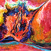
"Sarafina Herself"18x24 Oil on Canvas
WIP: [link]
** Thanks for the DD! **
Related content
Comments: 35


I disagree with Promethicon and Elder-Sun about the face. I think the ambiguity lends an atmosphere of mystique to the painting which is intriguing. That is what caught my eye first. The anatomy seems solid, and I think the amount of textural contrast is spot on to draw the eye to the figure. It isn't the most original in terms of content or composition, but for what it is, it's an admirable interpretation. The only thing that bothers me is the bluish shadow cast by the book. I can't decide if it's indicating a secondary yellow light source or not.
👍: 0 ⏩: 0


Beginning with the positive aspects of the work: you seem to have a good grasp of the proportions of the subject, as well as the (minor) foreshortening you do (compare the sizes of the hands and the feet in the foreground and you'll see what I mean). The colors are good, and your usage of shadow is sparse but mostly accurate (as far as I can tell, anyways). The composition itself is nothing special, a seated nude of the type most art students are expected to make sooner or later, and the execution of this composition is competent, but not particularly eye-catching. I like the busy red background, as a plainer design simply wouldn't work. Where you go wrong, I think, is the subject's face, which is, I think, deliberately obscured. I can't see any thematic reason for the subject to be faceless, so it suggests lack of skill. I believe you should have at least attempted to draw the face, as it stands out the way it is; were you deliberately trying for this effect, it would be a good thing, but as it is refusing to try draws more attention than trying and failing would. Besides, as the saying goes, "Practice makes perfect." Altogether, this is a good work of its type with just a few flaws that need your attention. Keep at it!
👍: 0 ⏩: 0

Oooh... I like this. On one hand, I would have loved to have seen the real face, but at the same time, it plays with the mind like the Mona Lisa does. You wonder what her expression was, and your mind tries to fill in the rest of the face, as it wonders why Mona was smiling, or was she really smiling at all. Nice brain riddle with out words.
You can feel connected to her, that she is a real being depicted, and at the same time...the blurred face makes her a complete stranger. In a slight way, it is also unsettling, as our minds seek so much to see people's faces, whether or not we know it.
Very lovely painting. The mix of extra colors in the skin gives it depth and life, even though they are subtle for the most part, though more apparent in other places.
I like too how a majority of the elements are warm in color, but there is the one cool object in the form of the blanket. The lighting on the back board, though the board appears to be warm too, is also reflecting the cool objects. Warm objects tend to weigh very heavy in an image, yet the relativity small amount of cool here seem to be doing a good job of visually balancing them.
👍: 0 ⏩: 0

hi! You are selected for partecipate to Grifio Art Gallery 3th Edition.
the partecipation is completely free. If you accept the invite you'll be in our gallery for middle november 2012 and I'll send you all information for enter in gallery.
Best regards.
👍: 0 ⏩: 0

I knew it was oil base right away! 
👍: 0 ⏩: 0

Such rich and vibrant contrasting colors, I love it.
👍: 0 ⏩: 0

Nicely done~ =3
I too like the fact the face is blurred~
👍: 0 ⏩: 0

I think masking her face is what makes this piece, I don't care what anyone else says!
👍: 0 ⏩: 1

This is a VERY detailed drawing. I am extremely impressed!
👍: 0 ⏩: 0

I like you picture the beauty of Sarafina 


👍: 0 ⏩: 0

Wow....I have been staring at this for like 10 minutes now...theres something about it...so well executed!
👍: 0 ⏩: 0

Promethicon's criticism of the face is correct in region, but I would argue here that the reason the obscured face doesn't work is the lack of a clear silhouette along the right side of the face. This part of the painting appears smudged, not obscured by the artist deliberately. We can see the line of the shoulder and breasts, the toes, the pages of the book -- but we cannot see any hint of the line of the chin, and we cannot tell where the shoulder ends and the face begins on that right side. The facial shadowing of the nose and approximate location of the visible eye should be matched by the other details in this region of the painting. Give us a sharp line to see the shape of the cheek and shoulder, and I think this is a rather stunning painting. In fact I would disagree strongly with Promethicon's judgement that this piece is not eye-catching.
The cast of your of lighting and your color choices draw the attention squarely to the breasts and the book she is reading, giving us the context and keeping our eye on what matters. I particularly adore the use of washed out colors for the the background and floor, which makes the brightness of key details "pop".
I'd love to see this work posted again with a bit of work to the facial silhouette. I would look forward to it if you mentioned you might do so.
👍: 0 ⏩: 0

oh my, this reminds me of one of the models in henry yan's guie to figure drawing. really well done.
👍: 0 ⏩: 0

Ohhh love Sarafina! 
👍: 0 ⏩: 0


