HOME | DD

IDeviant — The alphabet factory

Published: 2008-03-15 17:54:32 +0000 UTC; Views: 1515; Favourites: 28; Downloads: 0
Redirect to original
Description 
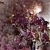
Churning out identikit letters to spell more pointless words. What's new?

I've submitted a particularly large-dimension file as I feel it's one of those that's really worth hovering over
Related content
Comments: 53

IDeviant In reply to ??? [2008-04-10 06:28:30 +0000 UTC]

👍: 0 ⏩: 0

nightmanflock [2008-04-03 05:29:30 +0000 UTC]

Dang... you can't appreciate this properly at all without the massive resolution, but once you do, it's incredible!

👍: 0 ⏩: 1

IDeviant In reply to nightmanflock [2008-04-03 14:36:02 +0000 UTC]

Absolutely! Looks quite a different beast in thumbnail I always appreciate time taken to 'see the bigger picture'

👍: 0 ⏩: 1

nightmanflock In reply to IDeviant [2008-04-04 02:11:46 +0000 UTC]

With stuff like this, it's really too bad for anyone who doesn't

👍: 0 ⏩: 0

Sc0t0ma [2008-03-31 21:36:01 +0000 UTC]

Really nice render, on top of being much different from most apophysis flames.

👍: 0 ⏩: 1

IDeviant In reply to Sc0t0ma [2008-04-03 06:31:38 +0000 UTC]

I rendered initially at my more normal 900 x 1200 for this aspect, but something made me try for larger and I think it paid off! Also, epispiral always behaves better with finite thickness

👍: 0 ⏩: 0

lamaska [2008-03-31 18:22:24 +0000 UTC]

splendid work. must say, i see the letters there

👍: 0 ⏩: 1

IDeviant In reply to lamaska [2008-04-03 06:26:31 +0000 UTC]

I feel that no single letter from our familiar alphabet can be truly isolated from the tangle, yet it teases the eye into seeing them all as potential letters

👍: 0 ⏩: 0

synconi [2008-03-31 18:08:52 +0000 UTC]

I love all the layers, and the very minimal gradient!

👍: 0 ⏩: 1

IDeviant In reply to synconi [2008-04-02 06:35:09 +0000 UTC]

My gradient choices are generally spontaneous, intuitive. Always works a treat

👍: 0 ⏩: 1

synconi In reply to IDeviant [2008-04-02 09:59:02 +0000 UTC]

I wish I could do that, I spend hours looking for gradients.

👍: 0 ⏩: 0

Leichenengel [2008-03-31 16:54:26 +0000 UTC]

Interesting Idea

👍: 0 ⏩: 1

IDeviant In reply to Leichenengel [2008-04-02 06:33:35 +0000 UTC]

👍: 0 ⏩: 0

silverb [2008-03-18 19:50:10 +0000 UTC]

Superb piece.

👍: 0 ⏩: 1

IDeviant In reply to silverb [2008-03-20 07:23:37 +0000 UTC]

👍: 0 ⏩: 0

Mogrianne [2008-03-18 16:13:31 +0000 UTC]

I like the depth of this, the frames and breaking through the frames. Nice work.
Moira

👍: 0 ⏩: 1

IDeviant In reply to Mogrianne [2008-03-19 07:24:24 +0000 UTC]

You have the essence of it: which layer is on top?

👍: 0 ⏩: 1

Mogrianne In reply to IDeviant [2008-03-19 14:35:59 +0000 UTC]

I actually could not tell, but I think one of the letter layers there was a lot of overlay used so it was a very cool effect.
Moira

👍: 0 ⏩: 1

IDeviant In reply to Mogrianne [2008-03-20 07:42:07 +0000 UTC]

The question was rhetorical! More a statement of the essence. The piece is not layered in the usual sense, rather it appears to be an intertwingling of layers. In full view, it's possible to see the thing in different ways: a chaotic jumble of letter-like objects spilling from compartments; a regular pattern; and then suddenly, some wheel-like structures come to the fore

👍: 0 ⏩: 0

fractaldreamer [2008-03-18 02:14:50 +0000 UTC]

I could just gaze for hours into the depth of this. Most interesting!

👍: 0 ⏩: 1

IDeviant In reply to fractaldreamer [2008-03-18 15:35:49 +0000 UTC]

Do you also see the various wheel-like structures, of which the diagonals are spokes? Sometimes they stand out, sometimes they hide...

👍: 0 ⏩: 0

james119 [2008-03-17 17:33:20 +0000 UTC]

I'd like to include this one in the Lost Book Museum, with your permission. Also I have to confess that I used it as a bump map in my latest piece, [link] which I will remove or credit, as you wish.

👍: 0 ⏩: 1

IDeviant In reply to james119 [2008-03-17 20:55:19 +0000 UTC]

I thought it might be suitable for the club! But I knew you'd pick it up on And it works nicely as bump map - makes it look like illuminated script Credit optional - I'm quite relaxed about such things.

👍: 0 ⏩: 1

james119 In reply to IDeviant [2008-03-18 03:53:09 +0000 UTC]

I was about to post it when my #1 Lost Book Scout, *ELYPhAS suggested it, too. Posted, and credit given for bump map in my gallery.

👍: 0 ⏩: 1

IDeviant In reply to james119 [2008-03-18 15:36:12 +0000 UTC]

👍: 0 ⏩: 0

SquareSoul [2008-03-16 15:14:20 +0000 UTC]

Spectacular! Liking the depth, the textures, the colour, the pattern ... I could go on.

👍: 0 ⏩: 1

IDeviant In reply to SquareSoul [2008-03-17 07:42:33 +0000 UTC]

Oh do, do...

👍: 0 ⏩: 1

SquareSoul In reply to IDeviant [2008-03-29 16:05:38 +0000 UTC]

Ok Ok ... will this do?

I have added this piece to my Weekly Fractal Top 3 in my journal [link]

If you'd prefer not to be featured, please do let me know and I'll remove the image.

👍: 0 ⏩: 1

IDeviant In reply to SquareSoul [2008-03-30 12:48:38 +0000 UTC]

That will not only "do", but actually delights Thank you indeed

👍: 0 ⏩: 0

Ann-McLaren [2008-03-16 14:47:17 +0000 UTC]

So that's how they do that.. Hmmmm

👍: 0 ⏩: 1

IDeviant In reply to Ann-McLaren [2008-03-17 07:41:54 +0000 UTC]

Indeed! And then the newsagent's shelves are crammed with the final products

👍: 0 ⏩: 0

esintu [2008-03-16 08:52:32 +0000 UTC]

you outdid yourself.. again! this is simply stunning, I love all the patterns and textures.. just lovely

👍: 0 ⏩: 1

IDeviant In reply to esintu [2008-03-17 07:40:54 +0000 UTC]

Well, that's got to be the finest aim of any artist: to improve within themselves, but not to dwell on comparisons with others

👍: 0 ⏩: 0

Annushkka [2008-03-16 02:54:54 +0000 UTC]

What program did you use??

👍: 0 ⏩: 1

IDeviant In reply to Annushkka [2008-03-17 07:38:30 +0000 UTC]

Apophysis... always Apophysis

👍: 0 ⏩: 1

Annushkka In reply to IDeviant [2008-03-17 17:31:07 +0000 UTC]


I am flabbergasted...

👍: 0 ⏩: 1

IDeviant In reply to Annushkka [2008-03-18 15:30:58 +0000 UTC]

Stained-glass framework with epispiral

👍: 0 ⏩: 1

Annushkka In reply to IDeviant [2008-03-18 17:02:21 +0000 UTC]

really??

👍: 0 ⏩: 1

IDeviant In reply to Annushkka [2008-03-19 07:23:21 +0000 UTC]

Indeed! I find there is much to be discovered within the framework

👍: 0 ⏩: 1

Annushkka In reply to IDeviant [2008-03-19 19:59:53 +0000 UTC]

yup...

👍: 0 ⏩: 0

psion005 [2008-03-16 00:58:37 +0000 UTC]

A most beautiful underlying design

Me--->

👍: 0 ⏩: 1

IDeviant In reply to psion005 [2008-03-17 07:38:09 +0000 UTC]

And would you believe it began with the stained glass template?

👍: 0 ⏩: 0

contrarymary [2008-03-15 19:37:02 +0000 UTC]

Wow! Definitely worth full view.

👍: 0 ⏩: 1

IDeviant In reply to contrarymary [2008-03-17 07:29:48 +0000 UTC]

It's always a difficult call, deciding to submit much larger than normal screen resolution, knowing that it can't be seen as a unit. But with this, it was more important to indulge the detail

👍: 0 ⏩: 0

peggymintun [2008-03-15 19:02:53 +0000 UTC]

Layers and layers and layers. Wow.

👍: 0 ⏩: 1

IDeviant In reply to peggymintun [2008-03-17 07:26:21 +0000 UTC]

Indeed! Hard to know what's on top

👍: 0 ⏩: 0

LaPurr [2008-03-15 18:36:07 +0000 UTC]

This looks like cubbyholes stuffed full of cutout letters.

I don't know if you've ever read the story of how the Oxford English dictionary came into being, but this reminds me of how submitted slips of paper with definitions and examples of usage were originally stored.

There are pointless words?

👍: 0 ⏩: 1

IDeviant In reply to LaPurr [2008-03-17 07:24:23 +0000 UTC]

No, I didn't know that about the OED! Pointless words? Start at celebrity chit-chat magazines

👍: 0 ⏩: 1

LaPurr In reply to IDeviant [2008-03-17 07:35:05 +0000 UTC]

No, those aren't pointless words, those are pointless people doing a poor job of using perfectly good words.

The story of the OED is actually very interesting.

👍: 0 ⏩: 1

IDeviant In reply to LaPurr [2008-03-18 10:31:16 +0000 UTC]

I stand corrected: 'tis the arrangement of the words that is pointless

👍: 0 ⏩: 0


| Next =>