HOME | DD
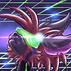 Jblask — Dawnbreaker

#dark #dragon #light #sword #dawnbreaker #aesk #torchofmidnight
Published: 2018-04-07 22:35:43 +0000 UTC; Views: 1053; Favourites: 30; Downloads: 6
Redirect to original
Description
Hey everyone! Practicing digital art and this is the first piece I really felt was decent enough to share with everyone. I decided to take a stab at Aesk and his signature weapon in an action pose working light and contrast and practicing effects for Aesk when he's in the Dawnbreaker mode. I still need a lot of practice and you can probably spot lots of messes in this piece haha. XD Hope you all enjoy this piece!Related content
Comments: 499

Thank you so much for taking the time to leave your detailed thoughts! I guess I picked the super birght colors because I love the intense contrast of light and darks and playing with glow effects. but I guess it's was a bit too much for people. xp
👍: 0 ⏩: 1

Well I like it but I don't want to eye rape people either. XD
👍: 0 ⏩: 1

lmao
yeah, let's not eye rape people XD
👍: 0 ⏩: 1

haha yeah I don't want to do that!
So is it the combination of colors I used? Or just how bright they were?
👍: 0 ⏩: 1

I personally liked the combination, so I think it was just the brightness. like some parts were too bright for me.
👍: 0 ⏩: 1

Oh okay that's great to know. I really love the colors I picked and I'm really hard to please myself so I'm glad the color choice is good ! Just their tone I need to work on!
👍: 0 ⏩: 0


There is a little too much going on in this drawing. The anatomy is very impressive though, especially in this pose. I personally feel as if there is too much color going on. I'm having a hard time figuring out what is the focus. Is it the sword or the character running? The gold, dark blue and the bright sky blue (on the belly) Seem to clash too much. I suggest going for either more muted colors on the character and having touches of a bright color or muting the colors on the sword and go for a more metallic look to make it look like it belongs in the picture. Though I like the choice to make the background black as to not draw anymore attention away from the character. Amazing work, but try for a more muted color pallete
👍: 0 ⏩: 1

Thank you so much for taking the time to time to give me your thoughts!
I'm a little bummed the colors are the biggest compliant from people because I liked how they stood out. 
👍: 0 ⏩: 1

It is my pleasure!! I understand the frustration with color pallets, It took me a long time to figure it out. I even took a class about colors and how to properly use them. To make the focus of the drawing pop, make the item or character slightly brighter. This brings the eye directly to where you want it to be. It is also a good idea to use colors for weapons that are more metallic, it makes it look more natural and can be pleasing to the eye. Never stop drawing! You'll get it one day, all artist start somewhere and so far you have a great start!!
👍: 0 ⏩: 1

Thank you so much for your encouragement!
about the colors... are they choices for the character and weapon themselves bad? or just the brighteness is what's too much? XD
👍: 0 ⏩: 1

The brightness is too much. mute them slightly on the character and mute the colors on the sword to a metallic ton and everything will look perfect!
👍: 0 ⏩: 1

Awesome thanks! What's a good way to make a metallic tone? I'm currently working on another piece with metallic weapons so it's definitly something I should learn. XD
👍: 0 ⏩: 1

The way that i do it is i look up color palettes and base my colors off of them. it gives you a nice range of color but keeps you on track for what you need to use
👍: 0 ⏩: 1

Okay thanks! I'm trying to give the current weapon I'm working on a bronzish look. Hopefully it will look good. XD
👍: 0 ⏩: 1

Keeping trying your hardest and it will!
👍: 0 ⏩: 1


PROS: There is obviously a consistent style in place and it's easy to understand what the goal in mind was for this piece. While the linework is certainly not perfect, it is reminiscent of the art style I often see in my high school, which is very detailed and elaborate. It looks like that is the direction your art is headed.
(Apologies in advance for the cons being much longer than the pros. I wrote the cons first and it's easier to give advice on how to improve than it is to just state everything that was done well. Contrary to what you may understand from what was written, I do actually like the piece.)
CONS: I know that in many anime shows and other cartoons, when a character 'powers up' or 'equips' themselves, the background often disappears to better show off the effect and power of what's going on, so I won't say much about the background or lighting. I was going to mention the fact that I couldn't tell where they were or where the light was coming from, but then I remembered this TV trope, so it makes sense.
There are two things to address as far as lighting goes, which are where the light is coming from and what the light is hitting. As stated earlier, the former has already been addressed, it looks like the character is simply glowing, which is fine, except the latter question regarding lighting has still been left unanswered. The shadows are placed randomly; the shading is not consistent. Most of it suggests that there is a light source coming from the top right of the photo, but it isn't all consistent with this assumption. If the character is glowing, there should be little to no shadow. It should only be where the body overlaps itself, but shading can be very difficult for a glowing character. Last note regarding lighting, it's best to find a consistent way of shading, rather than switching between sketching and airbrush.
Another thing is color schemes. I'd recommend studying color theory if you are very serious about art, and even a 5 minute video can do wonders for color choice. However, if you are just doing this for casual fun, I'd still recommend that you google color palettes and go with one of those. The colors you chose and the way they were executed do not work well together. For one, there is no diversity in the saturations. To see if your colors are well chosen, one trick is to turn your piece black and white. If you can still tell the difference between the colors, then you're good. If not, there needs to be some adjusting. Of course, this doesn't work 100% of the time, but it's a good starting place. I could go into complementary colors and other types of color schemes, but as I said earlier, a simple YouTube search will do that much quicker.
Lastly, there are many accessories on this character that don't make any sense. There's a belt tied around the left ankle, and straps around the mechanical armbands. These things are interesting stylistically, but don't add anything to the picture except confusion.
I don't like commenting on anatomy because I feel like while every other decision is a conscious choice (color scheme, outfit, etc.), anatomy isn't something that can be improved so easily and so long as the artist keeps drawing, it will improve over time. For that reason, I don't care much to say what was done well or not well as far as anatomy, especially since I'm unfamiliar with this species anyway.
👍: 0 ⏩: 1

Hi there! thank you so much for taking the time to leave a detailed and thoughtful critique on this piece!
There's a lot you talked about and I'm not quite sure how to reply to it all...
👍: 0 ⏩: 0


Not bad for your very first digital work! e.deviantart.net/emoticons/b/b… " width="15" height="15" alt="


The anatomy, colors choices, shading, lighting and background could use some more work of course ^^ If I were to suggest some changes. it'd be making the background black first, and then use the airbrush to add in the highlights on Aesk's body and the light coming out of the sword.) e.deviantart.net/emoticons/s/s… " width="15" height="15" alt="


Also, try to avoid using colors that are too bright on the character, that way, the drawing would look more realistic and natural! Only use bright colors for things that glow! e.deviantart.net/emoticons/b/b… " width="15" height="15" alt="


Overall, looking at this first digital work of yours, I honestly don't know why I feel so proud of you, Jblask! XD
👍: 0 ⏩: 1

Thank you soooooo much!
I realize there is a lot to work on still... I knew this was a mess of a pic but I was scared if I didn't upload somethign with this much effort I never would so here it is...
👍: 0 ⏩: 1

No problemmmo! <3
And you did upload it! That's how you get feedback! That's how you improve! 
👍: 0 ⏩: 1


Good for a first digital piece! But here's some advice: theboobiesaretoosmal AHEM, and the tail is a little too big for the perspective. The sword looks too heavy for the character, and is held weirdly. Maybe have the arm being the character? Also try to turn the character towards it is trying to hit, not the camera, because the sword is facing a different direction. Don't shade with black, shade with a darker version of another color it is being put on. and the bright yellow is hard to look at, maybe lower the opacity? Have a great day! e.deviantart.net/emoticons/b/b… " width="15" height="15" alt="


e.deviantart.net/emoticons/b/b… " width="15" height="15" alt="


👍: 0 ⏩: 1

WOOPS i typed "being the character" I mean't to put "being behind the character" sorry!!
👍: 0 ⏩: 1

Hey! thank you so much for taking the time to critique my work!
LOL theyaren'tboobscuzhe's6XDXD. The sword is definitely huge however it is made of solid light that's why it's the yellow I picked and how he is able to carry it. So I hope that clears up some of my choices.
I do't get many critiques so thank you for stopping by!
👍: 0 ⏩: 1

I don't get many critiques so is there anything else you would like to add? :3
👍: 0 ⏩: 1

Not really! this peice of art is REALLY good for a first peice of digital art, im suprised! just take the tips I gave you, work off of them!
👍: 0 ⏩: 1
"We will be the shining in the darkness!"
-Nepgear
And it looks pretty awesome! 
👍: 0 ⏩: 1

I definitely need to give Aesk an awesome qoute or something. x3
Thanks so much! I definitely wanted to give him an empowered and inspiring scene!
👍: 0 ⏩: 0

He's a character that means a lot to me and I'm glad that I'm getting better at bringing him to life!
👍: 0 ⏩: 1

good to hear~ keep going man~
👍: 0 ⏩: 1

Thanks I definitely plan to!
👍: 0 ⏩: 0

Wow, fantastic work for you first digital piece!!
👍: 0 ⏩: 1

Thank you! It was definitely quite an endeavor
👍: 0 ⏩: 1

You're welcome! I can imagine it would have been
👍: 0 ⏩: 1

Happy with the final product though!
👍: 0 ⏩: 1

i forgot to comment on this ughh
This looks awesome!!
Really great work on the whole thing. From posture, to shading/lightning, etc.
Keep it up! :>
👍: 0 ⏩: 1

Haha it's okay. XD I know everyone is busy!
Thank you so much! It was definitely time consuming and I still have a lot to learn but I'm happy with it!
👍: 0 ⏩: 0

I'm so lazy to write a critique so ye XD
Deymmm it already looks good with your first piece!! Tbh my first piece I posted somewhere (not in DA 
Just draw draw draw more digital stuffs Jblask! I'm so excited to see your future artworks soon >W<
👍: 0 ⏩: 1

Thanks so much! And they'll be coming soon!
👍: 0 ⏩: 1
| Next =>


