HOME | DD
 JeremiC — Duality on DeviantArt

Published: 2007-06-26 15:31:48 +0000 UTC; Views: 3940; Favourites: 57; Downloads: 124
Redirect to original
Description
+I modified the original with help of your comments+This is a piece made for my friend:
Any comments on how to make it look better are accepted!
Thanks
 (Wink)")
****** This piece was featured on DailyDeviant [link] and suggested by [link] ******
Related content


Comments: 43

HAHA THATS THE SKYLINE OF MY CITY. i've never seen it used in a deviation b4. coolios.
👍: 0 ⏩: 0

This one is really great! I love the way you use the vectorcircles to create the smokeeffect of the train and the city!!! fav'ed!
👍: 0 ⏩: 0

The colors you use impress me so much! I just have the same, rather normal, outlook on colors and I would just LOVE to shove myself out of that box and try some new awesome color palettes like yours! Great work and I'm impressed with your work!
👍: 0 ⏩: 0

Great piece! I don't really know what else to say...
")
👍: 0 ⏩: 0

very nice. I like how the colors go so nicely together. And the dragon is very cool too.
👍: 0 ⏩: 0

i love what you do, what do you use? who taught you how to do that!?
👍: 0 ⏩: 0


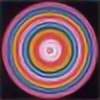


thats very nice. great colors, great composition.
... but I don't like the duality logo.
👍: 0 ⏩: 1

hehe thanks!
ur talking bout the ugly deviant art logo or the font?
👍: 0 ⏩: 1
I don't like the Font. The spacing between U and A is too big.
👍: 0 ⏩: 1
lol u r right i never noticed that!
Yeah the original had a different font, pu someone complained
Ill take care of it dude!
Thanks!
")
👍: 0 ⏩: 0

WOW ! very nice ! i love the way those dull colors look ! nicely put together man..
👍: 0 ⏩: 1
Thanks man!
I usually work with brighter colors though,
but I really like this match too
👍: 0 ⏩: 0


honestly i really like this, the whole concept and color scheme, fits very well.... i think the only thing i would change is the text in the upper right, b/c it looks pixelated aside from the rest of the image being very smooth. But overall, way cool bro....
")
👍: 0 ⏩: 1
Thanks for the advice, I actually didnt really pay attention, but now I see it, it looks pretty bad!
Thanks
👍: 0 ⏩: 1
lol, no - problem @ all... glad to have someone take my advice into consideration.... youre the BOMB

👍: 0 ⏩: 0

Love it. For some reason I like how the foreground and background contrast with the city scape and stuff. Nice.
👍: 0 ⏩: 1
 (Smile)")

Wow, lovely!
I like the colors a lot, they blend well together. Maybe typography needs a little aliasing or blurring. it stands a little too pixelated imho.
A very cool piece!
👍: 0 ⏩: 1

love it! but it's so different with the colours from your normal pieces.. maybe a bit brighter, but if your friend wanted it to be more pastal, it'a great!
👍: 0 ⏩: 1

Cool piece man, some stuff like the dragon looks sketchy and the typo doesn't really fit the piece but the rest of it is great.
👍: 0 ⏩: 1


dude, that looks awesomeee
only thing i can sai is maybe some stronger collors
👍: 0 ⏩: 1
J'aime beaucoup la composition, et les couleurs sont agréables, GG
👍: 0 ⏩: 1