HOME | DD
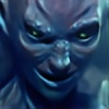 JoaoRodrigoBaptista — How to hunt a wolf

Published: 2011-07-29 19:18:23 +0000 UTC; Views: 1008; Favourites: 24; Downloads: 23
Redirect to original
Description
This is a different style from what I'm used to do. I'm currently working on building a portfolio for children's illustration, and this is my first attempt at that sort of style.I kept some parts of this intentionally rough, but in hindsight I don't think that works very well, so it's something I'll adjust in future efforts.
Even though this is something I'm not used to do, it was incredibly easy and fun to do. I love how the color came out in the end.
Adobe Photoshop CS5
Related content


Comments: 19

Overall

Vision

Originality
Technique
Impact
I think the overall composition is done well, the light effect, color scheme and all works very well. The central composition, though overused, works well for childrens books I think.
The child seems to have a dopey look on his face, and im not sure if that is intentional. It might be that the child is to be ignorant, naive or innocent, but Personally I get more of the idea that the child is just plain stupid (the kind of funny-stupid you get in american cartoons - completely unaware and would walk off a cliff without a second thought)
The style in which you have drawn the characters is great for children's books. I agree with you that some areas which were left rough do not actually work very well that way.
The bear trap is not totally obvious at first glance. I'd spend a little time trying to make it more recognizable as a hunters trap. Get some reference photos, they are usually flat on the sides without that vertical definition that looks like it is rippled.
I think you've got the right direction with this, just need a few more practice pieces to get the technique down and refined to something that your comfortable with.
the over all effect is understandable and good! I would say if there was one technical aspect I would work on the most, it would be to either get more detailed and rendered or go the opposite direction. the piece seems to be hovering between flat colors and form - try to push it in one direction or the other. Personally I would try to take the way you painted the child into the wolf. The two seem to diverge in style - and I think the child is the most completed and well done aspect of this piece.
👍: 0 ⏩: 1

Thanks for taking the time to critique this! I agree there's a lot of room for improvement, and this was my first try at something different, so I guess future endeavours will be better!
👍: 0 ⏩: 0

It's pretty cute. I think the fire is way too bright and takes away most of the attention of the watcher from the rest of the picture, maybe make it more dim for a better effect
👍: 0 ⏩: 0
good concept. Don't be afraid of color, add more in. For example the leaves could use some blue from the night sky and the red hood could use some cream, pink, yellow, or white from the glowing flames.
keep it up!
👍: 0 ⏩: 0

the colors did come out well, but your line work is suffering from what looks like a serious lack of attention; crack down on your figures by studying things like facial features and anatomy(if you're going to draw anthros like the big, bad wolf then study some animal anatomy, too). also, i recommend referencing some other artists who have spent their whole careers doing childish and cartoon style work - i looked at some of the other pieces in your gallery and it looks like you're clinging to references when you draw them - having to stylize the line work in this piece brought you outside of your comfort zone i think and some heavy practice couldn't hurt.
the colors, though.

👍: 0 ⏩: 0

I love the colors you used in this. I think the foliage looks great as well. One thing I might mention though is that the expressions seem kinda (please excuse the harsh term) dead. It doesn't seem as if they're focused on anything in particular. The werewolf's pose seem great though; it's dynamic, yet simple. However, the boy's pose seems a little stiff.
Hope I didn't sound too harsh.

👍: 0 ⏩: 0

I think with this piece, you are trying to incorporate too many styles at once. Each part of the image looks great in itself, but combined, there is a disconnect between subject elements. Your red riding hood character uses a different coloring style from your wolf. The ground, a different style. The background a different style. My advice to you is pick your favorite to work in, and stick with it! Your illustrations will be much more cohesive then.
👍: 0 ⏩: 0

Very nice shading there, I believe you have succeeded at the style with rough yet good line work. Good texture work on the bush, and wolf. ha ha I like the wolf eyes because they seem crazy and out of focus good job.
👍: 0 ⏩: 0


Whoops. Never mind, looks like a great way to catch a wolf. I said poor girl, 'cause she seems a bit too close for comfort haha.
👍: 0 ⏩: 0
Ekk!! looks like a very scary children's book. Poor girl. haha. Love it! The colours are amazing.

👍: 0 ⏩: 0

Nice job! I love the concept and the techniques that you used--it really helped the idea and create a great atmosphere~ The clouds could have a bit more attention paid to them, and maybe you could consider making a composition that is not focused in the center--otherwise it creates very little movement. You're doing awesome though! I love it and good luck on your portfolio~
👍: 0 ⏩: 0

")

Really nice colours, like you said its a bit rough in places i would try and clean that up a bit.
Scene-It
👍: 0 ⏩: 0


I agree that the artwork is very good.
To improve it, I would add some shading on the moon to reflect its irregular surface. Looking at a map of the moon could help with this.
👍: 0 ⏩: 0

Very cool.
I love the warm colours and the atmosphere in it!
👍: 0 ⏩: 0


Nice, I love the colours  (Smile)")
To improve it, you could give the moon a bit more of a glow, and maybe add a few stars? Also, the directions of the eyes - the wolf would look better if it was looking directly at the girl, and she would look better is she was staring into the fire.
It's really good, a lot better than I could ever do!
👍: 0 ⏩: 0