HOME | DD
 JonathanWyke — Peter Grant
by-nc-nd
JonathanWyke — Peter Grant
by-nc-nd

Published: 2014-06-03 16:42:00 +0000 UTC; Views: 997; Favourites: 26; Downloads: 0
Redirect to original
Description
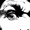
Just a doodle really. I've been (re)reading Ben Aaronovitch's terrific Rivers of London series, and fancied trying a quick sketch of Peter Grant, the magic-wielding copper.Peter Grant and The Rivers of London are all © Ben Aaronovitch
Related content


Comments: 8


Technique
Impact
One of the best, maybe even the best "Peter Grant" interpretaton I have seen.
Several artists pictured him as rather young looking, slender figure (maybe based on the idea that an apprentice is somewhat boyish). Yet, it's mentioned on several occasions that Peter (as a civilian) does sometimes look not too trustworthy, maybe even a tad intimidating. Your design (especially the square jaw, the "from below" viewing angle, and the slight "Boxer nose" touch) capture those aspects really well. All in all, he (correctly) looks more like a brawler than a book nerd.
The next point is Peter Grant mixed heritage. Many artsts tend to go the easy way, by either drawing a "white guy with dark skin", or a "black guy with light skin". I like that you manage to mix European and African facial features well: He got (as mentioned in the book) his Africans mothers broader lips, but yet you manage to stay out of a cartoony exaggeration. The only little nitpick I have is you left out his curly hair. Peter Grant mentioned in one book his Europeans fathers smooth hair was one of the few things where he would have liked to take after his father. When he explicitely mentions his hair as essnetial part of his appearance, I feel it should have been shown. But that's a complaint on a rather "high level". Anyway, back to topic, I like you did not go for a European or African appearance, but managed to mix those facial features in a credible way.
One last thing: All in all, his face (especially the jaw region, and the eyes) remind a bit of the bulked up Brad Pitt in "Fury". The similarty to an existing person gives your drawing an aspect of "credible realism".
👍: 0 ⏩: 1

Thanks for the kind words, and also for taking the time to do such a thoughtful Critique!
You're right about the hair I think. I was caught up in his being a copper, so had decided that cropped short hair was the way to go, and that was wrong I think.
👍: 0 ⏩: 0


")

