HOME | DD
 jubjubjedi — Space Marine v. Ork 3

#gamesworkshop #ork #orks #spacemarine #spacemarines #warhammer #warhammer40000 #warhammer40k #spacemarine40k
Published: 2015-11-18 04:00:01 +0000 UTC; Views: 13591; Favourites: 347; Downloads: 0
Redirect to original
Description
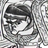
A third attempt at Games Workshop's art test!What can I say, I'm a sucker for punishment...
Related content


Comments: 63

I have a feeling that in 1.5 seconds, that Ork will be turned to mist by that marine's powerfist.
👍: 0 ⏩: 1


You are awesome! This is better than most official artwork!
👍: 0 ⏩: 1

Thank you for your kind words!! I have yet to hear back from Games Workshop and it's been weeks, LOL...
👍: 0 ⏩: 1
Well from what I have seen all those years, they are really slow in recognising talent...so, with such skill and not hearing back from GW, hey it's a compliment!
👍: 0 ⏩: 0

did they ever critict about the other 2. or they just say no?
👍: 0 ⏩: 1
Yeah, the crits are included below. Some of it made sense, thus my third try!
👍: 0 ⏩: 1
oh i mean crits from GW. not from us deviants.
👍: 0 ⏩: 1
Oh, right, here it was:
• This is the most important part. All art must represent the models, this includes armour and anatomy, down to the minute detail of shoulder pads and weapons (reference shots are supplied). It should also reference relevant iconography and heraldry wherever possible. (your picture doesn't do this accurately enough).
• Colours must be vivid enough to convey details and colour schemes accurately.
• Rendering on foreground figures must be very sharp and detailed.
• The tone should be brutal, epic and violent.
👍: 0 ⏩: 1
i see. now i understand why so many outstanding art are being rejected by GW...
they want a total 100% copy of characters from their minis.
alot of artist redesigned their armor or design a characters of their own...
👍: 0 ⏩: 1
It's not even so much that the artists don't copy the miniatures accurately, but the quality of the miniature -references- that GW tend to give their artists. Even working for Fantasy Flight Games, I've had to do a lot of research just so I can get good quality pics of the miniatures, often from multiple angles. Thankfully, some of the miniatures can be seen in 360 degrees on the GW website.
👍: 0 ⏩: 1
well... yeah. google helps alot. surely marines are easy find.
👍: 0 ⏩: 1
You would think, but when it comes to being specific, like a particular kind of power armor variation and a particular kind of weapon, it get's tricky and time consuming. Honestly, this should be the job of the developer, not the artist.
👍: 0 ⏩: 1


That ork's face is about to be inverted
...and disintegrated...
👍: 0 ⏩: 1


First off, great piece. I've seen over a dozen of these tests over deviant art, so it's safe to say it's a fairly tough one. It's pretty awesome to see you sticking to it like this, so keep it up man!
Here are a few things i noticed. I'm nowhere near as good as you so take my advice with a healthy dose of salt.
Watch the perspective on the breastplate: it looks a little flat for the height it's at. Also, the skull on the marine's belt looks a bit flat because its so front on.
Have the characters be more engaged with each other. In a close up shot like this, having the orc staring off into the distance like that makes him look a little oblivious. Flipping through old warhammer codexes, they seem to be fans of eye to eye confrontations, or having an opponent seconds after a killing blow with the victor standing triumphant. Grimdark and all that.
Really digging the marine's pose, especially that S line on the pistol arm. he does look a tad bit squished into the frame though, bent a little too much at the waist and maybe loosing a bit of the volumes on the legs. Also, having the power fist completely in the shot would be cool.
All that being said it's a really rad drawing. Sorry if it looked like i was really nitpicking. Best of luck dude!
👍: 0 ⏩: 1
Hey man, thanks for the comments! Someone else mentioned the Ork looking oblivious and that they should be more engaged, and it makes total sense. As I had mentioned, the art test required faces for both to be visible... also, I -did- want the Ork to be oblivious, like he had just finished butchering someone off-screen and he isn't prepared for the Marine launching himself at him because of his bloodlust. For the most part, I'm just trying to address the following points of feedback from my last test:
• This is the most important part. All art must represent the models, this includes armour and anatomy, down to the minute detail of shoulder pads and weapons (reference shots are supplied). It should also reference relevant iconography and heraldry wherever possible. (your picture doesn't do this accurately enough).
• Colours must be vivid enough to convey details and colour schemes accurately.
• Rendering on foreground figures must be very sharp and detailed.
• The tone should be brutal, epic and violent.
I think GW is less interested in the storytelling that they are with accuracy, rendering, and tone at this point. I could be totally wrong, of course...
👍: 0 ⏩: 1
No worries man. As the one taking the test you know the requirements better than me ")
To be honest, after sending the comment i was a little embarrassed because I'm studying animation and not concept art, so i don't know how often the fields overlap in terms of preference and goals.
For my classes, a lot of our drawings and 3D stuff focusses on strong silhouettes with exaggeration and perspective as well as the staging of a character. Construction and staying on model is the very last thing we worry about, but when we get to that point we go ham on it. At then end of it though, a strong film shot is the end result we go for.
When you start a piece, do you sort of follow a similar though process, or is it different?
that last comment "• The tone should be brutal, epic and violent.". that's probably one of the coolest critique points I've ever read
👍: 0 ⏩: 2

Nah, storytelling is important, but you need to represent their models correctly.  (Smile)")
👍: 0 ⏩: 0
Hey! Don't feel embarrassed... any and all comments and critiques are welcome! I only have one set of eyes, and those get tired easily LOL...
Actually, this falls squarely into illustration, not concept art. Concept art would apply if I were creating assets from scratch, not merely showing existing assets in a particular context/scenario. Most of that stuff you mentioned (silhouettes, perspective, staging) also apply in illustration, though it might be described more as "readability" and "storytelling". Perspective is just universal, though it's definitely easy to fudge in illustration... often, it's not imperative to get in down accurately unless there is a lot of architecture present. But yeah, there are a lot of similarities in the process. For an illustration, at least for me, it's blocking out rough shapes to create an abstract composition, then establishing foreground, midground, and background elements. Then there is the actual drawing (accurate, if possible) and then rendering. For the most part, I have a "movie" going on in my head when I do an illustration.
👍: 0 ⏩: 1
Constantly mixing the two up because where i go to school illustration and concept art are lumped into one program XP
sorry about that
I feel like tired eyes are a universal problem for artists and art students
It's pretty cool to hear about how similar the process is for everyone. In any case, best of luck with your art man!
👍: 0 ⏩: 0

...you know...I will NEVER EVER be able to create anything at this level..so, with nothing but good intentions, I will say this much: That your space marine/ork pieces like this do tend to have, like, their backs always turned, facing the camera, and they are not eye to eye in a fight or even turned towards each other. I think the positioning is a little stiff in that and less dynamic and so therefore less realistic. If this ork was turned to face him and we could see his back, see the punch coming over his shoulder, the moment would be really captured and the focus would center on how good the Ultramarine looks. That would make an awesome card capture. So, I think sometimes people have trouble with certain aspects of anatomy or positioning, and in the days I did draw anything, I always had trouble with feet. One of those wooden pose figurines helped, even with angles and aspects, to draw something from 'behind' and you don't always need their expression, but can tell the action through what the viewer sees. ")
👍: 0 ⏩: 1
Hey! Thanks for the comments! So, in regard to the characters faces being visible, that's a requirement of the GW test (same with all Fantasy Flight Games commissions). I guess the art is meant to be a selling point for their line of miniatures, so they want visible faces as much as possible, especially for primary characters/focal points. But yeah, I see your point... I've often done compositions where the backs have been turned, and they usually got turned down. Basically, you have to be creative within the rules they have set down. In my piece, the Ork is meant to look like he is being caught unawares, possibly after having just butchered someone off-screen.
👍: 0 ⏩: 1
lol well don't I feel stupid for thinking I had something to contribute
👍: 0 ⏩: 0


AWESOMEEEEE!
MMMMMMMMMMMMAAAAAAAAAAAAAAAN, I wish I had time to paint warhammer things. Still have my cathedral painting half finished hanging in my room for 5 years now.
"The persistence is the virtue of the righteous who shall see the blessing of the Emperor!"
- Chapter 2, Verse 9, of Vigilatus Lexum from the accounts of Antonious.
👍: 0 ⏩: 1
What?? Finishhhh iiiiittttttt!!!
What have you been up to these days??
👍: 0 ⏩: 1

Well good luck! You know what they say about third tries!
👍: 0 ⏩: 1

LOL, sorry to hear that! Honestly, I almost did too, but I took a hard look at my second submission and some of the feedback they gave actually started making sense to me. This will probably be it for me though, in case this piece falls through.
👍: 0 ⏩: 0

This is awesome! Very nice colours, I would think of tweaking the levels to pump up the overall contrast of the image.
👍: 0 ⏩: 1
Thank you for letting me me know!
👍: 0 ⏩: 0

My last pay check was $9500 working 12 hours a week online. My sisters friend has been averaging 15k for months now and she works about 20 hours a week. I can't believe how easy it was once I tried it out. This is what I do... wallstreet34.com
👍: 0 ⏩: 0
This one is pretty good man, keep an eye out for those shoulderpads and how perspective works on that and the upper torso. The pose and the execution is good, but the shoulderpad look a little wonky, and the upper part of the torso should curve in towards the helmet a little.
You are getting there dude!
👍: 0 ⏩: 1
Thanks for the critique, I'll see what I can do !!
👍: 0 ⏩: 1
You're welcome.
Hope it didn't sound too pretentious
👍: 0 ⏩: 1
Not at all...I've implemented both comments and updated my pic!
👍: 0 ⏩: 0
| Next =>