HOME | DD
 KaizokuShojo — Older Jack Levin - Charcoal

Published: 2011-11-27 08:28:14 +0000 UTC; Views: 738; Favourites: 18; Downloads: 46
Redirect to original
Description
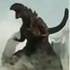
It had been a while since I had drawn a picture of Jack Levin, my favourite F-Zero pilot, so I pulled a piece of blue cardstock to give it a shot. It's the first charcoal I've done in a while without looking at anything as I drew. Unfortunately as I drew, however, he looked...a lot older than the nineteen years of age he is in F-Zero GX.
  Instead of tossing it or scrapping it, I decided to instead continue and make it a drawing of an aged Jack. I'm not sure how old he is, but, he's obviously older...more experienced... He's probably still a pilot, but he's likely quit the music scene. Boy/teen pop idols more often than not fall out of vogue after a while, after all.
 There are a LOT of flaws... His neck isn't very good...he looks a little tilty/crooked (mainly due to some flaws in his hair, eyes, and eyebrows. But, I liked it enough to post, I think...
I need to practice more.
")
I like this blue cardstock...it'll be good for a Murdock portrait.....if I ever decide on what picture to use.....
Materials: Blue cardstock, General's brand charcoal pencils (including white charcoal).
Jack Levin (c) Nintendo
For more Nintendo art, visit my Nintendo gallery folder by clicking here.
To see more of my charcoal works, click here for my Charcoal Gallery folder!
Related content


Comments: 24

I absolutely dig the older look you have given Jack here, really works well! The expression is really awesome and despite the flaws you said, I honestly think they do not upset the piece greatly. Have you considered drawing some other F-Zero Pilots older?
👍: 0 ⏩: 1

Thanks!
That's good. 
I hadn't, but it is a thought. Although with some of the other pilots they'd look very old, if I aged them as much as I did with Jack. XD Have any particular one in mind?
👍: 0 ⏩: 1
Hmm, I did a Princia image once, she was a few years older but it is interesting to think how she would be I think. Looking at the original 30 though, would be interesting to see how James McCloud would age a bit more too! I will end up drawing the original guys eventually for my own project I think. Do love how this one came out though  (Smile)")
👍: 0 ⏩: 0

Its cool seeing Jack drawn older. I never thought I would see someone do that. I also love that you put him on a blue background. ^^
👍: 0 ⏩: 1
Thanks! Yeah, it was a really random thing. XD Glad you like it!
👍: 0 ⏩: 1


It is, especially when you feel pain from your spine.
👍: 0 ⏩: 0


The highlights on the face are AWESOME!!!! I love those cheeks!
His left eye seems like it's slightly leaning towards the viewer's right a bit, but it wasn't the first thing I noticed, so maybe that's okay. XD
The hair is cool, it's like you can grab it and fluff it. HAHAHA. I like how the face is a bit more realistic looking than the clothing. Not that the clothes aren't realistic, but it's more cartoon/comic looking than the shadows on the face. That's a neat blend. :]
👍: 0 ⏩: 1
Thanks! ")
Yeah, there are lots of little leany-parts. XD I need to get some new, longer charcoal pencils...the worn-down ones are making hard to reach over already done areas and get things right. XD
xD It probably has some sort of 24/25th century hair gel in it...
It's less of a blend, and more of...I got lazy when I got down there. 8D
👍: 0 ⏩: 1


you know, i didn't say very much
i love the texture of the clothes. the shadows around the neck look great. the thickness of the every line is just perfect (except those neck tendons you always obsess over, and the collarbone; your collarbones generally look like...they protrude much, and there's no flesh over them, or it's just tight skin...make people more fleshy about the collarbone XD). i can see more colors...purples, silvers...and almost a hint of gold in a couple of spots. your charcoal work just...astounds 
👍: 0 ⏩: 1
XDD
Thanks.
Pft.
Pft. XD Thanks.
*sneezes from charcoal dust*

👍: 0 ⏩: 0
i have to be honest, when i clicked on this tonight, the first thing i noticed was the crookedness. it's very unlike you and...very like me
this is extremely striking! the white on the blue is really great. i think the highlights and shadows around the nose are the best, and my fave part. i'm amazed at how very much you're able to make it look like there are more colors than just blue, black and white. it really...looks like several blues, grays...
oh, this is random, but would you consider uploading that one photo of the progress to scraps, where the light hit it a certain way? i just think it's cool XD
i feel so repetitive, but the textural differences here are really beautiful. the details you can get with charcoal are just amazing... i especially like his hairline; it looks very realistic. all the subtle facial features are very good...little wrinkles, highlights and shadows, bone structure... there is tons of depth to it. it's just...phenomenal, really. and i love the eyes. they remind me of...a certain ninja, actually XD
also, amazing that you could do this from no references! i looked him up and you did great
and he's more handsome older xD
👍: 0 ⏩: 1
Yah. XD It's pretty bad. ")
Thanks.
I'd have to...get that pic again, from you or the phone. xD
Thanks.
Pft.
I didn't say NO references. XD I used the wallpaper, but it's a big enough difference.
Everyone is.
👍: 0 ⏩: 0