HOME | DD
 kalaadrius — Sojasalk II

Published: 2007-12-23 12:08:42 +0000 UTC; Views: 1755; Favourites: 30; Downloads: 0
Redirect to original
Description
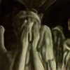
==================================Pealkiri : Sõjasalk II
Title (eng): War party II
Media: A4-sized paper, ballpoint pen, pencils (HB, 2B, 4B),
blending stick, GIMP for color adjustments on scanned work
References: characters (except the snail) from game
"HoMM V: Tribes of the East"
==================================
Apparently an orcish war party has stopped to let the snail cross the road as trampling over the snail brings no honor even to these savage warriors...
---
I'm quite unsatisfied with the shading on this work. Any comments and advanced critique about shading is most welcome.
Related content


Comments: 25


Well, yes, probably HoMM V creators were influenced a little by the Warhammer
 (Smile)")
👍: 0 ⏩: 1
HoMM = Heroes of Might and Magic (a video game)
👍: 0 ⏩: 1

you have really rendered the mood of a wintery setting! and i also think you've done a good job distinguish foreground/background in terms of tone; if you are unhappy with the shading perhaps next time you could think where you want to have most detail and make the shading most sophisticated and tonally diverse there and leave the rest of the shading more uniform for areas of lesser detail.
hope it helps
👍: 0 ⏩: 1
Thank you for the comment and advice
In this picture, lack of contrast between tones seems to be the main issue, but I can also blame my LCD monitor for this. I agree that some more serious planning is necessary.
👍: 0 ⏩: 1
 (Wink)")


I love it when artists put this amount of effort into their work. Great detail and great character design.

👍: 0 ⏩: 1

Not only does this have loads of armour reference in it, it also has a snail, which is one of my favourite animals ever ! I love it
👍: 0 ⏩: 1
Hello! I've featured you in my journal ([link] )
👍: 0 ⏩: 0

Thank you! I am glad you like it
👍: 0 ⏩: 1

oh and the background is great as well (that's what i cannot draw or i dont know.. i'll try... ")
")
👍: 0 ⏩: 1
great details, congrat.. but i wouldn't be pleased to meet them
👍: 0 ⏩: 0

I love the detailing you put into this. Nice work!!
👍: 0 ⏩: 1