HOME | DD
 Kittermew — Coloring Progression

Published: 2010-12-22 06:13:31 +0000 UTC; Views: 2774; Favourites: 54; Downloads: 408
Redirect to original
Description
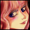
Ok, so I made a progression tutorial-ish thing rather than an actual tutorial because I... really suck at explaining.Dx
Downloading for full view is available.
I hope this is somewhat useful to someone in the world. I am sorry for being so..unspecific!
<3 Kittermew
Final Product: [link]
Related content


Comments: 9

ohgod, I lol'd at "repeat for clothes and hair". XD
Hey, can I do this with Ps?
Well, I guess I'll have to find out. |D
👍: 0 ⏩: 1

You can try for photoshop. But if you're in photoshop you may want to try the dodge tool or layer masks. I only developed the coloring style that I did because I was trying to create a dodge/burn effect xDD
👍: 0 ⏩: 0
Totally going to reference from this tutorial in the future! Thanks!
 (Smile)")
👍: 0 ⏩: 0

This is so helpful! : DDD
I myself usually stop around "cell shade w/ non-saturated colors"...
OTL
👍: 0 ⏩: 1
C:
The more you know~*rainbow* ;D
👍: 0 ⏩: 0

I LIKE IT!
I will definitely need to try this once I get something worthy of digital coloring! 8D Thank you, Pennyyyyyyy
ALSO BUNEARY <3
👍: 0 ⏩: 1
You're welcome! I hope I wasn't /too/ obscure with my explanations. xD;
👍: 0 ⏩: 1
--I'm not sure what you mean by "brightness/contrast" in the 5th step. I found the menu, but none of its options do anything like what your example looks like! I'm basically putting each step on a different layer, do you think that's the problem?
👍: 0 ⏩: 1
That may be the problem. c:
There should generally be;(for all the steps before add layer for overlay)
-Lineart
-hair
-clothes
-skin
You adjust the brightness/contrast/color deepen for each of those layers separately. In the tutorial step that you are looking at I was on the skin layer adjusting it by itself. It should look a little ghosty and and brightness bar should be less than the other too bars but not below 0. Some of the lightest bits should seem /almost/ white. It usually is too white, and so I color pick the darkest of the like colors(like if it were the skin you are working on, then color pick a shadow-y area of the skin) and air brush it lightly over the excessively bright parts.
Hope this helps! You can ask me anytime if you get stuck on anything. : D
If that didn't help, the other thing I think you may have meant was if I adjusted all three bars in the brightness/contrast menu? D: I did. I kind of said something about that in the mass of text above but I just now interpreted what you said differently. ^^ ;
👍: 0 ⏩: 0