HOME | DD
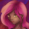
 kmkibble75 — Random: Bobbed Girl

#bobbedhair #digitalart #drawing #portrait #woman #blueeyes
Published: 2018-03-21 21:51:48 +0000 UTC; Views: 653; Favourites: 28; Downloads: 0
Redirect to original
Description
Today was another snow day, so I used it to play with the idea of drawing randomness. So, this young woman is the result of using a random number generator to choose the pose, skin tone, eye color, hair color, and sweater color. I used the same lip color that the pose resource had, because it seemed to fit her well enough, and I picked the violet locks that frame her face just because I thought it would look cool.The background color was just a guess -- I originally went with a darker shade of blue, but I thought that, in combination with her violet hair, stole attention away from her eyes. I'd love to hear any thoughts or ideas you have on that.
So, this was about 6 hours work total, which is pretty good for me. But it pretty much kills the idea of ever getting a bunch done in a single day. Anyhow, any critiques or comments you have are appreciated and welcome!
____________________________________________
Disclaimer: I’m red-green colorblind. Because of this, it’s difficult for me to tell similar shades/hues of different colors apart, and, therefore, I need to work with very limited palettes when I color pieces. For shading and highlights, I’ll generally adjust the ‘value’ portion of the HSV setting to make the base color lighter or darker; I’m unable to ‘cool’ shadows by adding blue or anything like that. I’ve often been told to be bolder in my highlighting and shading, and I’m trying to be so, but… sometimes it still seems pretty tame. I’m just saying this in case you mentioned I need to do that on a previous piece – I’m not ignoring you, and I appreciate the input. It’s just not very easy for me to implement confidently.
Related content
Comments: 13

Tremendously late with all my comments on your work, but boy have you been busy! Awesome to see such a volume of creative output from you, man. I know I've been gone for a while but I'm wowed by both the consistency of your uploads and (at the same time) the constant improvements within them. It's inspiring as hell to see. The detail in the hair and the tones of the skin in this one especially are massive. The more I look at it the more depth it gets, and the warm background color in this definitely brings out the violet, I agree. It's a really striking result.
👍: 0 ⏩: 1

Better late than never, for sure (though we could also argue whether this actually is late at all...)
I'm so glad you like this one -- she was fun to do, especially since she kind of came out of nowhere. I'm glad to hear my use of tone is getting better; it's the one thing I've been consistently told could use some work. I really leaned hard into darkening shadows in the current work-in-progress, so I'll be interested to hear what you think in regard to that with that one.
And I'm also glad to hear that the gamble on the background color worked. You just never know what the end result will actually be when I'm involved with something like that.
This was a really nice boost to start a Monday with -- thank you!
👍: 0 ⏩: 0

Hello, I’m commenting from ProjectComment !
First off the lineart is really gorgeous for the face and shirt especially. It’s clean and dynamic with just a hint of line weight, too. The eyes look very alive even with her somewhat restrained expression.
As NovemberLilly mentions, more contrast would really help make the illustration pop and be more eye-catching. One technique you could try is to actually start the shading from the shadow color (if 0% is pure white and 100% is pure black, somewhere around 70%) and then brighten it little by little. When painting dark shadows there’s often a step where it looks gross and that’s normal 
On a somewhat related note, it could be nice to show more light direction in the shading. I see the light comes more or less from the upper-right, but the skin and shirt don’t have any real shading on the left side to match with the hair, which does.
For example, I would personally place some shadows like such:
Overall though I think this is neat illustration. The style is realistic enough while having some flair to it, and the body language is efficient, too ^^b
👍: 0 ⏩: 1

Thank you so much for taking the time to comment and for putting together that example. I hadn't heard of that 70% rule, but I'll try to give it a shot in the future because, frankly, I like rules when it comes to color (because, for obvious reasons, I'm not good at guesswork).
This was a huge help -- thank you, again!
👍: 0 ⏩: 0

Hello, I'm here from ProjectComment
This is a very good piece! Your line work is smooth and detailed but not to the extent that it is distracting. The tones and colors look good together, I'm not usually a fan of purple and green together, but you made it work really well!
There is still some advice I would like to share on how to improve your art. First of all, (and this is something I tell everyone) shadows and highlights are very significant when it comes to making your art stand out. you have done a wonderful job, especially on skin tones, but the contrast of the light and dark will help your drawing stand out. Using reference, from real life or pictures, will really help you see this. I like to experiment with shining lights in different ways and on different objects and study how the light falls and what kind of shadows it creates, soft, hard, faint, bold, etc. This is difficult to get the hang of and certainly takes a lot of practice, but keep working with it and you'll take your drawings to the next level!
The second thing that I wanted to mention is hair. The hair you drew here has a good flow to it and lays very naturally, but one thing that I personally like is detailed hair. You have some color contrast and highlights in your drawing, but it all sort of still looks like one mass rather than individual parts forming sections. One think that helps me is using a fine brush and adding a lot of fine hair details in a darker shade (not black), particularly to the ends and roots. One thing to keep in mind of you want to try this is the direction of the hair. Keep you lines in accord with the flow of the hair. Here is a video that helped me a lot. Even if you don't want to do hyper realistic drawings the information can transfer and help with other styles. www.youtube.com/watch?v=y-hFyo…
That's about all the advice I can give, I hope that was help full for you
Keep up the good work!
👍: 0 ⏩: 1

Thank you for taking the time to comment!
I'm glad you commented on the shadows and light -- that's something I've been working on, pushing myself to be a little more bold with it. Sometimes, even as light as I may do them, I feel like the shine I put on cheeks is just too strong, and then dark shadows add too many years to the subjects' ages. But I think I need to learn when to go darker (under the chin) and when to refrain from that (under the brows) to get the appearance I want. It's good to know where some improvement is still needed (someday I'll get it right!).
I'll pull that video up and give it a look -- hair is another thing I've been working on, and although I think I've improved, I know there's still a good bit of ways to go before it looks awesome.
Thank you very much, again, for these notes. I really appreciate the help!
👍: 0 ⏩: 1

if you want more confidante in your shading, maybe try going really dark, A lot darker than you would normally even consider. It will most likely look silly at first, and the shadows will be way darker than you will actually want, but it will help you be more confidante in your shadows. And since it's all for practice, no one has to see them anyway
👍: 0 ⏩: 1

That's a pretty good idea!
👍: 0 ⏩: 0

I've tried to make a bob like that for one of my characters but, yours is pretty good!
👍: 0 ⏩: 1

Thanks! It's definitely a challenge to get the bangs to look right rather than ridiculous, but it's worth the effort, I think.
👍: 0 ⏩: 0

Very excellent, the hair is so amazing m8!!
👍: 0 ⏩: 1

You're welcome :3
👍: 0 ⏩: 0


