HOME | DD
 LemmyKoopas1FanGirl — Katt and Krystal

Published: 2017-11-18 19:26:04 +0000 UTC; Views: 1326; Favourites: 44; Downloads: 6
Redirect to original
Description
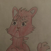
Thought I draw both Katt Monroe and Krystal together. I redesigned them both, Krystal I did awhile ago here, fav.me/dbbri5g , and for Katt..I didn't change here too much just added arm gloves and added more to her top.Katt and Krystal (c) Nintendo
Related content
Comments: 30

👍: 0 ⏩: 1

You’re welcome. I can imagine Krystal as the smarter & more responsible of the two.
👍: 1 ⏩: 1

👍: 0 ⏩: 1

Yeah, but Krystal’s telepathy gives her the ability to collect intel & read minds.
👍: 1 ⏩: 1

👍: 0 ⏩: 1

Hey there from : iconprojectcomment: ! I hope this will be of some help. Overall it's a nice drawing but there are some things you could do to improve it. It's good to use shapes as a base for your work and I think you have underneath? (Before inking)...but one thing I noticed, especially on the face shapes is that it's like they are layered rather than connected, like the muzzle is just a little mouth-shaped detail drawn over the top of the general construction of the face, what I mean it's like the facial features look like all separate pieces drawn over the top of the head instead of an actual 3D head/muzzle. The chins look very flat though you did a better job on Katt's open mouth, I think you know what you're doing and just need some coaching and I wish I was skilled enough to offer it. To me it just looks like you could add more, dimension I suppose? Man I hope I'm making sense....
The eyes are pretty but the open section on the inside may be contributing to the flat feeling but that may just be your style! And I am running out of ways to explain my take on this so I'll just post this and hope I explained things okay >.<
👍: 0 ⏩: 1

Thank you for the critique, this will help me in the future 
👍: 0 ⏩: 0

Krystal doesn't seem too happy to be here. XD
👍: 0 ⏩: 1

Well there's no time to relax or smile when your a war with the rival tribe
👍: 0 ⏩: 1

Fair enough. XD
👍: 0 ⏩: 0

It's okay 
👍: 0 ⏩: 1

Another great job, but I'm wondering why you always draw Krystal with an angry look on her face xD
👍: 0 ⏩: 1

Well my head-cannon of Krystal is that shes takes everything very serious as she is second in command of a tribe. Well that my portray of her in the zero timeline. Also Thank you
👍: 0 ⏩: 1

Kinda like her personality in SF Command XD And you're welcome 
👍: 0 ⏩: 1

^^....Not at the moment no
👍: 0 ⏩: 1

It's okay, whenever you open them again could I make one?
👍: 0 ⏩: 1

Okay thanks 
👍: 0 ⏩: 1

Whenever you're opening them tell me so I can give ya refs of the characters
👍: 0 ⏩: 1

Howdy! Im from Project Comment! Even though you have a decent grasp of anatomy, it's not perfect. It's probably due to the hair tufts on their cheecks, but the body is barely thicker than the head. If this happened in real life, such a body wouldn't be able to support such a head. Make the shoulders longer, make the body width longer. Also, this is probably part of your style, but maybe try to make your eyes smaller. That way, you'll be able to add more detail to the face. Also, the necks don't really...bend like that. They more or less stay the same width until the base at the shoulders. Another tiny thing: Make the arms wider, and make them look less stick-ish. Crystal's right arm is so thin that it could only belong to an anorexic, if that was your intent then good job! If not, try to work on that. Using references is not a sin.
Anywho, I hope this makes you improve!
👍: 0 ⏩: 1

Thank you for the critique, the eyes I can make a little smaller but there are ment to be big especially Krystal's:- 4.bp.blogspot.com/-E6CkWhEFHtU… (Official Star fox adventures design). Also Krystal right arm does look so thin so thank you for pointing that out for me.
Again, thank you for this critique this will help me improve my anthro anatomy
👍: 0 ⏩: 0


