HOME | DD
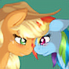
 lotothetrickster — AppleDash Kiss

Published: 2012-04-11 00:58:43 +0000 UTC; Views: 6181; Favourites: 141; Downloads: 145
Redirect to original
Description
Experimenting with the line quality and the background. I kind of like this one for its simplicity.Related content
Comments: 23

On her heart, cause it's soaring right now.
👍: 0 ⏩: 0

When you talked about impressionistic digital painting in your comments in another piece I immediately thought of this one. In some ways I think it's a stronger example of that because you match colour of the outlines to the colour of the bodies, and they fade in odd places. The effect is much more impressionistic not to mention more vibrant in my opinion. You should probably emphasize this direction more rather than black outlines.
Only complaint: I've noticed this in your pony art, the curve of the upper legs falls entirely beneath the main body. Most of it should actually overlap with the body itself, with only the lower curve visibly falling beneath the body. Otherwise the drawing is fine.
👍: 0 ⏩: 1

Thank you!
Honestly, drawing ponies isn't really my passion. Pony art is just a way to attract people to my original art, although I certainly appreciate your comment 
👍: 0 ⏩: 1

You're welcome.
Honestly, drawing ponies isn't really my passion. Pony art is just a way to attract people to my original art...
Hm, fair enough, though as a bit of friendly advice the basic points about the legs would extend to other quadrupedal mammals as well. I've noticed some of your works with quadrupeds, such as one involving a hyena, involve a similar dipping in the legs. So it may be something to work on depending on what else you work on in the future.
And I'm going to have to look more at your gallery later on after I'm done doing job applications.
👍: 0 ⏩: 1

I don't see it as an issue as cartoons are not known for accuracy. I can draw realistically, but I choose not to. It's a matter of aesthetic preference at this point, but thanks for taking the time to critique
👍: 0 ⏩: 0

The sheer adorableness of this picture caused me to completely overlook the missing wings, really. Keep up the good work, just try to remember Rainbow Dash isn't the fastest flier in Equestria for nothin'
👍: 0 ⏩: 1

Lovely! Though... I see a common error when dealing with pegasi. Dashie's wings!
👍: 0 ⏩: 1

Oh, crap! I forget the wings 30 percent of the time. Anyhow, thanks for commenting
👍: 0 ⏩: 0

Yeah, I noticed if I try to add too much to the image, like a complex background or extreme lighting, it makes the subject more difficult to read.
Thanks for commenting
👍: 0 ⏩: 0


