HOME | DD
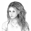
 LPVictoria — C4D Hair'n'Light Test

Published: 2014-08-07 13:37:31 +0000 UTC; Views: 3625; Favourites: 94; Downloads: 167
Redirect to original
Description
Hello everyone! Yes, I'm still alive!This picture is a just a way to test some new features that I learned. First, the lights and shadows. It was a little challenge to make that light lines look natural. Second is the hair. Well, that is the main one. I'm not a hairdresser, but with that C4D hair tools I felt like I'm real stylist. It was the hardest thing I ever did in this program... phew... It was nice experience and I think I'll use that tool in future works, but still, I like to draw hair more than to render it in C4D.
And what do you think? Does this type of hair look better than painted one?
Credits:
Programs: XNA Posing Studio (posing), Cinema 4D (Rendering), Adobe Photoshop (Post-Processing)
Models: [coming soon]
Related content
Comments: 5

Волосы выполнены крайне небрежно и нереалистично. Если бы они были нарисованы в каком-нибудь ФШ, то складывалось бы такое чувство, что дальше силуэта работа не шла вообще (за исключением добавления блик которые тоже выполнены далеко не сносно). Очень сильно выделяется задняя часть, освещённая красным. И это уже не говоря о том, что
задняя часть волос (та, что слева от зрителя) малость отличается от передних.
👍: 0 ⏩: 0

The hair does look a bit too much like its been modelled with wide quads, making the hair look quite flat in places, especially on her front left fringe covering her eye, whereby there is a straight highlight line. Also, on her left shoulder, I can't really work out what is hair and what is leather jacket because the edge between shadow and highlight its quite abrupt, or her hair has sharp corners/more wide flat quads. And I really like your painted hair, so I'd like to see more painting hair
In general, love the pose, love the eye and the facial expression. The red light on the clothing is great. Her fingers look a bit odd though. and i probably would have had the rotation of the window shades follow the flow of the light into the room.
Overall - a great piece to add to your awesome collection of art work
👍: 0 ⏩: 0


