HOME | DD
 MaximoVLorenzo — OHKO tone samples

Published: 2010-09-17 00:26:26 +0000 UTC; Views: 3610; Favourites: 131; Downloads: 76
Redirect to original
Description
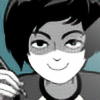
sampling how I'm going to tone OHKO, also these are the B/W version of the OHKO button designs! Characters from left to right are Serge, Lune, WilliamRelated content


Comments: 48

Its pointing out the obvious I know, but you REALLY do have a nack for shading, I am lovinge Lunes hair, also the touches on William's collar is so cool.
👍: 0 ⏩: 0

amazing work man!  (Smile)")
👍: 0 ⏩: 0


wee bit of patterning going on with your dot grains...this is something I will need to experiment with as well, before I go to print!
👍: 0 ⏩: 0
You've got a lovely sense of design, and I think you've used the perfect mix of blacks and tones. 
👍: 0 ⏩: 0

You know it is effective and good character design when you can see that JUST from headshots like that.
Bravo! And on second look, the moiré does look slightly distracting. Something else I'd do is maybe tilt Lune's star just so the top point of the star is a little more visible. Aside of that, super aces!
👍: 0 ⏩: 1

Thank you! :] I'm gonna get rid of that second toning when I do the comic
👍: 0 ⏩: 0

This is a really stylish work and the comic is going to be sooo awesome, if you have the patience to do all the pictures like this.
I really admire you~
")
👍: 0 ⏩: 1
Ahhh thank you! That's very sweet of you to say! I dig your work too!
👍: 0 ⏩: 1
No problem, really!
👍: 0 ⏩: 0

Holy shit I love their profiles
YOU ARE GOOD WITH NOSES AND STUFF
👍: 0 ⏩: 1

Really nice, profile shots like these give me boners. These are all great!
👍: 0 ⏩: 1


Oh man, I like the different profiles and the solid linework. Very cool!
👍: 0 ⏩: 1


wow you got a nasty moire pattern, I can't tell you much.
I feel like the tones are toooo dark.
👍: 0 ⏩: 1
maybe ill try lighning them up a tad... hmm. And I'm iffy about the double pattern hair.
👍: 0 ⏩: 2
and yeah, double pattern hair is a no. Less is more, man.
👍: 0 ⏩: 0
yeah just do your thing. try adding the color, grey em and use em as a refs.
👍: 0 ⏩: 0

Really interesting styles of the profile
I like how they're not the same faces (Like I've seen in some manga books)
👍: 0 ⏩: 1

):I I want OHKO to hit hardcore. Because I was toys.
👍: 0 ⏩: 1
haha im tempted to do patched together
👍: 0 ⏩: 0


Try not to over do it with the tones and make it too dark. These are looking good so far!
👍: 0 ⏩: 1
oh yeah...i feel bad toning this much haha
👍: 0 ⏩: 1
Try to limit it to one or two tones maybe? Like One Piece (when Oda uses tones anyway ). I need to learn to tone too D:
Goodluck!
")
👍: 0 ⏩: 1

 (Wink)")


Niiiiice, man. Not overdone like some people do their tones.
👍: 0 ⏩: 1

I love this! Especially the male on the far right!~ Such a great profile! :>
👍: 0 ⏩: 1
