HOME | DD
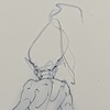
 mazingerpip — Skull Rider

Published: 2009-12-23 05:54:07 +0000 UTC; Views: 2574; Favourites: 48; Downloads: 0
Redirect to original
Description
My favorite character from Kamen Rider Spirits. Taki Kazuya, the Skull RiderKamen Rider Spirits is a manga where all the showa riders ( excluding Black and RX


 ) come together to fight a common threat.
 This guy isn't a Kamen Rider though. But he's a badass nonetheless.
If you're a KR fan, go read Kamen Rider spirits now!


watercolor


Related content
Comments: 19

Skull Rider is way awesome, definitely one of my favorite characters from the manga, if not my favorite, great work 
👍: 0 ⏩: 1

Thanks! Yep, he's my fav from the manga too. They should really do a live action version of him.
👍: 0 ⏩: 0

yeah he's awesome. thanks for the fave!
👍: 0 ⏩: 1

Matagal ko na ring gustong gawan ng fan art si Skull Rider.
Kaso tinatamad ako.
👍: 0 ⏩: 1

hehe malupet na fanart yun pag gumawa ka! si skull rider pinakamaangas sa kanila e hehe
👍: 0 ⏩: 0

The rendering is too broken up. You should look for a way to unify the blacks. They also flatten out the form instead of emphasizing dimension.
The things to study to improve this are 1) the direct and indirect lighting of basic forms and 2) pen and brush technique.
👍: 0 ⏩: 0

hehe meron sa onemanga.com kaso ndi kumpleto kaya nakakabitin hehe
👍: 0 ⏩: 0

yep looks cool...great composition and use of blacks/greys.
👍: 0 ⏩: 1


