HOME | DD
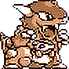 MBLOCK — Kalos Starters GRB Devamp

Published: 2013-08-25 03:36:43 +0000 UTC; Views: 9615; Favourites: 661; Downloads: 83
Redirect to original
Description
Next time I should do a sketch before doing a lineart out of thin air... hence the faulty lines and scrappy poses. (But that kinda makes then look a bit more first generation-ish now that I look at it) Anyway, this is a doodle.All the starters don't have quite their original design, I though I had to adapt them to get them more like old designs.
See also;
~LunaratheAra kindly made an official-looking sprite based on the Fennekin in my drawing !
You can also see my art gallery on Tumblr! Click here !
(Please don't repost my art, why not reblog/like instead?)
Related content
Comments: 54

I'm going to make an attempt to pixel the Chespin.
If that's okay.
👍: 0 ⏩: 0

Nice! I especially like Fennekin. It really looks like if it appeared in Yellow.
👍: 0 ⏩: 0

Excellent work! You captured the retro feel perfectly!
👍: 0 ⏩: 0

Can I please use this for my 8-bit Elite 4 Battle video?
It fits perfectly...
👍: 0 ⏩: 0

I love this! They look a lot more awesome this way^^
👍: 0 ⏩: 0

Ack, you made Chespen look even more awesome then it already was
👍: 0 ⏩: 1

much better than the original designs, especially the fennekin!
👍: 0 ⏩: 1

Aw thanks so much! Yeah, I based him on old designs, like Ninetails/Vulpix and Growlithe.
👍: 0 ⏩: 0

Thank you! It's really, really fun to do!
👍: 0 ⏩: 0

love it! they all look cooler but especially chespin!!
👍: 0 ⏩: 1

Thanks! Yeah he was really fun to redesign.
👍: 0 ⏩: 0

Especially the grass starter looks way more cool this way 
👍: 0 ⏩: 1

Thanks a lot! He was the one I tried to really simplify it's design, though the others I worked on too, they were more instinctively designed.
👍: 0 ⏩: 0

Is it alright that I made an actual sprite of the Fennekin? 
👍: 0 ⏩: 1

Hey no problem! Just give credits and I'd like to see what it gives out!
👍: 0 ⏩: 1

I gave credit and everything 
👍: 0 ⏩: 1

So cool! Mind if I put you into the description?
👍: 0 ⏩: 1

You may put me in the description.
👍: 0 ⏩: 0

Y'know, I've been wondering: Why do you say GRB anyway, when GR(jp) has a different style to RB?
👍: 0 ⏩: 1

Oh well, I don't really want to make a huge difference here, just told the watchers that the devamp is in the first generation style; including pokemon green that was a bit different from Red and Blue. But good observation here!
👍: 0 ⏩: 1

Although I would like to see you draw something on par of the horribly, horribly disproportionate Green.
👍: 0 ⏩: 0

no prob
can u check out my fakemon?
👍: 0 ⏩: 1

Nice! It definitely has that first gen feel. ...I think Fennekin looks even better this way, personally--it doesn't have ultra-weird proportions like it does in its official design.
👍: 0 ⏩: 1

Yeah, I gotta agreed with you on the official Fennekin proportions, they are a bit weird... but maybe this has a meaning in it's evolutions? Thank you!
👍: 0 ⏩: 1

Maybe. I think they might just have tried to go for the more "chibi" style and just gone overboard though, really. Regardless, I am starting with Fennekin because I have a tradition of always choosing the Fire starter. I hope the proportions get better as it evolves.
👍: 0 ⏩: 0

Yeah, it's funny, but it's even more pleasing to draw complicated pokemons than simple one into this style, so 6th gen suits this fine.
👍: 0 ⏩: 1

Pokémon designs have indeed been getting more and more complex, but that makes them nice to draw, right?
👍: 0 ⏩: 1

Yes. Afterall, why the first generations were simplier in design, that because of the system. Maybe pokemon was always complicated and we never knew!
👍: 0 ⏩: 1

Actually, you're right. Go beyond the designs of the Pokémon, delve into the mechanics of the game. Pokémon's pretty complex, on second thought!
👍: 0 ⏩: 0

Trop beau sérieux! J'aime beaucoup ton idée de Chespin, j'le préfère à l'officiel haha, + simple pis + cute ^_^
👍: 0 ⏩: 1

Ah merci beaucoup! Ouais mais j'ai roché rare pour Chespin, je trouvais son design bien trop complexe pour faire partie de la première génération alors fallut que je peaufine des trucs.
👍: 0 ⏩: 1
| Next =>


