HOME | DD
 mechanicalmasochist — Rats In A Lab blank version
Published: 2013-03-23 02:20:54 +0000 UTC; Views: 3741; Favourites: 214; Downloads: 13
Redirect to original
Description
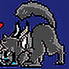
alternate version to the other onewhich one do you prefer?
Related content


Comments: 37

this one, but it would look cooler if it was the same color as the other
👍: 0 ⏩: 0

both use shale at the front and black as a end of page.
i think that would be cool.
👍: 0 ⏩: 0

I like this one. Red stands out more and the design of Blank does as well.
👍: 0 ⏩: 0

I agree with ~Moonfire3451 , ~okami129 , and ~Metaknightrules , back to back would be perfect~ <3
👍: 0 ⏩: 0

hmm well i agree with pixelscratch on red being an eye-catching color (not to mention my favorite), and also the fact it's blank with the wires in his head, it gives an even more interesting approach.
👍: 0 ⏩: 0
PixelScratch [2013-03-23 20:16:56 +0000 UTC]
I like this one better. Red is just such an eye-catching color.
👍: 0 ⏩: 0

I prefer the blue one, but the red one adds more detail. Maybe they could be back to back or something?
👍: 0 ⏩: 0

Both, this could be the back and the other be the front
👍: 0 ⏩: 0


")

I think this one is better, but I admit it would be cool to see one with both Blank and Shale.
👍: 0 ⏩: 0

For me, the first one looks more like a cover, however I feel like this one portrays what the story line is about more.
👍: 0 ⏩: 0

Maybe you should put one side as Blank, and then behind Blank could be Shale?
Idk, just a suggestion.
👍: 0 ⏩: 0


I like this one better :3 But it would be cool to see them combined ^^
👍: 0 ⏩: 0

why don't u combine them like put this rat on one side & the other on the other :3
👍: 0 ⏩: 0

They're both so amazing. xox <3
My vote is for this one though. cx <3
👍: 0 ⏩: 0

I like ths one. I think its because the wires in his head make it more interesting.
👍: 0 ⏩: 0


I honestly like both versions. This version definitely supports the idea of the rats being experimented on. Though, I don't quite like the red as well as the blue. The red seems very harsh to look at, and I think the blue would be overall better.
👍: 0 ⏩: 0
xxRyderspritexx [2013-03-23 02:33:59 +0000 UTC]
I think I prefer this one more. It would give the cover a more "lab/experimenty" feel to it.
👍: 0 ⏩: 0

I had another idea: how about both? Like Shale on one side and Blank on the other but like flipped? Like: one|other but the other one was upside down?
👍: 0 ⏩: 0

I like the previous one better, more because of the cooler colors. I think this one is cool though!
👍: 0 ⏩: 0


If it's more of a cover for a book, I'd love to see the other one as the main cover, and this one being on the back of the book. I love side by side touches like that.
If you could blend the two, that'd be pretty badass.
👍: 0 ⏩: 1

I only worry I'd need a blurb on the back of some sorts? if I was making more than one issue it would be ideal
though i might change the gear and text on the right to blue and have it split down the middle that might make it look odd...
👍: 0 ⏩: 1
True, true..
But you won't know until you try it. Maybe blending the two near the center to more of a purple could balance it out, but not too much that it's over exaggerated.
Having a compilation of covers for different scenes in the comic could work. I could see these two covers being like a transition page if you change perspectives in the two characters.
👍: 0 ⏩: 0


i dont know how you do it...
I LIKE DIS ONE
👍: 0 ⏩: 0

I honestly prefer this one, the rat has the more expiremented on look
👍: 0 ⏩: 0

")